
latest
habitat tv

Say goodbye to the morning scramble for keys, coats and sunglasses and hello to this… see this and more videos
blog

Reader roundup: See what our readers have been up to!
Refurbished vintage furniture, charming exteriors and magnet walls for kids. These projects are sure to… more
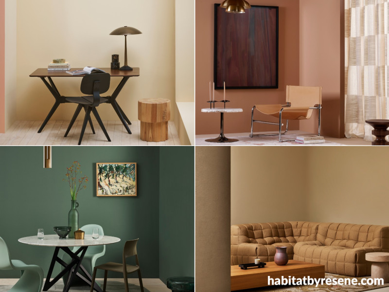
Four trending interior colours for 2026
10 Jun 2026
For your consideration, we’re bringing you another set of our favourite colours right now. These four hues are all grounded in nature’s tones, and they just happen to be seriously trending this year. Here’s how to use them and what to pair them with at home.
Buttermilk
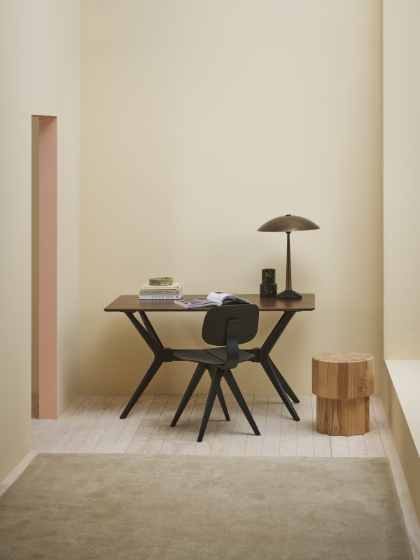
Walls in Resene Buttermilk, floor in Colorwood Breathe Easy. Table and chair from Good Form, rug from Baya. Project by Amber Armitage, image by Melanie Jenkins.
What it looks like:Resene Buttermilk is a warm yellow with a slight hint of orange.
Where to use it: Use this shade in a home office, bedroom or living room to bring warmth and relaxation to your home.
Best friend colours:Buttermilk looks fantastic paired with other warm hues like Sante Fe, Resene Colorwood Oregon, and contrasting shades like Nero:
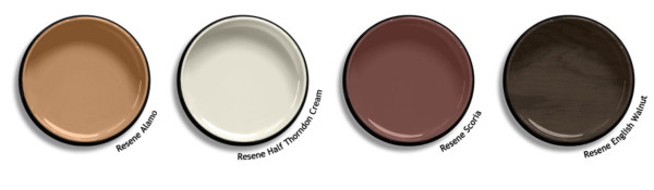
Alamo
Walls in Resene Alamo, ceiling in Irish Coffee, floor in Okey Dokey. Rug from Designer Rugs, chair from Good Form, art by Kate Van Der Drift. Project by Amber Armitage, image by Melanie Jenkins.
What it looks like:Resene Alamo is a faded salmon and beige hue, evoking memories of dusty roads.
Where to use it:Use this shade in living rooms, bedrooms and hallways for a warm, cocooning home over winter.
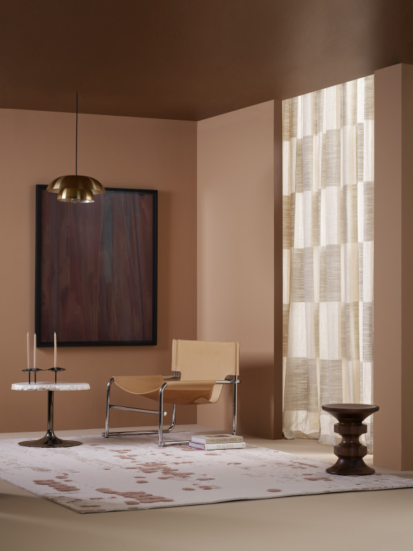
Best friend colours: Pair Alamo with warm whites like Half Thorndon Cream, rich brown reds like Scoria and dark wood stains like English Walnut:
Vantage Point
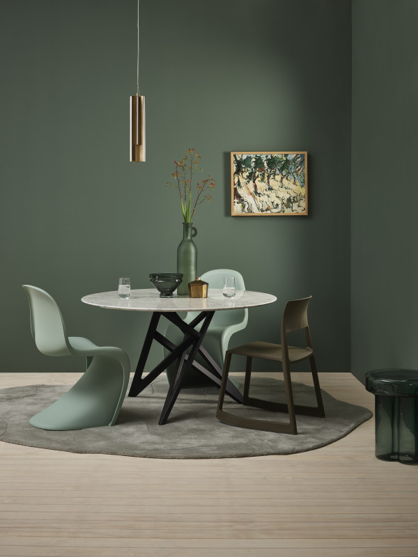
Walls in Resene Vantage Point, floor in Breathe Easy. Pendant from Powersurge, art by Alan Pearson, table and rug from Ligne Rosset. Project by Amber Armitage, image by Wendy Fenwick.
What it looks like: Resene Vantage Point is a smoky green.
Where to use it: Muted greens such as this work well in most areas of the home, especially dining rooms, sitting rooms and bedrooms.
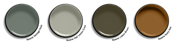
Best friend colours: Pair Vantage Point with other nature-inspired hues such as Half Lemon Grass, Lisbon Brown and Rusty Nail:
Double Sisal
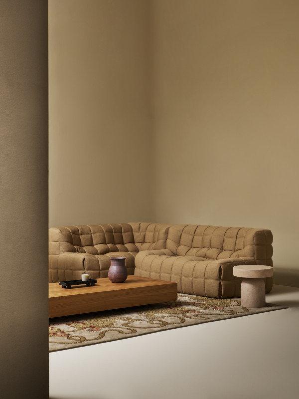
Walls in Double Sisal, floor in Resene Walk-on in Half Sisal. Sofa from Ligne Rosset, tables from Tim Webber Design, rug from Designer Rugs. Project by Amber Armitage, image by Melanie Jenkins.
What it looks like:Resene Double Sisal is an ochre tone, reminiscent of natural fibre.
Where to use it: Use this shade in living rooms, bedrooms and home offices for a calm and grounding space.
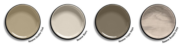
Best friend colours: Pair Double Sisal with neutrals such as Blanc and Triple Napa, and light stains like Breathe Easy:
Stay tuned for next month’s top colour picks and make sure to check out habitat on Instagram for all the latest home decorating inspiration.
Published: 10 Jun 2026

