
latest
habitat tv

Say goodbye to the morning scramble for keys, coats and sunglasses and hello to this… see this and more videos
blog

Re-living the 1980s through art
Clint C is an artist whose work instantly sparks recognition and joy. Based in Hamilton,… more
A bolder shade of calm for February
11 Feb 2026
As the year settles into its rhythm, February’s colour alert from Color Marketing Group (CMG) turns toward depth rather than dazzle. Protopia is a dark, thoughtful purple that feels grounding and protective, offering a sense of calm with a quietly watchful edge. And, we’ve got just the right Resene colours to help you bring it to life.
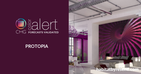
Protopia is a deep, low-chroma purple designed for real life at home. It feels calm and enveloping, like a room that holds you rather than shouts for attention. This is a colour that encourages reflection and care, subtly tuned to notice what feels off while keeping the space grounded and reassuring.
In interiors, it brings depth to walls, cabinetry and soft furnishings without tipping into drama, making it ideal for homes that value comfort with intent.
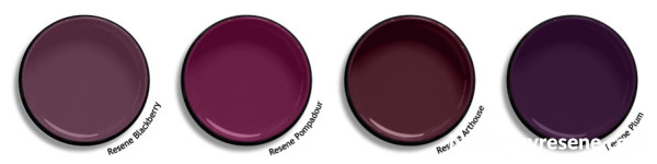
For this hue, you could also try Resene Blackberry, Pompadour, Arthouse and Plum:
Here’s some inspiration for how to work with deep purple hues in your home:
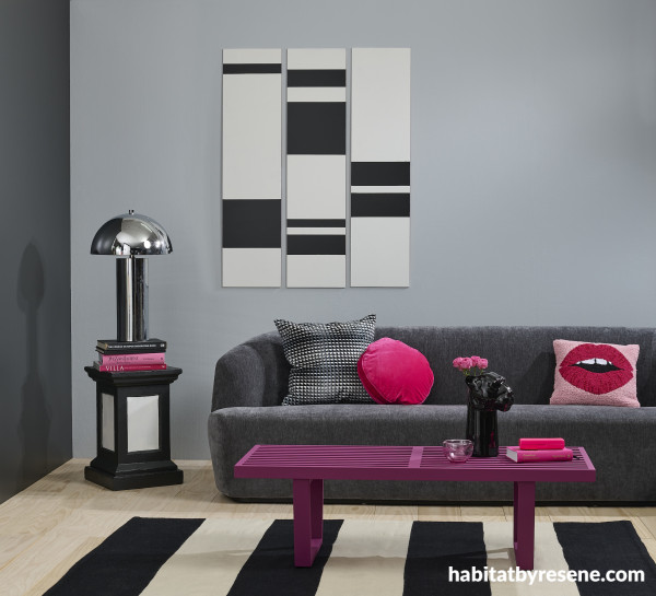
Paired with grey, deep shades of purple really make a statement. Here, the bench seat is painted in Resene Pompadour, back wall in Half Gull Grey, left wall in Element, floor in Colorwood Whitewash and side table and artwork in Eighth Black White and Element. Sofa from Dawson & Co, cushions from Kip & Co and rug from The Ivy House. Project by Kate Alexander, image by Bryce Carleton.
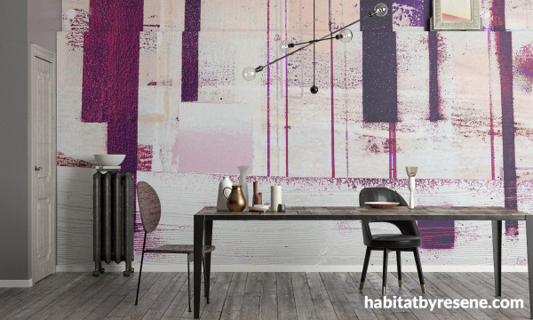
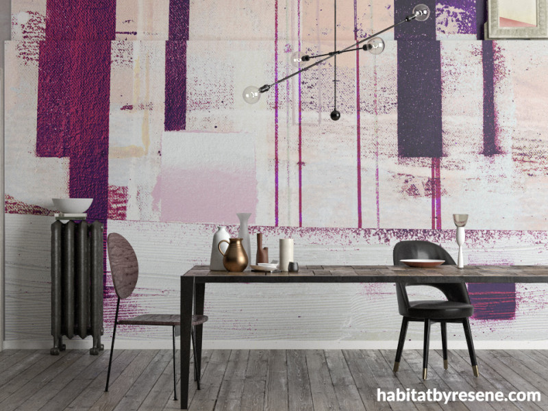
Add an artful touch to your home office or living room with a design like Resene Komar Pure Wallpaper Collection PRH-0819. The deep purple hues pair well with crisp whites like Black White and darker wood tones like Colorwood in Dark Oak and Walnut.
Tip: For a classic paint that never fails, use Resene SpaceCote Low Sheen on walls. Or, for something a little more dazzling and sleek on doors and furniture, use a higher gloss, especially for bolder, brighter colours, like Super Gloss Enamel or Lustacryl semi-gloss.
Published: 11 Feb 2026

