look book
latest
habitat tv

Say goodbye to the morning scramble for keys, coats and sunglasses and hello to this… see this and more videos
blog
Reader roundup: Public murals and powder blues
A Morningside mural, an exterior refresh, and striped walls. Let these projects be your inspiration… more


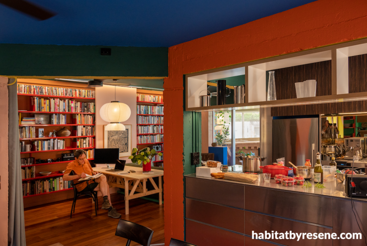
Ceiling in Resene Tory Blue, left wall in Sakura, beams in Howzat, Energy Yellow and Sebedee.




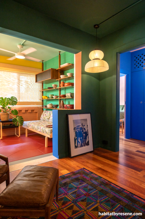
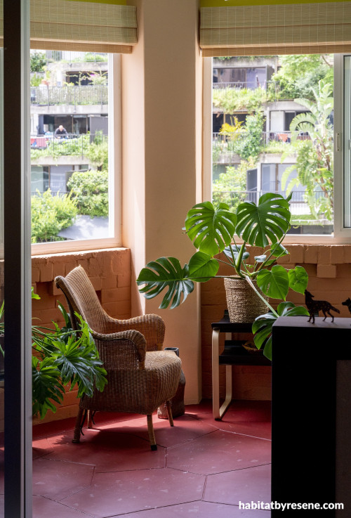
Walls and ceiling in Resene Howzat, sunroom in Vista Blue, Howzat, Energy Yellow, Sante Fe, and floor in Red Oxide.


The art of ageing in place
Growing older doesn't have to mean leaving behind the places, routines or surroundings that make us who we are. For many people, ageing in place is about far more than accessibility. It’s about remaining connected to the memories and spaces that tell the story of their lives.
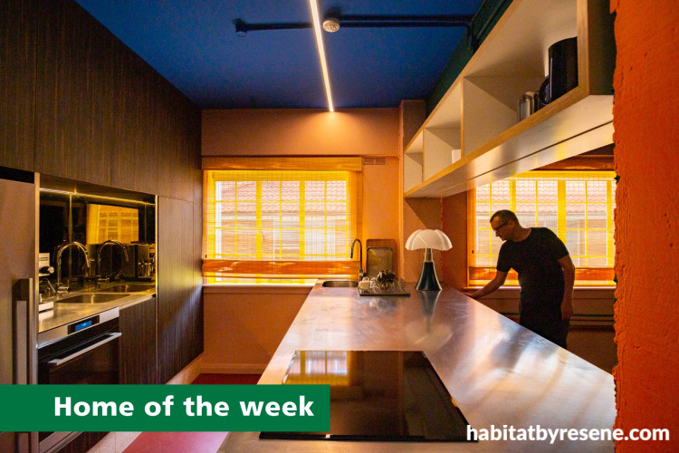
That philosophy sits at the heart of this remarkable renovation by Plus Minus Design, with colour design by Lymesmith. The modest 1920s apartment has been transformed into a deeply personal space where colour and functionality work hand-in-hand.
Redesigned for Michael, a 76-year-old who wanted to spend his later years living independently, his long-term home in Sydney’s Elizabeth Bay is a celebration of individuality.
For Michael, “White represents death, and I’m not ready to go there!”. His home rejects all that is clinical and neutral. Instead, it embraces his personality at every turn.
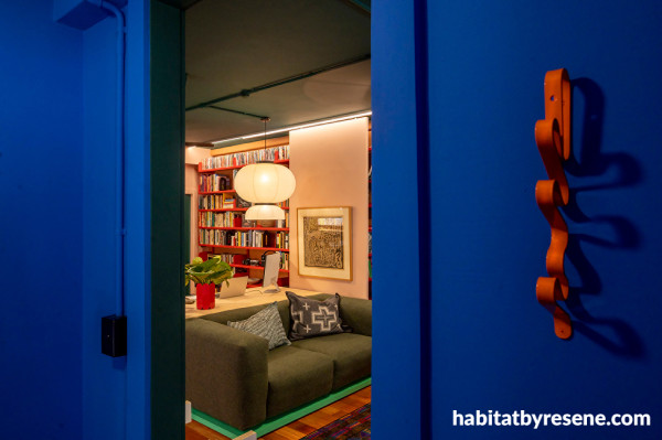
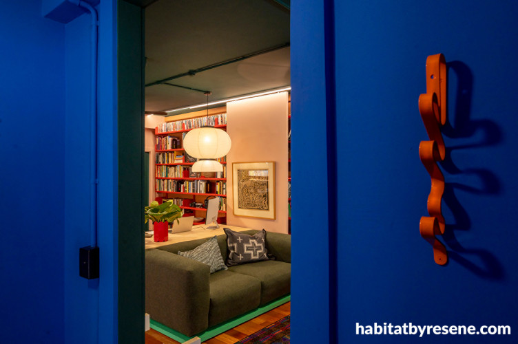
Walls in Resene Tory Blue and Sakura, ceiling in Deep Teal.
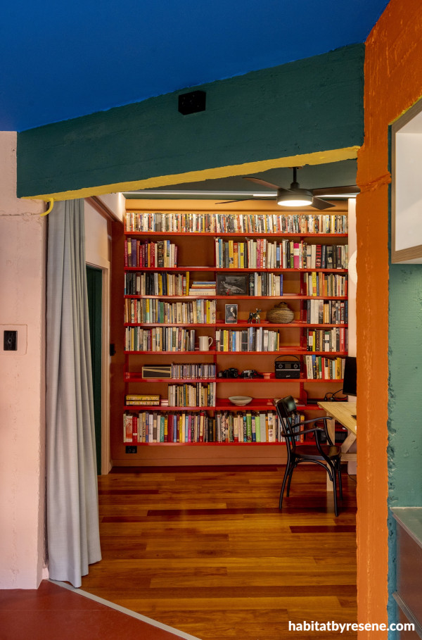
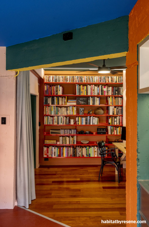
Ceiling in Resene Tory Blue, left wall in Sakura, beams in Howzat, Energy Yellow and Sebedee.
In the original space, the kitchen was awkwardly long, the second bedroom lacked purpose, and the finishes were dull and generic. Michael wanted a home where he could cook, entertain, work, read, watch films and enjoy his carefully curated wine collection. All within spaces that reflected his life-long love of colour, photography and design.
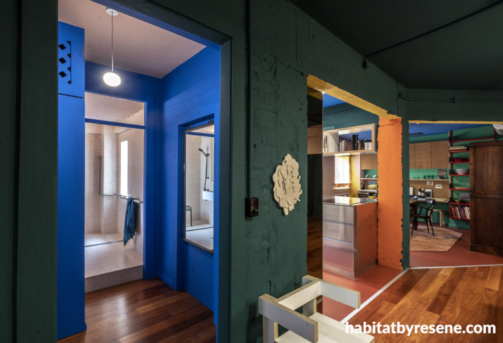
The renovation also reveals the building’s age in a beautiful way. Layers of previous renovations were stripped away to expose raw concrete and uneven walls, allowing the apartment's history to become part of its identity.
And instead of disguising these imperfections, the paint colours now highlight them.
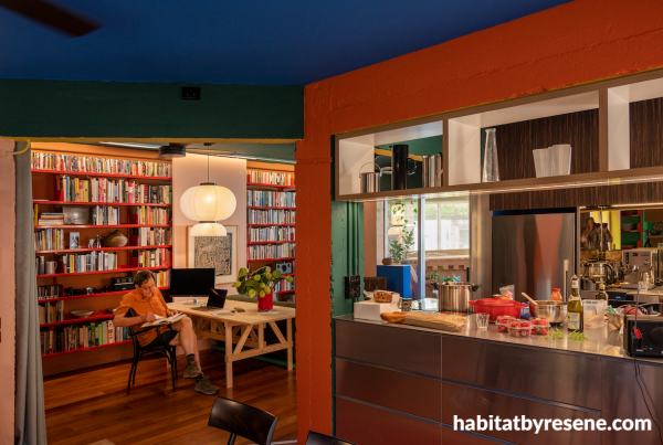
Right wall in Sebedee, beam in Howzat and Energy Yellow, ceiling in Tory Blue.
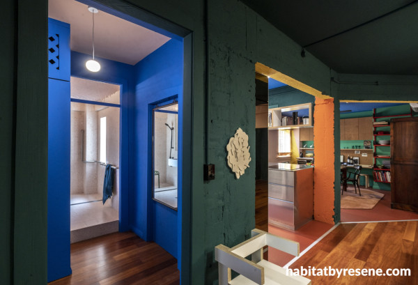
Bathroom hall in Resene Tory Blue with ceiling in Sakura, walls in Howzat.
Rich shades of Resene Deep Teal, Sante Fe, Tory Blue, Howzat, Sebedee and Sakura flow across the walls. Rather than each room feeling separate, the colours cleverly lead the eye from one area to the next, creating zones and revealing layers of the apartment bit by bit.
Darker areas naturally connect to brighter ones, and changing light throughout the day forever shifts the appearance of the palette. Michael even says that from his desk he can count a dozen different shades of pink, despite only one actually being used.
Colour isn't static. It changes with the light, with your perspective, and with the time of day, keeping the apartment endlessly engaging.
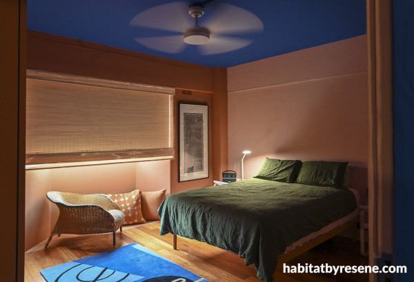
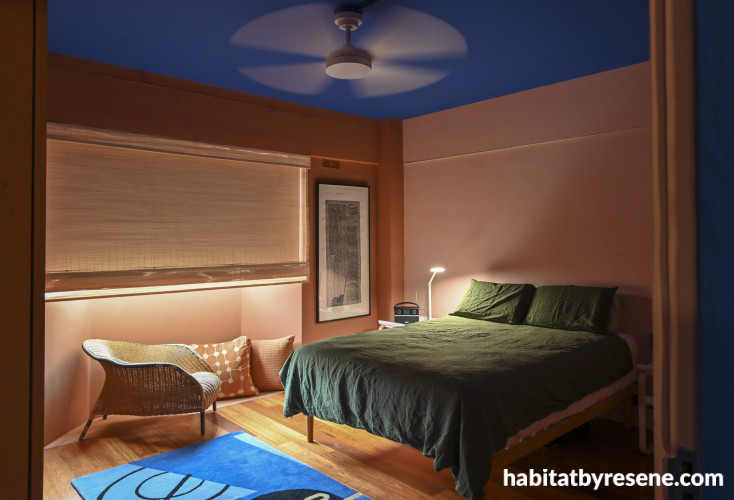
Bedroom walls in Resene Wax Flower and Sante Fe, ceiling in Tory Blue.
The ceilings are painted in five different colours including Vista Blue, Howzat, Deep Teal, Sakura and Tory Blue, helping define each zone while enhancing the apartment's gallery-like atmosphere.
Pops of Energy Yellow highlight beams, window frames and sills, adding moments of optimism, while the sunroom floor in Red Oxide anchors a bright space with warmth and character.
The apartment may be bold, but every design decision also supports practical living. Opening the former kitchen and dining creates generous sightlines through the home, revealing layers of colour that magically expand the sense of space and entices visitors to explore.
The layout revolves around Michael's desk rather than a television or fireplace, reflecting the rhythms of his own life. There’s little about this apartment that follows convention, and yet, it works.
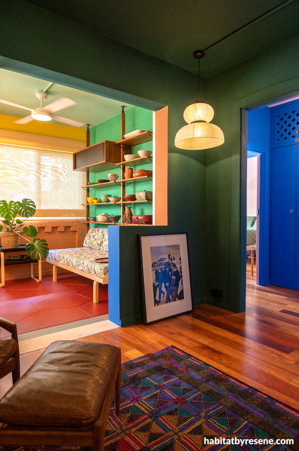
Walls and ceiling in Resene Howzat, sunroom in Vista Blue, Howzat, Energy Yellow, Sante Fe, and floor in Red Oxide.
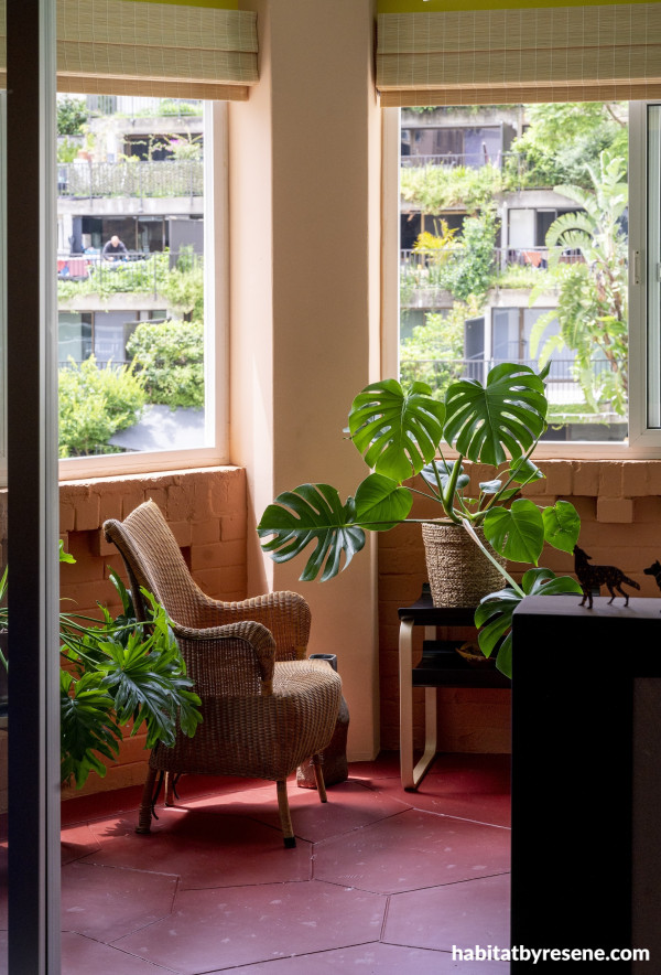
Sunroom floor in Resene Red Oxide, walls in Sakura.
Perhaps another important note here, is that colour plays an important role as we age. As our eyes naturally let in less light over time, stronger colours and clear contrasts become easier to distinguish over muted palettes. Rather than the whites and greys often associated with homes for older people, this space embraces rich, saturated hues that create warmth, improve visual definition and make each space feel engaging.
The home was predominantly finished in Resene SpaceCote Flat, a product that is equally applicable to broadwall and trims due to its enamel like toughness. The choice of a flat finish is esstential for deep saturated colours, and gives surfaces a soft quality that feels lived in rather than precious.
This apartment celebrates ageing in place through a joyful, expressive and deeply personal approach to colour. It adapts to the person who lives there, supporting independence and celebrating life’s uniqueness.
It also offers a powerful reminder that our homes should be places that reflect who we are, especially as we age.
colour design Lymesmith
architecture Plus Minus Design
build Bright Build
paint Hyan Duck Kim
images Anthony Browell
Resene Pro Tip:
If you’re planning on painting older, exposed brick inside, be sure to clean all surfaces first to remove dirt and dust, and use Resene Interior Paintwork Cleaner. Next, use Resene Sureseal. This penetrating, solvent-borne sealer binds up old, weak surfaces and mortar. After this, apply Resene Quick Dry primer/undercoat before your chosen topcoats.
Alternatively, you could apply a clear coat to the old brick. This will intensify the colour and apply a surface that is more easily cleaned. Depending on the porosity it is best to apply a gloss finish first before applying a lower sheen finish or retaining the higher gloss. Resene’s Concrete Clear range is ideal for brick and masonry finishes.
Published: 30 Jul 2026
Do you have a home full of wonderful Resene paint and colour? Send us some snaps by emailing [email protected].


Resene Energy Yellow
the look
If you're stuck on what
colour to use or need colour
advice, try out the Resene
Ask a Colour Expert service.
Resene Energy Yellow
the look
If you're stuck on what
colour to use or need colour
advice, try out the Resene
Ask a Colour Expert service.