
latest
habitat tv

Say goodbye to the morning scramble for keys, coats and sunglasses and hello to this… see this and more videos
blog

Re-living the 1980s through art
Clint C is an artist whose work instantly sparks recognition and joy. Based in Hamilton,… more
Whanganui Regional Museum repaint showcases culture, heritage and inclusivity
13 Oct 2025
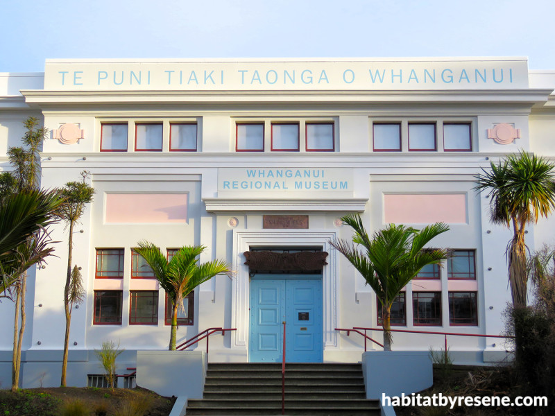
Wandering through Pukenamu Queen’s Park, you will notice a renewed sense of life emerging from one of Whanganui’s most treasured landmarks. The Whanganui Regional Museum has revealed an exterior transformation that feels both grounded in history and freshly optimistic thanks to a carefully considered new Resene colour palette.
The repaint is part of Whanganui District Council’s long-term plan over the next 10 years which includes a full exterior refurbishment of both the Museum’s original 1928 building and its 1968 extension, which also houses the Davis Lecture Theatre. This first stage has showcased how colour can breathe fresh meaning into an architectural icon in some unexpected ways.
Leading the design was Craig Dalgleish, director of Dalgleish Architects Ltd and design technician Catherine Macdonald, who drew inspiration from Whanganui’s natural and cultural context. The awa, whenua, farmland, sky and the deep relationship between Ranginui and Papatūānuku.
The museum’s exterior has been transformed with Resene Heritage Colours, including Resene Merino, Resene Bali Hai, Resene Soft Pink and Resene Scoria.
“We wanted the Museum to sit confidently on its corner and announce itself,” says Craig. “The colours reference Whanganui’s natural environment, cultural past and architectural heritage, but they also reflect optimism and inclusivity. We deliberately moved away from the safe neutrality of greige to create a sense of welcome and vitality.”
Working closely with Resene Trade Sales Representative Nick Gibbons and Rāwiri Tinirau, Pou Rauhī/Māori Advisor for Whanganui Regional Museum, the architects ensured that every colour was culturally and contextually resonant.
The building’s new look is anchored by warm, natural tones. Resene Merino and Resene Triple Merino nod to Whanganui’s farming heritage and its early prosperity built on the wool trade. These gentle neutrals are balanced by Resene Scoria, a volcanic red that references both local geology and the deep, earthy reds seen in traditional marae architecture. And Resene Bali Hai, a tranquil blue inspired by the moana, the awa and the distant mountains.

Panels of subtle Resene Soft Pink add warmth to the exterior in Resene Merino, Resene Triple Merino and Resene Scoria on window trims. The base of the building is painted in Resene Stack to ground the structure.
Perhaps the most surprising yet successful choice is the gentle yet blushing tone of Resene Soft Pink, drawn from the Resene Heritage Colours and colour charts of the 1920s. “Resene Soft Pink is unexpected, but it speaks directly to the ethos of the Museum – inclusiveness,” says Craig. “It pulls the scheme together, connecting the warmth of the whenua expressed in Resene Scoria with the authenticity of the building’s design era.”
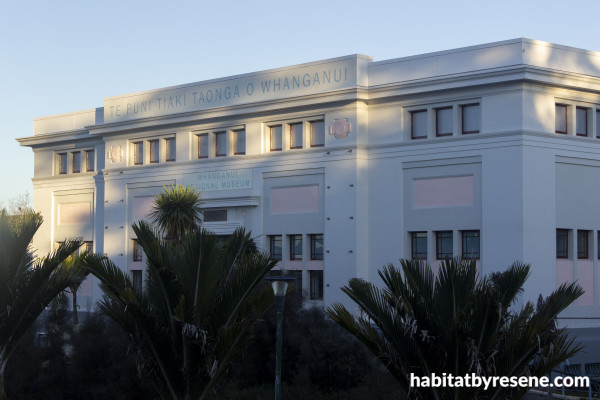
Careful attention was paid to the building’s classical form, which is designed in three parts, base, shaft and capital, like a column. The vertical rhythm of the architecture is accentuated through colour, helping unify the 1928 and 1968 sections. The vertical segments on the later addition are painted in Resene Scoria red, symbolically referencing the pou of marae and visually tying the two structures together.
During the restoration, an unexpected discovery was made. A modernist architectural detail hidden beneath old bitumen waterproofing. “It’s a modern detail leaning to the modernist movement, abstract, asymmetrical and subtly done by the architect at the time,” says Craig. ‘It bridges the transition between the classicism of the 1920s museum and the modern abstraction of the Whanganui War Memorial Hall opposite. Finding it was a real thrill, a small but fascinating piece of design history brought back to light.”
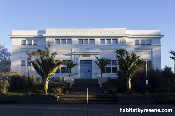
Reflecting the moana, awa and distance mountains, Resene Bali Hai on the doors pop against the blue sky. Resene Soft Pink complements this blue hue and the timeless, heritage shade of Resene Merino.
For the design team, the project was as much about ethos as it was aesthetics. Moving away from beige was both a creative and philosophical decision. “Historically, the museum has felt quite patriarchal,” says Craig. “It’s important that it feels inclusive. This colour scheme is very deliberate, it’s intended to say: You’re all welcome here.”
That sense of welcome extends to the wider civic precinct, where the museum stands alongside the Sarjeant Gallery, Whanganui War Memorial Hall and the Alexander Heritage and Research Library. Together, these buildings form a cultural landscape that is both forward-looking as well as deeply rooted in heritage.
“The new colour scheme has a degree of 1920s optimism,” says Craig. “It looks backwards, but it looks backwards to look forwards.”
Whanganui Regional Museum Director Dr Bronwyn Labrum says the result is everything she hoped for. “I could not be more delighted,” she says. “We had very careful discussions throughout the development of the colour scheme and I always had great faith in Craig and Catherine, with whom I have worked on our recent award-winning exhibitions. Their work is outstanding. Thoughtful, appropriate, yet bold and contemporary.”
Craig and Catherine are quick to acknowledge the trust and enthusiasm of the Museum team. “We are very grateful to Te Puni Tiaki Taonga o Whanganui – Whanganui Regional Museum for their trust in us. This would not have been possible without their encouragement, enthusiasm and ethos.”
The museum welcomes visitors into a space where past, present and future come together in colour, culture and connection. And now with a refreshed façade, it stands as a renewed symbol of Whanganui’s rich heritage and creative spirit.
design Craig Dalgleish and Catherine Macdonald, Dalgleish Architects
technical lead Gerald Cogan, BSM Group Architects
paint Allan Tong
images David Silvester, Karen Hughes
Published: 13 Oct 2025

