

latest
habitat tv

Say goodbye to the morning scramble for keys, coats and sunglasses and hello to this… see this and more videos
blog

Brick Bay unveils its poetic new folly for 2026
The winner of the 2026 Brick Bay Folly competition has been unveiled. Within the Wings… more
Ultra bold, ultra chic: Why ultramarine blues continue to captivate
15 Sep 2025
In design, there are certain colours that assert themselves as perennially compelling – and humanity’s love for deep, rich ultramarine blues goes back centuries. Authentic ultramarine pigment is made from grinding lapis lazuli – a semi-precious stone – into a powder. This colour was once so precious it was exclusively reserved for paintings of religious icons and royalty. In 1826, a synthetic form of ultramarine was invented – which helped make the colour widely available for use by any who desired it.
Today, both the authentic and synthetic forms of ultramarine continue to remain a refined favourite both for dramatic colour drenched looks and adding eye-catching accents. Part of what makes ultramarine blues so alluring is their innate duality, which exudes both a commanding presence and an ethereal calm. Their rich saturation allows them to anchor a space while their luminous depth evokes clarity and chic sophistication. Ultramarine blues also respond dynamically to natural lighting and can shift considerably from morning through evening.
Along with these advantages, a big part of what keeps architects and designers coming back to ultramarine tones like Resene Ultramarine, Resene Aviator, Resene Decadence, Resene Space Cadet, Resene Resolution Blue and Resene Wet N Wild is the ability of these blues to pair beautifully in a diverse range of palettes, making them exceptionally versatile across a variety of project typologies. As accent colours, they deliver dramatic impact without overwhelming. When used across an entire space from tip to toe, they exude richness, glamour and sophistication.
For those feeling cautious about using one of these commanding colours in a scheme, we have curated some tried-and-tested Resene colour palettes you can easily put into practice. By leveraging these combinations, you’ll be left with layered spaces that feel dramatic, engaging and inviting – no matter what type of project you’re working on.
Resene Ultramarine
Resene Ultramarine remains the top option for getting a quintessential, pure ultramarine blue that’s deep, brilliant and timeless. Made with authentic ultramarine pigment, its power lies in its historical resonance and clarity. In conference rooms or library lounge areas, painting feature walls in Resene Ultramarine offset by deeper Resene Wild Blue Yonder on adjacent walls and accents in crisp Resene Black White creates an environment that suggests gravitas, focus and refinement.
In retail, Resene Ultramarine acts as a display hero that acts as a beacon for attention with enough contrast to allow for light or boldly coloured merchandise to ‘pop’. For food and beverage venues, an enveloping atmosphere in Resene Ultramarine with furniture and fixtures in clean whites like Resene Alabaster and soft greys like Resene Half Surrender ensures the tone remains deep and atmospheric yet welcoming and comfortable for patrons.
Top tip: For the most genuine ultramarine options, look to the Resene Beyond the sea palette, which features six brilliant colours made from authentic ultramarine pigment: Resene Azur d'Acre, Resene Ultramarine, Resene Lapis Lazuli, Resene Brilliante, Resene Artiste and Resene Wild Blue Yonder. These hues are only available tinted into Resene SpaceCote Low Sheen, however, you may adjust the sheen by applying a topcoat in Resene Concrete Clear flat, satin or gloss.
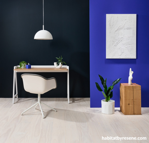
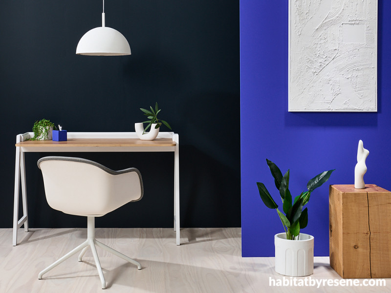
Back wall in Resene Wild Blue Yonder, right wall and pencil cup in Resene Ultramarine, pendant lamp, vase, plant pots in Resene Black White and textured artwork created with Resene EzyFill topcoated in Resene Black White. Chair from Bauhaus, desk from Target Furniture, plinth and sculpture from Public Record. Project by Laura Lynn Johnston, image by Bryce Carleton.
Resene Aviator
The allure of Resene Aviator lies in its ability to be both bold and velvety – an effect which can be further enhanced through thoughtful contrast and clean, light companion colours. In commercial office spaces, this hue is at its most compelling when balanced against soft, understated tones. Pair accent walls in Resene Aviator with a gentle off‑white such as Resene Alabaster or warmer Resene Half Spanish White to provide a counterpoint that still allows these splashes of ultramarine to energise without overwhelming. Brass hardware or pale oak joinery finished in Resene Colorwood Breathe Easy against this backdrop can lend a timeless, quietly glamorous feel that’s particularly effective in meeting rooms, executive suites or reception areas.
In a boutique hotel setting, Resene Aviator can beautifully complement earthy palettes when combined with warm creams like Resene Eighth Rice Cake, mid brown hues such as Resene Shingle Fawn, deep browns like Resene Wood Bark and timber stained in Resene Colorwood Natural.
Accent wall painted in Resene Aviator and other walls and ceiling finished in Resene Aquaclear Satin. Build by Andrew La Grouw, Garry Miller and Michael Whyte. Image by Jamie Cobel.
Resene Resolution Blue
Resene Resolution Blue is a clear, mid‑tone ultramarine that pulses with energy. In retail environments, this azure shade dazzles on display walls when paired with neutrals with presence, like the muted earthiness of Resene Flax Pod or a pale greige like Resene Eighth Arrowtown. In restaurants or bars, its vibrancy is best tempered with warm, tactile materials like timber stained in Resene Colorwood Becalm and seating in a delicate taupe like Resene Swiss Coffee or a deep supple brown like Resene Espresso to create a rich and sophisticated colour narrative. For a dose of the unexpected, try offsetting statement walls in Resene Resolution Blue with a warm white like Resene Bianca and touches of Resene Coral Tree and Resene Nero on accent furniture and décor.
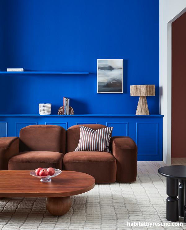
Back wall, shelf, built-in sideboard and mouldings painted in Resene Resolution Blue, passthrough wall in Resene Bianca, right wall (in adjacent space) in Resene Coral Tree and floor stain washed in Resene Colorwood Breathe Easy. Sofa, coffee table, fruit tray and ceramic basket from Slow Store, side table and bookends from Soren Liv, artwork by Greer Clayton from Parnell Gallery, lamp from Kayu Studio, cushion from Cittá, rug from Baya. Project by Amber Armitage, image by Wendy Fenwick.
Resene Decadence
Restaurants and bars need to make a big impact to compete, and a deeply saturated ultramarine like Resene Decadence can be used to create a dining destination that’s impossible to miss. A sleek bar counter in Resene Decadence overlooking seating upholstered in a soft taupe like Resene Dover White, illuminated by warm pendant lighting in a space clad in timber slats stained in Resene Colorwood Whitewash would set the tone for a must-visit spot to enjoy after work drinks.
In public facilities or civic interiors, such as libraries or community galleries, the same shade can be gently offset by pale blues like Resene Quarter Dusted Blue or neutral soft greys such as Resene Iron. This layering adds both dignity and approachability, turning Resene Decadence into a feature that anchors spaces intended for focus and contemplation. This attention-grabbing colour is also particularly effect in wayfinding signage when used in contrast with pale colours like Resene Joanna or bold brights like Resene Neva.
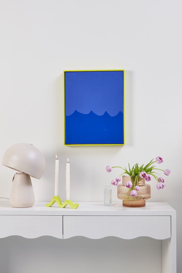
Wall painted in Resene Joanna, artwork in Resene Decadence with wave design created by overcoating in Resene Concrete Clear gloss and frame and candleholders in Resene Enamacryl gloss tinted to Resene Neva. Table and lamp from Soren Liv.
Resene Space Cadet
When a deep ultramarine is needed, there are few colours that assert character quite like Resene Space Cadet. In a creativity-focused spaces, this splashy colour makes a big impact especially when contrasted with crisp, clean neutrals such as Resene Half Black White or softer options like Resene Half Tea. Resene Space Cadet makes for a striking accent wall and can also holds its own when used with other bold saturated accent colours like Resene Groovy, Resene Havoc or Resene Sebedee. When used behind a reception desk clad in lighter Resene Refresh, offset by pale joinery in Resene French Pass, this tonal blue combination makes a statement as it ushers visitors into a space of confident design. And when used for exterior architectural details with a base in deeper Resene Indian Ink, Resene Space Cadet makes a chic and noticeable statement.
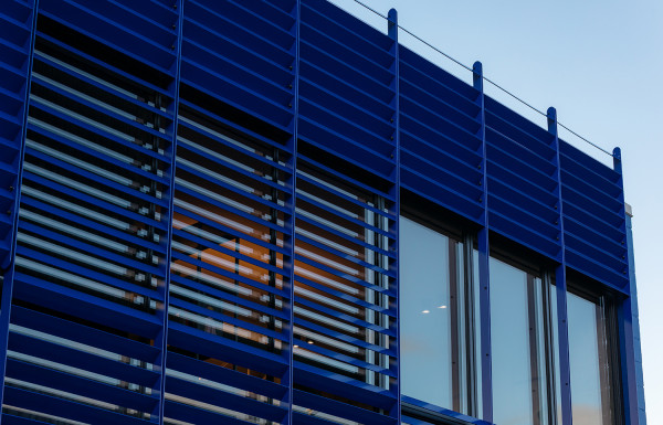
Exterior façade and screening in Resene Space Cadet. Project by PAC Studio, www.pacstudio.nz. Image by Common Space Studio, www.commonspacestudio.co.nz.
Resene Wet N Wild
An ultramarine with a violet-tinged richness that’s dramatic, theatrical and magnetic, Resene Wet N Wild is unquestionable in its ability to captivate. In schools or children’s recreation spaces, this mid‑tone blue becomes an equalizer that’s cheerful but not frenetic. A touch of Resene Wet N Wild can bring character to reading areas alongside a base in Resene Sea Fog while larger quantities of Resene Wet N Wild can be used articulate creative zones. At an outdoor splash pad, Resene Wet N Wild can provide depth to a palette of watery blues like Resene Lochmara, Resene Picton Blue and Resene Anakiwa while signaling the park as a place for fun.
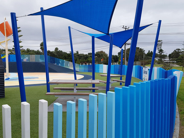
Fence slats in Resene Wet N Wild, Resene Lochmara, Resene Picton Blue, Resene Anakiwa and Resene Half Alabaster. Design and image by Auckland Council. Build by Heb Construction, www.heb.co.nz.
There are also a range of ultramarine-inspired options in the Resene Wallpaper Collection. Visit your local Resene ColorShop to peruse the full collection or find a selection of the latest releases at www.resene.com/wallpaper.
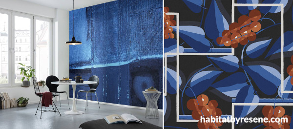
Accent wall (left image) in Resene Wallpaper Collection Komar Pure PRH-0245. Swatch (right image) in Resene Wallpaper Collection Folies FOL302.
For more captivating blues, check out the special edition Resene Beyond the sea palette, the Resene Multi-Finish range and the Resene The Range fashion colours fandeck. Always view or test your colours in-situ whenever possible by ordering Resene A4 drawdown paint swatches of your shortlisted hues online before finalising your specifications.

Published: 15 Sep 2025

