
latest
habitat tv

Say goodbye to the morning scramble for keys, coats and sunglasses and hello to this… see this and more videos
blog

Re-living the 1980s through art
Clint C is an artist whose work instantly sparks recognition and joy. Based in Hamilton,… more
The power of playfulness: Freemans Bay School’s colourful architecture drives the learning process
14 Dec 2022
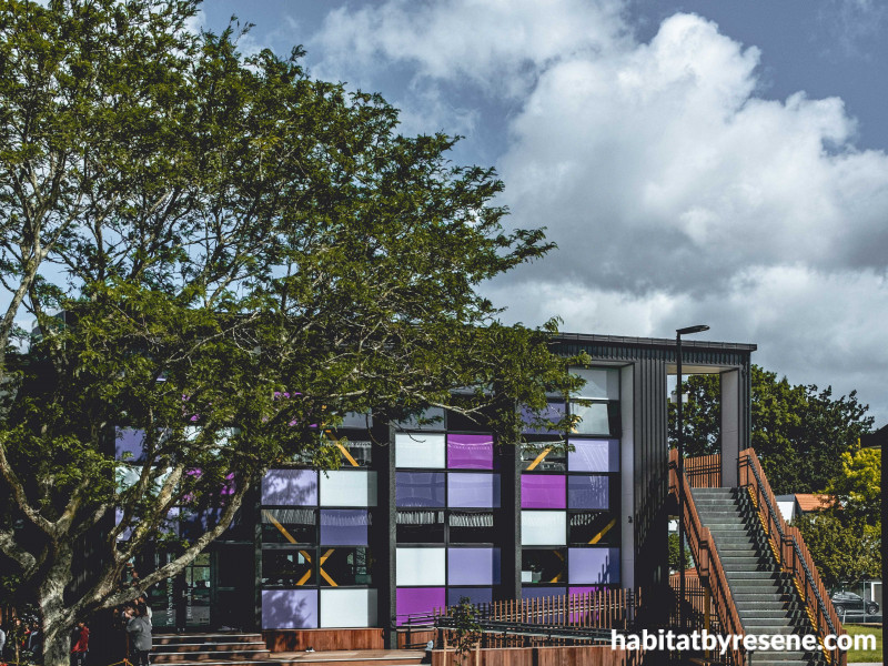
When the pupils at Freemans Bay School enter the grounds, they see a rainbow - an array of colours that arcs through the buildings to represent the diversity of the young students, drawn from many corners of the globe, who attend this learning establishment, the closest school to the Auckland CBD.
The team at RTA Studio has been responsible for the master-planning and ongoing design programme, necessitated by the fast-growing school roll in which the architectural undertaking responds to social, physical and pedagogical requirements. “The school board wanted the architecture to drive the learning process,” says project architect Matthew Wyatt. “They saw the school as a place for fun and exploration - engagement that went beyond the textbook.” And in this, Resene colour plays an integral part.
In Stage One of the upgrade and expansion, the 60s buildings and prefab additions that were no longer fit for purpose were removed and a new library and Māori immersion unit, administration building, classroom block (called a ‘learning house’) and hall were constructed around a central courtyard (see story here www.resene.com/archspec/products/masterclass-in-colour.htm).
Stage Two involved crafting a second six-classroom block over two levels. This new learning house, located to the west of the site, effectively extends and bookends the courtyard. It tucks in behind the landmark Rupa’s café and alongside the alternative entry where many parents drop off their children removed from the hubbub of the main Wellington Street entrance.
Keying into the vibrancy of neighbouring school buildings was a given; in this project, colour is a marker of identity. A patchwork of Resene purples features on every elevation. It’s a shade that alludes to the tones of the sunset of this west-aligned classroom. “And it also made sense because violet is the last colour of the spectrum that wasn’t already used in other areas of the school,” says Matthew.
While the decision to use purple was easy and natural, choosing the actual shades was a more scientific process. Initially, the architects unearthed an old photo of a sunset over Freemans Bay. Then they ran it through an online colour picker which translated the dominant tones in the image into RGB (red, green, blue) codes. Finally, Matthew keyed the codes into the Resene Find-A-Colour selector, www.resene.com/findacolour, which gave him eight options.
Trimming these down to four key colours was relatively simple - a decision based on past experience: “We needed one shade that started to talk to purple, one that was light and vibrant, one that was deep and rich, and one that was really dark.” Resene Titan White, Resene Dancing Girl, Resene Centre Stage and Resene Cherry Pie were those colours and externally, they play off each other to give the building its individuality.
On the eastern façade facing the courtyard, glass panels have been back-painted in Resene Imperite I.F. 503 Gloss tinted to these shades using a paint-by-numbers grid to ensure the ‘random’ pattern could be easily followed. The colours feature on the north façade too, interwoven with a wall of vertical COLORSTEEL® cladding.
Streetside, the building looks towards a group of 1960s townhouses, a distinctive part of the fabric of this inner-city suburb. The design of this western façade takes its cue from these urban residences, with modules that mimic the architectural rhythm and reflects their dimension. Projecting bays echo the lean-to typology and the outdoor landings are based on the carports attached to the townhouses. White soffits in Resene Sonyx 101 tinted to Resene Cotton Wool and dark steel cladding ensure the colour elements pop with personality. To the south, yet more Resene colours are added to the mix. An ablutions zone that projects from the building is built of precast concrete, but a series of slender curtain walls in back-painted glass gives a rainbow punch while maintaining privacy. Drawn from the palette on the other five structures in the schoolyard, Resene Freefall, Resene Kakapo, Resene Bite Me, Resene Energise and Resene Pursuit tie back into the whole.
The colour story doesn’t stop at the threshold but continues internally in the open-plan environment. Essentially, each floor comprises a single room which a team of teachers uses collaboratively. Furnishings such as communal tables of various sizes break up the space. Each level also has a ‘wet’ bench and kitchen as well as an art store, and there are walled break-out rooms on the western elevation that staff can use for teaching in a quieter environment.
Here colour becomes a pedagogical tool. Teachers use carpet squares of pink and purple to organise informal groups of students and the environment is playful and inspiring. “There are so many different areas for learning,” says Matthew. “They can sit in different-sized groups, there are places to learn while standing or moving, and cubbies to retreat to for self-directed learning.”
With the knowledge that gentle physical challenges fire up children’s brains ready for learning, the architects designed a climbing wall alongside the staircase, and bench seating scattered throughout is higher than you would expect, necessitating the students to clamber up. A red ‘caravan’ tucked in beneath the stairs acts as a casual relaxation zone and, on the upper level, a ‘jungle’ contains abstract plywood tree pods finished in Resene Bark wood stain where the children can nestle in for some alone time. “We suspended an acoustic cluster light made of cylinders that absorb sound above the jungle,” says Matthew. “It looks like a cloud.”
Resene Lustacryl tinted to Resene Charcoal has been used on interior trims and skirtings, with Resene SpaceCote tinted to Resene Black White on the plasterboard while exposed structural steel colour matched by Resene to COLORSTEEL®Kowhai Glow injects a sunny spirit into a space that is a million miles from the unimaginative cubicle-style classrooms of old.
The children, who were introduced to their new learning house just a few months ago, were fully engaged in the moving-in process and encouraged to set up a kawa (a way of being in the space). Principal of Freemans Bay School, Cindy Walsh says: “They are very proud and have a lot of ownership. They absolutely adore it.”

Within the new learning house, a climbing wall alongside the staircase adds an element of challenge that fires up the children’s brains ready to soak up information. Coloured carpet squares are used to differentiate zones within the open-plan space and exposed structural steel in yellow was matched by Resene to COLORSTEEL® Kowhai Glow. Plasterboard interior linings are painted in Resene SpaceCote tinted to Resene Black White.

The ‘jungle’ upstairs features tree pods made of CNC-cut plywood finished in Resene Bark wood stain. When viewed upwards through the ‘cloud’ – an acoustic light made of cylinders – the coloured ceiling panels look like dappled foliage.

A block of toilets was incorporated within the two-level building where each unit is differentiated by a coloured door painted in Resene Lustacryl tinted to Resene Kakapo, Resene Bite Me, Resene Energise, Resene Pursuit and Resene Freefall (not shown). This rainbow palette is echoed in a back-painted curtain wall on the southern elevation in the same colours.

The eastern elevation which faces the central courtyard is a patchwork of four shades of purple – from barely there to light, dark and deep tones. RTA Studio used Resene Find-A-Colour (www.resene.com/findacolour) to choose the four complementary colours: Resene Titan White, Resene Dancing Girl, Resene Centre Stage and Resene Cherry Pie. The purple was chosen to represent the sunsets and the diversity of the school population.

A robust wall of coloured steel was a conscious choice on the northern elevation which faces the playing field. The fibre-cement exterior cladding was painted in Resene X-200 tinted to shades of purple using Resene Titan White, Resene Dancing Girl, Resene Centre Stage and Resene Cherry Pie.

Across the road from the school is a block of 1960s townhouses from which the design of the western elevation takes its cue. The projecting elements mimic the form of a lean-to, and the landings are a reference to the carports that serve the townhouses. Fibre-cement soffits were painted in Resene Sonyx tinted to Resene Cotton Wool.
Photo credits: Jarred Walker
Words Claire McCall
Published: 14 Dec 2022

