Pastels with a twist: a look at the mid-tone Resene paint colours that are redefining spaces
08 Apr 2025
Pastel colours have made a strong return in recent years, marking a resurgence we’ve not seen since the early 1990s. Soft pinks, peaches, blues, greens and lavender purples have become prominent colours across a variety of design landscapes, from fashion to graphic design to interior design, furniture and décor. The reemergence of these gentle, soothing hueshas come as a refreshing alternative to neutrals, providing a sense of calm and subtle sophistication. But over time, this trend has evolved beyond the pale and delicate hues to welcome an emerging wave of more saturated, mid-tone pastels – adding depth and richness while maintaining the serene and inviting qualities that pastels are known for.
In place of the clearer, sweeter tones that normally come to mind when you think of traditional pastels, this new preference for more saturated, mid-tone pastel colours is in part reflective of a broader cultural desire for individuality and a more personalised approach to the design of our spaces. Ranging from muted corals to harvest golds to oceanic blues and greens, mid-tone pastels are proving to be more chromatic yet highly livable options when the neutrality of whites, the drama of deeper hues and the stimulation of bold and bright hues won’t suit the setting.
This trend is also a reaction to the ubiquity of white and off-white shades that have long been the default choice for architects, designers and clients alike. For years, neutral tones have been the dominant, go-to selections, often seen as timeless and adaptable. However, as people increasingly seek more unique aesthetics within their projects, there’s a growing fatigue with schemes that lack distinction. Designers are now looking to inject more personality and character into spaces, while still maintaining an overall calming and inviting atmosphere. Saturated pastels provide the perfect solution, offering a sense of vibrancy and life without the starkness of cool whites or the intensity of brighter, boldertones.
Another driving factor behind this shift is the psychological impact that colour can have on project users.Research has shown that certain colours can influence mood and behaviour, so given the renewed focus on creating spaces that nurture mental wellbeing, it’s no surprise that interior spaces are becoming more colourful, reflecting a growing interest in creating environments that feel uplifting, energising or calming. Mid-tone pastels, specifically, strike an ideal balance. They are gentle enough to create a peaceful setting, but they also offer a sense of personality and creativity that resonates with those seeking to move beyond strictly neutral tones.
While this trend is undoubtedly gaining traction in residential settings, its influence is also being felt across a variety of commercial and public spaces. Offices, retail spaces, restaurants, hotels, and even healthcare environments have been adopting this mid-tone pastel approach, proving the versatility of these colours in diverse contexts.
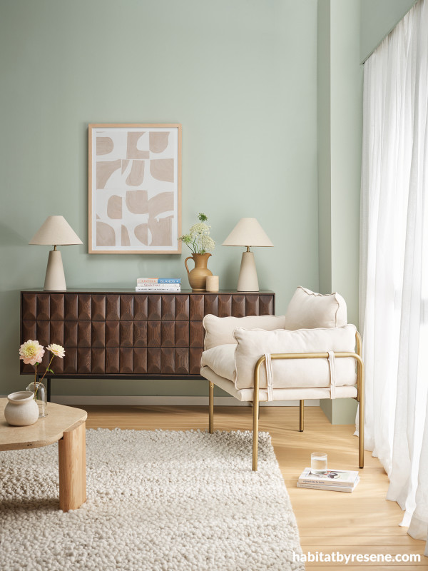
Walls painted in Resene Pumice, floor stain colour washed in Resene Colorwood Bask and skirting board in Resene Rice Cake. Chair from Mocka, sideboard from Danske Møbler, coffee table, artwork, lamps, travertine vessel, vases, tumbler and books from A&C Homestore, jug from Flotsam & Jetsam, rug from Baya.
For commercial office spaces, pastel tones can help create a welcoming and non-intimidating atmosphere while maintaining a professional and clean aesthetic. Consider soft yet saturated or greyed off tones like Resene Pumice, a calming sage green with a hint of blue, which brings a sense of balance and serenity to work environments. Paired with crisp whites like Resene Rice Cake for trim or accents, the result is a clean yet soothing space that promotes focus without feeling sterile or clinical. Alternatively, Resene Heliotrope, a pigmented periwinkle that’s slightly more purple than it is blue, adds a refreshing touch of energy to meeting rooms or collaborative areas without overwhelming the senses.

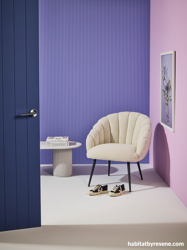
Back wall painted in Resene Heliotrope, right wall in Resene Petal, floor and coffee table in Resene Double Alabaster and door in Resene Rulebreaker. Chair from Danske Møbler, shoes and books from Father Rabbit.
Retail spaces – where creating an emotional connection with customers is key – can benefit from the warmth and approachability of saturated pastels. Resene Cashmere, a dusted peachy-pink, works well for creating an inviting and pleasant atmosphere in fashion stores or boutiques. This colour can be complemented with Resene Saratoga, a mossy olive green, for a sophisticated contrast that highlights product displays without taking away from the overall feeling of openness. Similarly, Resene Ashanti is another popular mid-tone aquaticbluethat would suit retail spacesthat need a calm, airy backdrop to allow lighter and darker coloured merchandise to stand out.

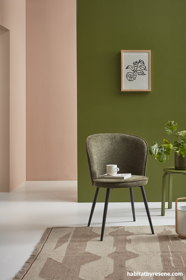
Back and left walls painted in Resene Cashmere, right wall and stool in Resene Saratoga and floor in Resene Quarter Merino. Chair and rug from Republic, artwork from Father Rabbit.
Restaurants and hospitality venues, on the other hand, often demand colours that create an inviting, comfortable environment. Pastels offer the right amount of energy to make patrons feel at ease while adding visual warmth to the space. ReseneHigh Tea, a greyed-off muted lavender, lends a soft touch to dining areas, particularly when paired with trending butter yellow tones like Resene Hampton and Resene Marzipan for furniture or painted wall features. The resulting palette has an elegant yet approachable quality, making it suitable for everything from intimate cafes to larger restaurants.

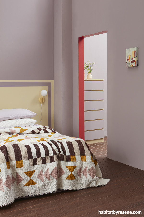
Walls and drawer fronts painted in Resene High Tea, painted headboard design and dresser base in Resene Hampton, floor finished in ReseneColorwood Bark, doorway threshold in Resene La Bamba and sconce in Resene Marzipan. Vase from Thea Ceramics.
Hotels can also make use of mid-tone pastels to evoke a sense of relaxation and calm, ideal for guest rooms and public spaces. Resene French Pass, a pigmented yet soft blue, works beautifully in bedrooms, creating a serene environment conducive to rest and relaxation. Pair it with a creamy white likeReseneQuarter Blanc for an understated yet elegant aesthetic. Or, for public spaces like lobbies or lounges, Resene Dust Storm, a dusty rose, offers a sophisticated yet cosy pairing whileaccents in deeper hues like Resene Avant Gardeprovides a striking contrast that adds depth and drama to the space.

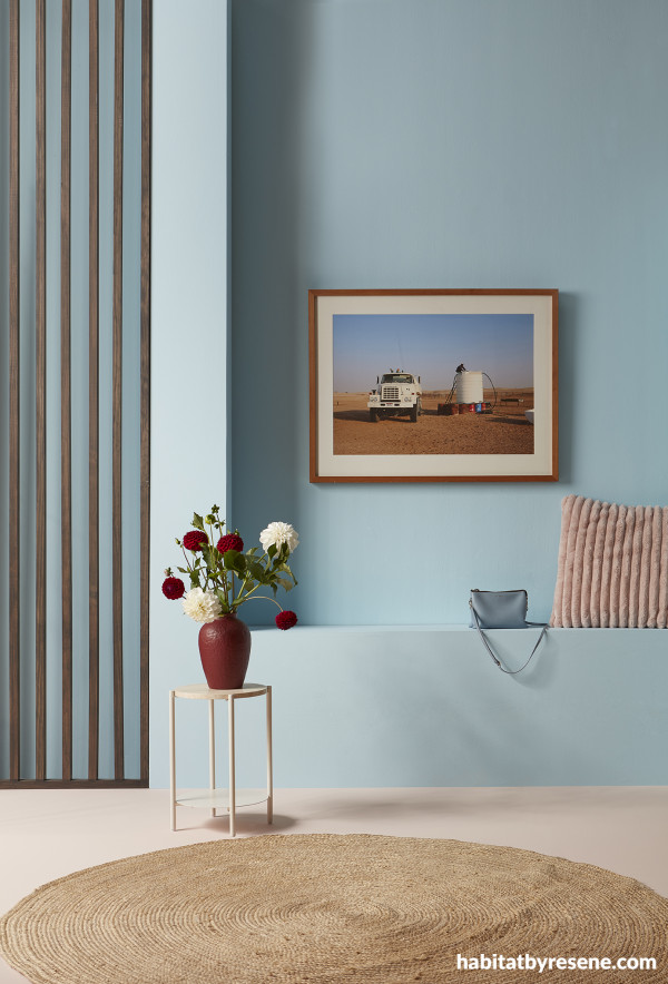
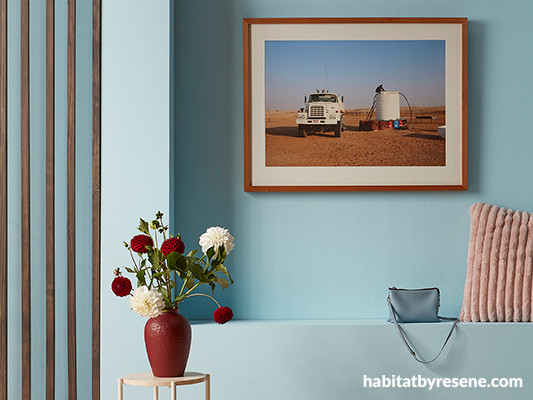
Walls and built-in bench painted in Resene French Pass, wood divider stained in ReseneColorwood Bark, floor in Resene Dust Storm and vase in Resene Avant Garde. Artwork by Amber Armitage.
In educational environments such as schools, where creating a stimulating yet calming atmosphere is essential, mid-tone pastels can provide just the right balance. ReseneZiggurat, a warm yet dusty blue, works well for promoting focus in classrooms while preventing the space from feeling cold or sterile. Pairing it with warm yellow accents inReseneCorn Fieldbrings an element of energy to learning spaces, without being overpowering.

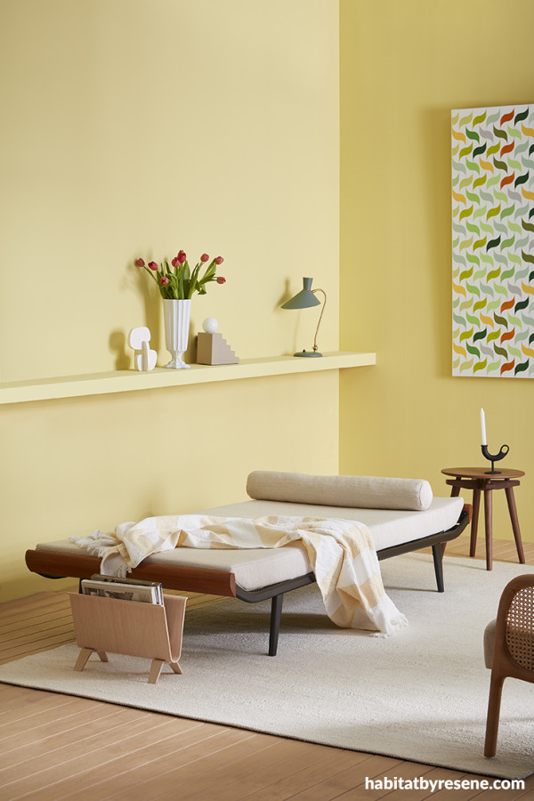
Walls and shelf painted in Resene Illuminate and floor stain colour washed in ReseneColorwood Bask. Daybed from Mr. Bigglesworthy, lamps, side table, sculpture, candleholder and magazine holder from Good Form, vase from Tessuti, artwork by John Tootill from Sanderson Gallery, rattan chair from Mocka, rug and throw from Baya, books from Father Rabbit.
Even in medical or therapy clinics, where a sense of calm and trustworthiness is paramount, pastel colours are finding their place. Resene Illuminateis an uplifting choice for treatment rooms in a physiotherapy or psychotherapy clinicwhere you want to evoke liveliness and renewal. Pair itwith a soft greened whitelike ReseneWhite Noise, which imparts tranquillity without feeling cold or clinical while also tying into Resene Illuminate’s green undertones.Nature-inspired greensarealso popular choices for healthcare applications, thanks to green’s psychological connections with growth and healing. Mid-tone dusty greens like Resene Tom Thumb and Resene Spanish Green are welcoming hues that can be layered together within a single space for depth and interest.

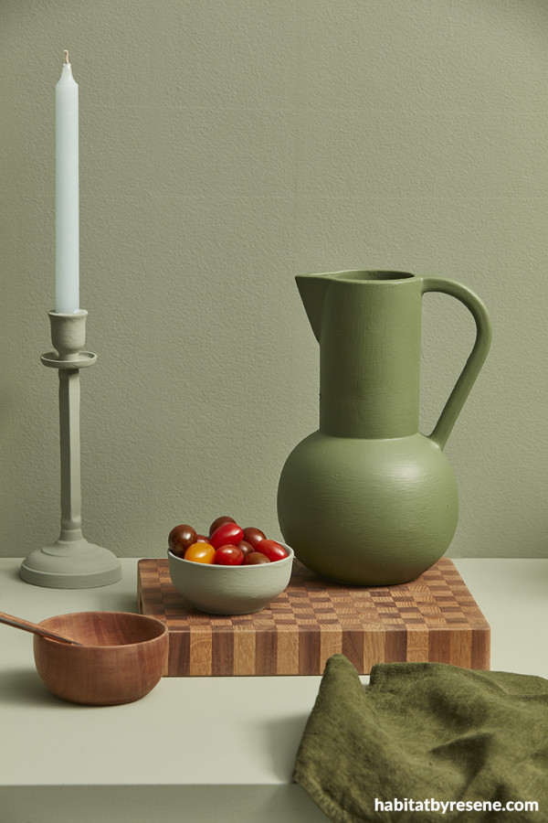
Wall, table, candlestick and bowl painted in Resene Spanish Green and jug in Resene Tom Thumb.
As the saturated pastel trend continues to gain momentum, it’s clear that mid-tone pastels are here to stay – offering their perfect blend of personality, calm and vibrancy. With a wide range of Resene colours to choose from, there’s a saturated pastel hue to suit virtually every design need and project typology. The ability to pair these colours with tonal variations, lighter neutrals or deeperaccent hues only enhances their versatility, allowing architects and designers to create spaces that are both refreshing and timeless.
For more saturated pastel Resene colour options, look to the latest Resene The Range fashion coloursfandeck. For more on the latest colour and decorating trends, check out our colour trend forecast in the most recent issue of BlackWhite magazine. If you’re not on the mailing list, you can pick up a copy at your local ReseneColorShop, read the online version or sign-up to receive future issues free.
projectsAmber Armitage
imagesWendy Fenwick
Published: 08 Apr 2025
