
latest
habitat tv

Say goodbye to the morning scramble for keys, coats and sunglasses and hello to this… see this and more videos
blog

Re-living the 1980s through art
Clint C is an artist whose work instantly sparks recognition and joy. Based in Hamilton,… more
Custom Resene colours make Paperbird the crown jewel of Potts Point
01 May 2020
There is no need to mince words – Sonia van der Haar of Lymesmith is quite simply a master of colour. Last year, the award-winning designer’s keen eye was brought on board as part of the team that helped to convert a former bakery into what is now known as Paperbird, a modern Korean restaurant in Potts Point, Sydney. Overcoming the challenges of a long and narrow, partially underground plan with little natural light or street presence, the space is just one of many that demonstrates Sonia’s chromatic prowess.
The bakery’s fitout was luckily of high quality and contained many bespoke elements, including a handsome concrete counter and mirrored banquet seating. For environmental reasons, the decision was made to retain as much of that infrastructure as possible and ‘to only do what was absolutely necessary’. And yet, a striking transformation was achieved through relatively small gestures.
The two most significant changes made were lining the walls with painted timber battens, which were necessary to create the desired acoustic environment, and a finely detailed steel bar was added to the counter and front of the restaurant. But the most dramatic difference was achieved by the new Resene colour scheme.
Previously, the entire bakery had been painted in a high gloss light caramel colour. The project architect envisaged painting the newly added battens in a soft blue-green colour inspired by Korean Dancheong painting, a polychromatic technique used on historic wooden buildings around Seoul. During her research, Sonia discovered the literal translation of Dancheong to mean ‘cinnabar and blue-green’ and developed a customised colour palette around the concept. In the end, she incorporated four blue-green shades that range from aqua to emerald supported with select accents in Resene Tall Poppy and Resene Quarter Pearl Lusta.
“The strategic placement of each colour dramatically improved the spatial qualities of the narrow and deep interior,” explains Sonia. “At the same time, the blue-green colours sit harmoniously with the brass, copper, zinc and timber finishes that were part of the original fitout.”
“Colour was used to define three zones,” she continues. “The first space is the entrance/bar area which can also be used for casual dining. The middle space allows flexibility in the arrangement and has more acoustic treatment making it perfect for groups. The dropped ceiling is clad in white battens, the wall battens are a deeper green. The rear section is a more intimate dining area with banquet seating, mirrored and battened walls. It is separated from the kitchen with an acoustically treated screen featuring Resene Tall Poppy red and Resene Quarter Pearl Lusta white.”
“The ceilings in the entrance and rear spaces are a custom-mixed deep black tinged with green. The colour helps the exposed ceiling beams and services recede into the background while creating an illusion of greater height.”
During the design process, Sonia says that there were three key problems that needed solving.
First was the acoustics. “The space was essentially a concrete bunker and the sound quality was hopeless for fine dining. This led the architect, Plus Minus Design, to line the walls with acoustic panels and timber battens.”
Secondly, the restaurant’s street presence left something to be desired. “The restaurant is not readily visible from the street but, when spotted, now looks interesting and inviting.” Sonia chose Resene Crusoe green to complement the brass door handles and other existing elements – a hue which helps draw the eyes of those passing by. “The colour is beautiful and vibrant during both day and night.”
Thirdly, the floorplan was long and narrow. Sonia relied on the strategic use of colour to enhance the space, create an impression of height and to divide the space into its three distinct zones. “This had the effect of making the space feel wider and more expansive, rather than long and narrow,” she says.
“Resene SpaceCote Flat was chosen for the timber battens for its ability to produce a quiet and recessive appearance. There are many reflective and metallic surfaces throughout the restaurant, so it was important that the paint finishes on the walls did not compete. On the front door, Resene Enamacryl was used and its glossy finish suits the steel construction and helps the shopfront to shine.”

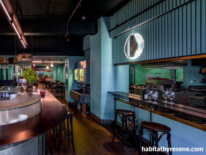
Designer Sonia van der Haar of Lymesmith used custom jewel-toned Resene colours to create the perfect mood for Paperbird. She opted for Resene SpaceCote Flat, given the abundance of reflective surfaces, to avoid glare and help the walls absorb some of the light. On the ceiling is a third custom colour, a black-green, to create the illusion of height.

In the mirror, you can catch a glimpse of Sonia’s second custom colour, dubbed ‘Resene Paperbird Green’. Above the mirror, the battens are in a custom colour ‘Resene Paperbird Blue’, a hue reminiscent of Korean 'Dancheong' paintings.

Flanking the kitchen access are props in Resene Tall Poppy as a point of difference. The back battens are painted in Resene SpaceCote Flat tinted to custom colour ‘Resene Paperbird Blue’ while the front battens are in Resene Quarter Pearl Lusta.

At the entryway, guests are welcomed with doors in glossy Resene Enamacryl tinted to Resene Crusoe, which was chosen to go with the original brass door handles. The battens are in ‘Resene Paperbird Blue’, a custom blue-green colour, and the ceiling is in ‘Resene Paperbird Black’, a custom black-green. Both are in Resene SpaceCote Flat to keep light reflection to a minimum.

From the street, the doors in Resene Crusoe catch the eye despite the restaurant being tucked half underground. The vibrancy of the custom blue-green wall battens helps to illuminate the front area and extend an invitation to passers by.

The former bakery space, before Lymesmith and Plus Minus Design brought it to life with a rich jewel toned Resene colour palette.
architectural design Plus Minus Design
colour selection Lymesmith
builder Hospitality Fitout Specialists
painting contractor The Colour Palette
images Ben Guthrie
Published: 01 May 2020

