
latest
habitat tv

Say goodbye to the morning scramble for keys, coats and sunglasses and hello to this… see this and more videos
blog

Re-living the 1980s through art
Clint C is an artist whose work instantly sparks recognition and joy. Based in Hamilton,… more
The Letter Q shows how colour made one man’s treasures precious to everyone
06 Apr 2020
New Zealand, often considered one of the most maritime nations in the world, has a storied history with the sea; one that affects each of those who live and visit her shores, whether it be through immigration, trade, design, innovation or leisure. Situated at Auckland’s viaduct, the New Zealand Maritime Museum (Hui Te Ananui A Tangaroa) is a hub for all of these stories – expressed through their galleries, event programmes, heritage sailings, special exhibitions and more. It houses one of the nation’s most important heritage collections which covers the breadth of NZ’s relationship with the sea: from the Great Pacific Migration, to the cutting edge of modern technology and design used in America’s Cup and modern yachting.
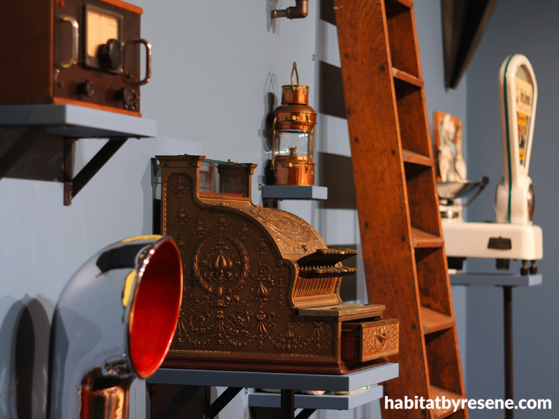
Last year, the museum developed a special exhibition to celebrate John Street, a man with a passion for preserving New Zealand’s maritime heritage. According to the museum’s website, John helped establish the New Zealand Maritime Museum, introduced the annual Tug Boat race, as part of the Auckland Anniversary Regatta, lobbied for the restoration of the Percy Vos Heritage Boat Yard and most recently, backed the fascinating 2018 salvaging of a shipwrecked schooner, DARING. The exhibit itself featured objects that he had long been collection which were originally part of the historic Foster’s Ship Chandlery.
“So many who have experienced the original Chandlery over the years describe it as a kind of labyrinth of nautical curiosities with surprises around every corner,” says Nick Eagles of The Letter Q, who was responsible for the exhibition design.
He says a key objective for the design team was to retain the eclectic character of the collection but also to guide visitors through the stories in the exhibition with a cohesive aesthetic.
It was a job Nick took to heart. Objects from the collection featured materials such as bronze, copper, rope, leather and wood all of which were tested under exhibition lighting alongside Resene drawdowns – A4 size swatches coated in the actual paint colours that they represent – to determine which colours would best complement such variety of textures.
“From there, a rich but refined colour palette was devised then fully integrated with all aspects of the design from lighting, exhibition graphics, audio visuals, interactives and marketing collateral. The whole experience from seeing posters on the street through to interacting with the exhibits is bound together using colour,” explains Nick.
According to Nick, the gallery, like most, was a relatively open plan space by default. However, colour allowed his team to create discrete thematic sections in the exhibition.
“Resene Seachange helped to define and recreate a shop counter area. Resene Tangaroa drew together the main gallery space along with graphic treatments in Resene Dolly which illuminate stories and give clarity to the narrative voice. Resene Bali Hai brought energy to the kids’ activity space, where younger visitors were able to engage with hands-on interactives and role-playing. There was even a kids’ activity featuring signal flags where the traditional primary colours were substituted with equivalents from the exhibition palette where we saw all the colours expressed together using the captivating nautical language.”

An interactive component explaining nautical signal flags was one of the kids’ activities. Wall in Resene Bali Hai.

Wall in Resene Bali Hai.
Nick says that the original Fosters Chandlery was also described as ‘a sort of a hybrid shop/museum’, so he wanted the new exhibition furniture to not only respectfully present collection items but also allow them to resonate with the ‘patina’ of the old shop. Plywood plinths and risers provided a warm counterpoint to the cooler paint colours and introduce the language of crates and nail boxes to the overall material language.
“Resene Tangaroa provided the perfect deep backdrop for the objects and supporting plinths, which appear as if illuminated by the glow of hanging ship lanterns,” he shares. “An evocative setting to discover the tales of a New Zealander infused with the spirit of the sea.”
Nick and the project team selected Resene paint colours for One Man’s Treasure based on “their ability to build a coherent story around a variety of collection objects with an array of textures and materials.”
“Resene Tangaroa initiated the visitor experience, where they saw the exhibition title – with typographic treatments in Resene Dolly – to contrast and complement the deep, rich wall colour.
“The RGB colour matches and material testing during the production stage ensured that the Resene paint colours retain a consistent appearance with printed media,” he says.

The initial visitor interface featured typography that was colour matched to other Resene hues used in the exhibit (Resene Dolly and Resene Del Toro), backed by a wall in Resene Tangaroa.
“The exhibition also needed to feel as if it was presenting the collection of someone with their own personality and understanding of the maritime experience – something between an eccentric retail space and a museum. The Resene colours provided the correct sense of nostalgia and create a dream space for visitors.”
“Resene SpaceCote has come through as a very effective way to get colours to sing under these specialised lighting conditions,” says Nick. “The coloured walls provide a supporting background to the rich objects assembled, and it’s the flat nature of the Resene SpaceCote finish that for fills this role particularly well.”
In 2019, the project won the Resene Total Colour Installation – Experiential – Product Award. Of it, the judges said, “immersive and moody, this complementary colour palette captures attention and draws visitors into the exhibition. The hues work to bring focus and a sense of continuity and storytelling to the collected pieces so they can take centre stage. The colours become part of the exhibition story woven into the theme. Colour brings this collection together.”

Resene Seachange on the walls defined and outlined a ‘retail space’ that worked much like a set design but with collection objects on display playing the main role, says Nick. “Close attention was given to the behaviour of Resene colours under exhibition lighting, where we could see how the colour related to its surrounds in light, shade and everything in between. All the Resene colours selected for the exhibition carried their rich pigmented effect through the range of light conditions.”

The gallery featured hinged walls which have been used at 45- and 90-degree angles to create smaller spaces within the gallery. Transitions between these spaces were clearly defined with a change in wall colour. From the retail space, Resene Seachange reverted to Resene Tangaroa. “Where the main gallery space was joined by an activity space for kids, we changed again – this time to Resene Bali Hai. This colour provided the right energetic complement to the plywood construction used for interactive elements,” explains Nick.

Resene Tangaroa, a deep marine blue green, was the key colour Nick’s team used to ground the exhibition.

Resene Tangaroa creates a dramatic mood and backs information design that was colour matched to Resene Dolly and Resene Del Toro, which were used elsewhere in the exhibition.
exhibition design and images Nick Eagles, The Letter Q
additional images Southern Studios
painting Rassmuss Whenuaroa
printing Big Colour Ltd.
mount making Object Support
display furniture Artisan Builders
conservator Rose Evans
lighting Brian Mahoney
set design Jan Ubels
Published: 06 Apr 2020

