

latest
habitat tv

Say goodbye to the morning scramble for keys, coats and sunglasses and hello to this… see this and more videos
blog

Reader roundup: See what our readers have been up to!
Refurbished vintage furniture, charming exteriors and magnet walls for kids. These projects are sure to… more
How to make these five classic colour combos feel cool and contemporary
11 Oct 2021
Despite their long-lasting appeal, working with classic colour combinations can still be tricky. On one hand, their timelessness makes them a smart choice for clients looking for longevity. But on the other, there is the risk that using them in the same old ways we have for eons can end up making your project look stale.
However, by looking to insights from today’s top colour trends, you can easily level up your Resene colour choices in favour of more contemporary ones while still leveraging what makes these classic combos so enduring. And as these five contemporary remixes show, it’s not just about which Resene hues you choose – it’s also what you do with them.
Red + White + Blue
While a more traditional take on this colour palette would typically see white taking the leading role, flipping the script to let blue do the heavy lifting is a quick way to make this combo instantly feel fresher.
Minerally marine blue greens like Resene Tarawera, Resene St Kilda and slightly deeper Resene Navigate are at the forefront of where blues will be trending in the next six to twelve months – so these are the perfect hues to use now if you want to be ahead of the curve.
Instead of a predictable choice like truer red or a red with blue undertones – which would just get swallowed up by the other blues – opt for a warm orange option like Resene Alert Tan for your accents. For your whites, choose a chalky porcelain white like Resene Snow Drift or a dirtied white like Resene Flotsam.

Background in Resene Tarawera, plate in Resene St Kilda, coaster in Resene Navigate, mug in Resene Alert Tan, sugar and cream vessels in Resene Snow Drift and vase in Resene Flotsam.
Yellow + Grey
Though it’s not the most classic of the combinations on this list, yellow and grey continues to make a cyclical comeback every couple of decades – and the pair has made a very recent return to the spotlight. Dusted yellows with a hint of grey such as different strengths of Resene Moonbeam not only make obvious partners to warm greyed whites like Resene Flotsam, but they also fit very well with the current tinted/smoked glass trend. Use these hues on bulbous and curvaceous forms and leverage other dusty pink, blue and green pastels like Resene Soothe, Resene Frozen and Resene Tasman for an ultramodern look.

Background in Resene Quarter Moonbeam, tray in Resene Half Moonbeam, large vase in Resene Moonbeam and small vases in Resene Soothe and Resene Flotsam.
Green + Blue
It’s hard to go wrong with this classic combo, given that we are exposed so frequently to the inseparable pairing that is green and blue every time we step into nature. The time we spend outdoors imprints us with plenty of passive inspiration for combining these colours in our design work.
But if you’re after a trendier take on this time-honoured twosome, you’ll want to look to Resene colour choices that blur the line between the two hues. Try a tonal palette built with a blend of blue greens and green blues like Resene Edward, Resene Undercover and Resene Green Spring for your base. Then, bring in accents in a glassy blue like Resene Cut Glass, a crisp blackened white like Resene Black White, warmed with a suede brown such as Resene Spice, a pop of pink terracotta like Resene Sante Fe and softened with furnishings in a creamy neutral like Resene Bianca.

Background in Resene Edward, bowl in Resene Undercover, large vase in Resene Green Spring and small vases in (clockwise from left) Resene Spice, Resene Cut Glass, Resene Black White and Resene Sante Fe.
Pink + Green
A duo that was periodically popular throughout the 1800s and again in the early 1900s, pink and green was also a favourite combination of mid-20th century homemakers who had the tendency to use it in less-than-ideal proportions. Specific variations like millennial pink and palm green defined the early 2000s and 2010s, but today’s takes on these tones are far softer and suppler. Opt for dusty dreamy hues like Resene Half Rivergum, Resene Lemon Grass and Resene Linen for your greens and Resene Soothe and Resene Coral Tree for your pinks infused with creamy taupe whites like Resene Eighth Joss and Resene Quarter Bison Hide to update this palette for the mid 2020s. Combine it with stonewashed linens and fresh plants for a natural vibe or rose gold and brass metallics like Resene Rose Gold and Resene Gold Dust for a glam space.

Background in Resene Half Rivergum, bowl in Resene Lemon Grass and vases in (clockwise from left) Resene Soothe, Resene Linen, Resene Eighth Joss, Resene Lemon Grass, Resene Coral Tree and Resene Quarter Bison Hide.
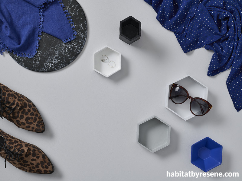
Black + White
There are virtually endless ways to work with the mother of all classic colour combos, but some of the ways that you can make this unquestionable chic pairing extra current are to shift the tints and shades you pick and inject a strong accent colour and some pattern into your design.
Trend forecasts are beginning to question whether stark achromatic minimalism is finally starting to date itself. There are some purists out there are going to find this prospect challenging, but it’s going to become more important to look beyond specifying the same black and the same white for every project and every situation. And as we discussed previously, we shouldn’t be treating a single white as a one-size-fits-all-solution anyway.
Now’s the time to bring out your Resene The Range whites & neutrals collection and take a good look at the wide range of character neutral options with more complex undertones. In this palette, we’ve used Resene Quarter Iron – a softened grey that’s been combined with luminous white, which has an edge of cool determination about it. Even just this subtle shift feels endlessly more interesting and vogue than your typical stark, flat white, and it makes layering in other favourite black tinged whites like Resene Eighth Black White an absolute breeze.
The same story applies to blacks. Change is hard, we know; and we’re never not going to love a good true black. But if you’ve never experienced the majesty of sleek blue blacks like Resene Jaguar and Resene Blackjack firsthand, you’re seriously missing out. While there are a range of accent colours that can bring the interest that your black and white palette might be missing, the blue undertones of these blacks make bold options like Resene Torea Bay, Resene Half Resolution Blue or Resene Aviator obvious choices.
And if there is anything that adds a professional edge to this palette, it’s expert-level pattern mixing. Look to bold options like stripes or animal prints mixed with subtler ones such as dots and naturally occurring choices like veiny marbles. To finish the look, soften the contrast of this palette by bringing in cool mid-range greys like Resene Concrete and Resene Silver Chalice.

Background in Resene Concrete with hexagon dishes in (from top) Resene Blackjack, Resene Eighth Black White, Resene Quarter Iron, Resene Silver Chalice and Resene Torea Bay.
styling Laura Lynn Johnston
images Bryce Carleton
Published: 11 Oct 2021

