
latest
habitat tv

Say goodbye to the morning scramble for keys, coats and sunglasses and hello to this… see this and more videos
blog

Re-living the 1980s through art
Clint C is an artist whose work instantly sparks recognition and joy. Based in Hamilton,… more
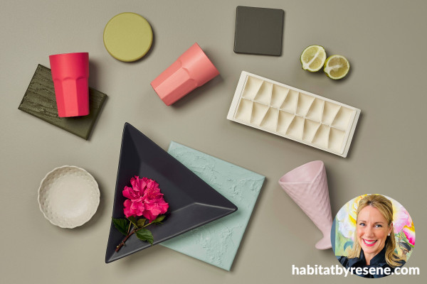
Here’s the colours our stylists are loving and why!
13 Oct 2025
We’ve asked some of our stylists we work with to pick their favourite colours and tell us why they work so well in design. These stylists are working with colour all the time, and we’re always inspired to see how they use colours in new and interesting ways. You might even get some inspiration for your next project.
Laura Lynn Johnston
“Most of my colour palettes are inspired by a cherished object; a piece of art, a throw or a vase carted home from a holiday. These are the type of items that make a house into a home.
In a recent project I needed to incorporate a mid-century teak headboard stained in Resene Colorwood Bask and a striking handwoven heirloom rug in a geometric design featuring hues similar to Resene Solitaire and Resene Summer Rose. To keep the space bright and airy, we went for walls in Resene Bon Jour. I layered a brick-toned duvet cover in a hue similar to Resene Dawn Glow topped and a pair of cushions in colours very near to Resene Sunbeam and Resene Illuminate. I finished the look by bringing in accents in cooler tones like Resene Heliotrope and Resene Ghost, with a chair in Resene Leather.
By working with the colours of the rug and headboard rather than against them, the bedroom design felt cohesive, cosy and infused with pieces of the client’s own story.”
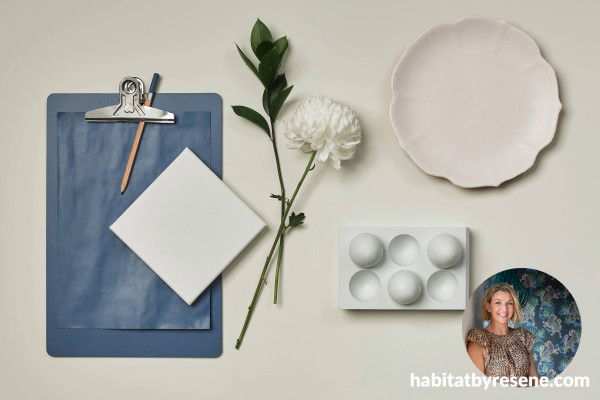
Megan Harrison Turner
“Over the past year mid-tone neutrals like Resene Half Arrowtown, Resene Stonehenge, Resene Friar Greystone and Resene Tana are becoming increasingly popular. The whites being chosen are also warmer, in shades like Resene Albescent White and Resene Poured Milk.
Blues and greens used together, like Resene Safe Haven paired with Resene Sea Nymph, or Resene Coast with Resene Cut Glass, are becoming more common, instead of just one colour plus neutrals.
The key to success is to keep one of the paint colours as an accent over about 10% of your space, rather than using both colours in equal amounts. Then echo the colours in fabrics or art somewhere in the room.
I love complicated blacks like Resene Night Magic, or, where black is too strong, Resene Porter and I love the wide range of greens that people are choosing from dark Resene Gordons Green to pale Resene Apple Green and Resene Cut Glass. Green is a gentle way to dip a toe into the colour universe.”
Monuean Ryan
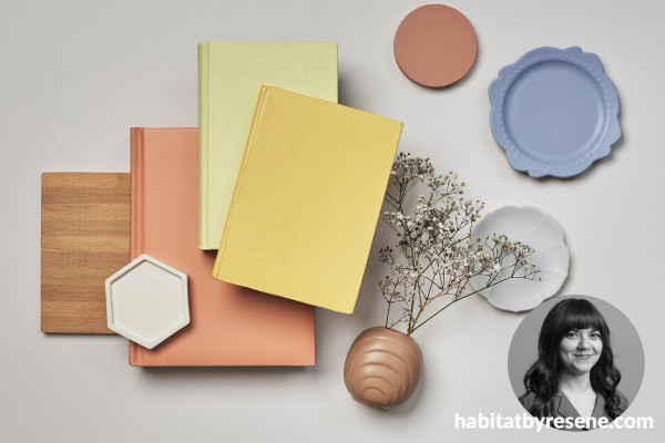
“The popularity of tonal colour schemes and nature-inspired hues isn’t fading anytime soon but adding more colour in projects and interiors is a clever way to define or shift the energy of a space. I’m obsessed with the high impact delivered by a ‘swish’ of unexpected colour whether it’s a soft bold contrast or as an energetic injection of a primary fuelled hue added to a neutral scheme.
Take an ever popular neutral like Resene Tea or Resene Triple Truffle and go for a ‘soft bold’ finish with an accent colour like Resene Gin Fizz, or reimagine a piece of furniture in Resene Rapture or Resene Glorious for a fresh injection of modern liveable colour.
Layer icy jewel tones like Resene Gelato or Resene Sorrento beside murkier, earthy hues like Resene Masala or Resene Ginko to weave in modern contrast, or even try darker contrasts like Resene Revolver or Resene Waiouru to reimagine your space in colour.”
Emily Somerville Ryan
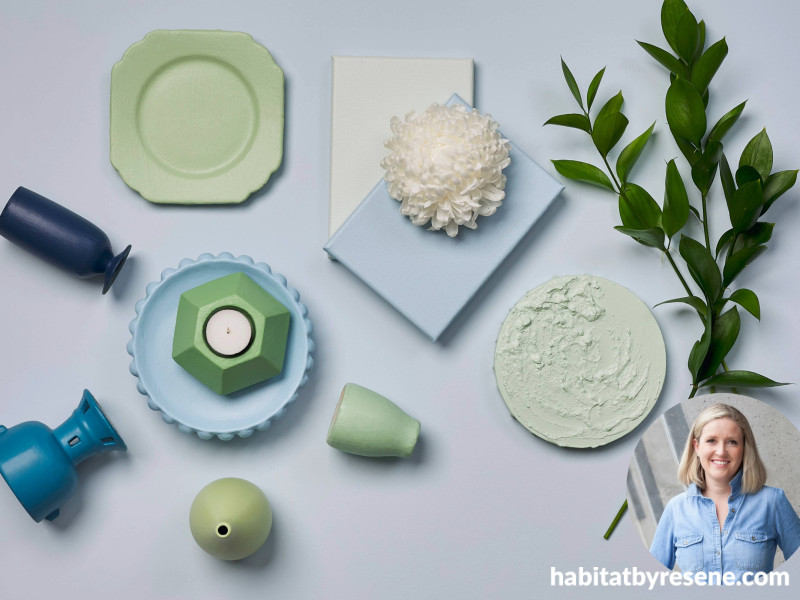
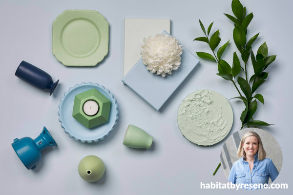
“I'm always drawn to the timeless, casual beauty of soft greens and beachy blues. There is a reason they are perennially popular; both blues and greens are very versatile and, in the right shades, marry well with most other colours.
To make the most of these shades as the basis of your colour palette use paler blues like grey-toned Resene Quarter Frozen, and misty Resene Spindle, or soft greens like Resene Surf Crest and Resene Ottoman on walls as an interesting alternative to neutrals. Then add bolder green or blue shades like Resene Licorice, Resene Wedgewood, Resene Norway and Resene Amulet as accent notes.
To complete a tonal layered look try mid-toned blues and greens like Resene Comfort Zone, Resene Caper and Resene Spring Rain.”
Annick Larkin
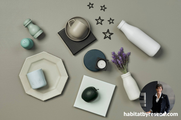
“My go-to neutral is Resene Eighth Tana, a subtle green-grey perfect for a clean and simple vibe. It's like the comfy hoodie of colours; totally chill and goes with everything.
Then there’s Resene Rulebreaker, a bold but warm blue that lives up to its name. Use it to freshen up a piece of furniture and make the whole room pop. On a softer note, Resene Quarter Duck Egg Blue is soothing and just right for spaces where you want peace and quiet.
For a whisper of grey try Resene Wan White. It’ll give you a fresh, airy feel, and makes a great backdrop to complement any accent colours you might want to add.
For a splash of fun try Resene Cest La Vie, a playful yet sophisticated pink perfect for adding warmth and personality, whether it’s on a wall, in accessories, or as a charming backdrop.”
We hope these wonderful stylists have given you some inspiration for your next projects. For more advice on colour head to your local Resene ColorShop or Ask a Paint Expert online for free.
Published: 13 Oct 2025

