
latest
habitat tv

Say goodbye to the morning scramble for keys, coats and sunglasses and hello to this… see this and more videos
blog

Re-living the 1980s through art
Clint C is an artist whose work instantly sparks recognition and joy. Based in Hamilton,… more
Old meets new with the Grand Hotel façade restoration
16 Aug 2022
Using paint to revive a heritage building can be tricky for designers who want to channel individuality while blending into the surrounding streetscape.
Getting this balance right for a client is sometimes an obstacle, but this ethos can be achieved with a considered approach.
This was certainly the case when Burgess Treep and Knight Architects used Resene paint colours to follow a brief – updating the façade of one of Auckland's iconic heritage hotels.
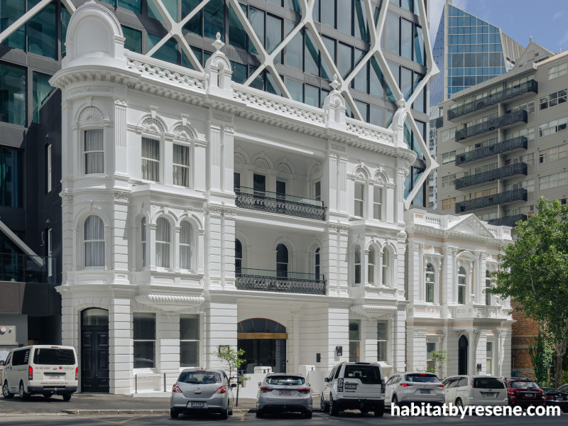
The Grand Hotel on Princes Street in the city was once the most prominent of all Auckland hotels.
Built in 1889, the hotel's heyday was strong, even being the accommodation of choice for Queen Elizabeth II on her 1953 tour of New Zealand.
Typical of the Edwardian Baroque architecture, its ornate language is true to its era, notably its domed corner rooftop pavilions and arched windows and door frames.
But the hotel stopped operating in 1966 and, eventually, most of it was demolished to make way for an office tower. In 2016, it was announced the tower would become an apartment scheme, The International.
At the bottom of the tower are two façades – of the former Grand Hotel and the former Freemasons Hall, built in 1909.

Burgess Treep and Knight Architects explored exterior colour schemes using Resene hues after Sanctuary Group invited them to revamp the facades. The buildings stand on Princes Street, in front of the residential apartment development, The International painted in Resene Half Alabaster and Resene Despacito.
In 2020, client – developer The Sanctuary Group ¬– asked Burgess Treep and Knight Architects to modernise these facades with a new colour scheme to accommodate The International. With a business relationship with the client and experience in working on heritage projects under their belts, Burgess Treep and Knight were a natural fit.
"I had worked with Gary Groves in the past on other projects of his, and we undertake heritage work too," Graeme Burgess architect at Burgess Treep and Knight Architects says. "We had nothing to do with the architecture; Gary just invited us to come in and give advice on the colour."
Their brief was to craft a colour scheme that would fit in with the inner-city location while honouring the facades' history. "We were asked to look at the building and come up a colour palette that would be sympathetic to the building and then be signed off by the client," Graeme says.
Using Resene colours, they experimented with ways to honour the building's heritage while providing character. "These historic street frontages were our canvas," Graeme says. "The new buildings behind the facades were the 'skyscape' of the heritage buildings, the latter being the 'hero' elements in the streetscape."
Graeme and colleague Lilli Knight carried out research on the architectural style of both buildings.
Scraping back the exterior surfaces, the history of colour that had been used became apparent.

The International is a residential tower comprising of 88 luxury apartments. The two listed heritage facades situated at the base of the tower are in Edwardian Baroque architectural style, enhanced by fresh Resene paint in Resene Half Alabaster and Resene Despacito.
"The area was a building site when we visited," Graeme says. "We peeled back the layers on the building to see what colours were underneath. In the world of conservation and heritage, it's what you often do. You can discover that the heritage colours used on buildings in the past were far more adventurous than today. You get revelations; it's quite wonderful.”
The proposal included a larger-than-life palette to add a bit of fun. "The colour schemes we sent featured a joke proposal that was completely outrageous, based on the Chrysler Valiant Charger car," Graeme laughs. "We're talking bright purple and lime green; we thought it was fun to do."
The chosen colour scheme featured Resene Half Alabaster on the Grand Hotel façade and Resene White on the accents and joinery. On the Freemasons Hall façade, the selection was Resene Despacito with Resene White on the accents and joinery.
The ideal sheen level, Graeme says, was critical to the scheme too. He opted for both low sheen and gloss finishes in the right places. "Resene X-200 was used on the exterior because of its low sheen and excellent exterior durability properties,” Graeme says. "Resene Enamacryl was used on the joinery because we wanted a gloss finish, like a traditional oil-based paint but also something non-yellowing."
With its icing-like swirls of cream and pinky beige, the historic facades are appealing to the eye, illustrating how old and new can work together. "We chose soft icing-like colours, it's almost treated like a wedding cake," he says. "It's very popular with brides on wedding shoots – people line up outside, which is sweet."
"The Edwardian style of the heritage buildings was our starting point," Graeme says. "The Grand is the larger and more elaborate of the two. Both have an underlying Georgian simplicity of form. We considered the historic colourscapes of London as a background, the use of soft creams, greens and dusty pinks in Georgian architecture, using this as colour inspiration."

The soft pinky beige of Resene Despacito provides a sweet touch of colour, contrasted freshly by Resene White on accents and joinery.
"We were also thinking of the lovely buildings in coastal Italy and that notion of very light subtle colours making the street come alive," Graeme says. "It's a difficult side of the street being on the southern side, so lighter colours help to reduce that sense of the bulk and mass as a gloomy thing."
The thought process behind the chosen colour scheme was well considered, as it not only brings dynamism to the street but gives each façade personality and unity. "The building originally was very pale in colour,” Graeme says. “After investigation into what was there we took this and looked at what we felt was a neutral but sympathetic colour palette; one which would enhance the hotel façade but also create a sense of the two buildings being side by side," Graeme says.
"The buildings have been treated each slightly differently; colours shift between each but as a whole, the two read as a group. The soft palette accentuates that they are individual buildings but it also draws them together."

Resene Half Alabaster, and Resene White on accents and joinery, brings to life the ornate Edwardian Baroque architecture of the former Grand Hotel façade.
The Resene colours have enabled the Edwardian Baroque architectural details of the Grand Hotel's façade shine. "The building was done in a style using a classical form of architecture as it was generally used by architects in the early 20th century when Edward was the King of England, hence it being called Edwardian Baroque," Graeme says.
"Baroque is applied because it's not strictly classicism in following the regimented ideas of classical architecture; it is more playful. In that period architects were expected to understand historical architectural styles when they designed buildings. The way proportions were ordered and decorative work was applied was not a casual 'throw this here and there', it was based on their understanding of historical precedent."

The inspiration for the former Freemasons Hall was the historic colourscapes of London and the use of soft for creams, greens and dusty pinks in Georgian architecture. The final choice on this facade was Resene Despacito with Resene White on accents and joinery.
"The Grand Hotel building itself was truly great," Graeme says, noting it being the place to stay for prominent visitors from abroad last century. "Being on that ridge line, its near Albert Park and once had a beautiful outlook to the harbour and back across city. This, of course, has all gone and there's nothing left inside; it's only a façade."
Using Resene paints, Burgess Treep and Knight have provided their client with a scheme that celebrates heritage and appealing colours to those who frequent the street. "It's great to have the whole building, but the façade was often the jewellery and ornament," Graeme says. "Even though you're left with one section, that section is a beautiful artefact – like a piece of jewellery. We looked at it as icing on the cake."
With these Resene colours, this heritage architecture not only resonates for the here and now, but also stands the test of time. It's proof that quality design coloured with care never gets old.
Published: 16 Aug 2022

