

latest
habitat tv

Say goodbye to the morning scramble for keys, coats and sunglasses and hello to this… see this and more videos
blog

Brick Bay unveils its poetic new folly for 2026
The winner of the 2026 Brick Bay Folly competition has been unveiled. Within the Wings… more
5 blue based colour palettes to suggest to clients that are colour curious
20 Oct 2020
Getting clients to commit to braver (and sometimes seemingly not so brave) colour choices can be challenging. While building trust can certainly play a role in convincing them to cross over to the chromatic side, anchoring your palette with hues that have universal appeal such as blue can sometimes act as a gateway to bolder or darker options. It all comes down to picking the right undertones.
If you’re trying to incorporate pops of green, plum, red or aqua into your project, try leveraging one of these five on trend blue based Resene colour palettes to convince your client to take the plunge.
Resene Half Duck Egg Blue + black + white + avocado green + warm blue
For those who have never lived anywhere that didn’t have white walls, even easy-to-live with near neutrals like Resene Half Duck Egg Blue can be a hard sell. Offsetting duck egg blues like Resene Half Duck Egg Blue, Resene Quarter Duck Egg Blue and Resene Mountain Mist with black, white and a restrained use of avocado green like Resene Wilderness and a warm blue like Resene Ziggurat – which also has a hint of grey to it – through art and accessories can help to lift the greys within the hues, causing it to behave much like a true neutral.

Background in Resene Mountain Mist with A4 drawdown paint swatches in (from top to bottom) Resene Alabaster, Resene Nero, Resene Rolling Stone, Resene Wilderness, Resene Celeste and Resene Ziggurat, round vase in Resene Wilderness, oval tray in Resene Celeste, coaster in Resene Rolling Stone, triangular dish in Resene Alabaster, small ribbed vase in Resene Quarter Duck Egg Blue and large ribbed vase in Resene Half Duck Egg Blue.
Resene Balderdash + lighter green blues + green whites
With the unparalleled rise in popularity that green has seen this year, it likely comes as no surprise the green blues are beginning to scale the ranks too. However, while the most popular greens we’ve seen in 2020 have been soft sages, the green blues that have started trending are far deeper – which can be a tougher sell.
The trick is finding balance by bringing in a mix of lighter green blues such as Resene Juniper and Resene Green Meets Blue to bring some levity to darker versions like Resene Balderdash. Rather than taking things even darker, rely on incorporating highlights for contrast and look to whites that share green undertones, such as Resene Ottoman and Resene Saltpan. Bringing in an oxidised green like Resene Gecko as an accent colour will bring in that ‘of-the-now’ factor that can easily be phased out for the next up and coming ‘it’ hue when the client is ready for a refresh.

Background in Resene Balderdash with painted objects in (from largest to smallest) Resene Juniper (scrolled bracket), Resene Green Meets Blue (large vase), Resene Ottoman (textured ball), Resene Gecko (coat peg) and Resene Saltpan (small vase).
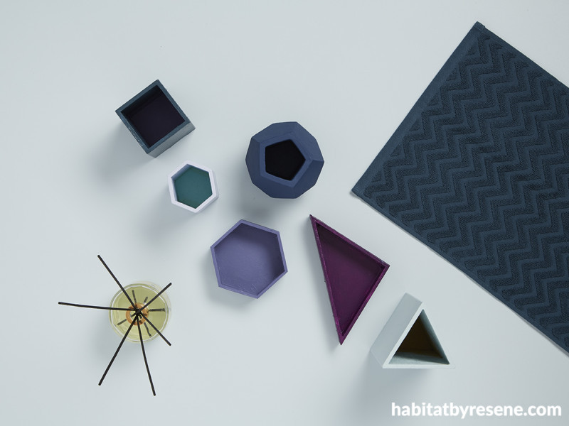
Resene Breeze + steel blue + plum
Purple is one of those polarising colours that people either love or hate and its often overlooked as a statement colour for the same reason. But the more some eschew this historically royal hue, the more refreshing it becomes – making it a great choice for people seeking uniqueness and individuality.
In this colour palette, a base in light and easy Resene Breeze becomes the gateway to braver choices. The rosy undertones of violet blue Resene Heartbreaker provides a bridge between deeper Resene Hammerhead and Resene Bunting, which anchor the scheme, and redder Resene Plum, which serves as the hero hue. For variation, a hint of lilac Resene Enigma and teal Resene Maestro have been thrown into the mix – but these could be omitted for equal success if one bold colour is enough for your client.

Background in Resene Breeze with painted objects in (from largest to smallest) Resene Half Opal (large triangle pencil cup), Resene Warrior (hex vase), Resene Bunting (square pencil cup), Resene Heartbreaker and Resene Maestro (larger hex tray), Resene Plum (triangle tray) and Resene Enigma (small hex tray).
Resene Dusted Blue + white + indigo blue + red
Similarly to the previous example, it’s the red-purple undertones in Resene Hammerhead that connects the blues in this colour palette to the eye-catching pop of Resene Havoc, so though it does contrast sharply, it doesn’t feel out of place. Sprinkle in a little dreamy off white like Resene Solitude amongst this timeless palette of Resene Dusted Blue, Resene Half Gull Grey and Resene Waikawa Grey and your client will wonder why they didn’t consider using red sooner.

Background in Resene Dusted Blue with painted objects in (from largest to smallest) Resene Half Gull Grey (large bowl), Resene Hammerhead (large curvy vase), Resene Waikawa Grey (smaller vase), Resene Solitude (cup) and Resene Havoc (lidded vessel).
Resene New Denim Blue + denim on denim on denim + pale aqua
Some find Resene Cut Glass to be a refreshing ocean aqua, but for others it might pack a bit too much of a pastel pop to be the dominating colour in their palette. But its cheerful green blue hue should not be overlooked as an accent – especially when layered into a denim on denim on denim tonal scheme. Don’t forget to incorporate plants or a few touches of pattern to create visual texture and seal off the look.

Background in Resene Quarter New Denim Blue with painted objects in (from largest to smallest) Resene Grey Chateau (large ribbed vase), Resene Iron (fluted vase), Resene Rhino (round vase), Resene Casper (tiny vase) and Resene Cut Glass (tiny pot).
styling Laura Lynn Johnston
images Bryce Carleton, Wendy Fenwick
Published: 20 Oct 2020

