
latest
habitat tv

Say goodbye to the morning scramble for keys, coats and sunglasses and hello to this… see this and more videos
blog

Re-living the 1980s through art
Clint C is an artist whose work instantly sparks recognition and joy. Based in Hamilton,… more
With views of the rolling Kapiti Coast, natural scrubland and wide skies, the owners of this beach house at Peka Peka didn’t have to look far for colour inspiration. But it was a much-loved carved glass art sculpture by Ron Reichs that was the muse for the striking blue they chose for their bedroom colour – at least, it was the starting point. “When the painter had completed the first coat, we were stunned at how vibrant the colour was compared with our memory of the colour,” remembers one of the owners. “All was revealed when he went back to get more paint and found out that it had been mixed incorrectly the first time. We said, ‘Don’t change it, we love it,’ – so a new colour was born.”
The couple bought the land the house is built on five years ago, because they loved the rural nature of the area and the elevated site with fabulous coastal views and proximity to the beach. They commissioned Gerald Parsonson of Parsonson Architects to design the house. “Our architects had great suggestions and were so aligned with our thinking that it made the design process very easy for us,” the couple says. “The layout, look and feel are almost exactly what Gerald presented as his initial concept.”
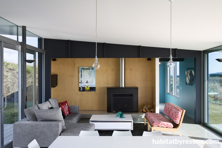
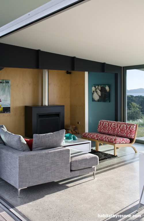
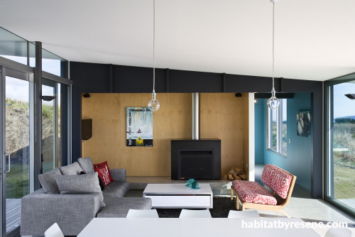
The central living area is the heart of the home, and their favourite space, with furniture mostly sourced from Kartell through Backhouse Interiors nd a coffee table from Portfolio. On sunny days, the couple open up the doors and move between sun and shade, warm and cool – states that are reflected in the warm and cool tones of the colour scheme – stone greys, sand-coloured plywood, and blues that echo the sea and sky.
How would you describe your ‘design style’?We wanted the house to have clean lines, be practical, offering shelter from the wind, and mindful of eco-considerations, but still modern and uplifting. We didn’t want it to feel too big, as it is usually just the two of us here.
What did you want to achieve with your house interiors?The “story”, as the architects would say, is that the living area is light and open – the conduit in and out of the house, the centre of all the activity. The bedrooms are more closed in – spaces to go to, rather than through, to feel cosy, secure, warm, thus no outdoor access, carpet, lower ceilings and more use of colour.
Where did your inspiration come from?This was very much a collaborative effort with our architects. We trusted them and their ideas and were delighted with the result. We wanted to take the environment into account, especially as we had to start with collection of our own water and treatment of our sewerage, and this thinking influenced the design, such as the size of the house, spacing of the external panels, thermal mass of the concrete floor, double glazing, use of Greenpeace-approved decking and the colours and materials both inside with the pine feature walls and joinery, but also outside with the aluminium panels.
What is your advice for someone trying to achieve a similar look?Think about how you will live in the space, not just how it will look. Copy ideas you like, but be prepared to do your own thing too.

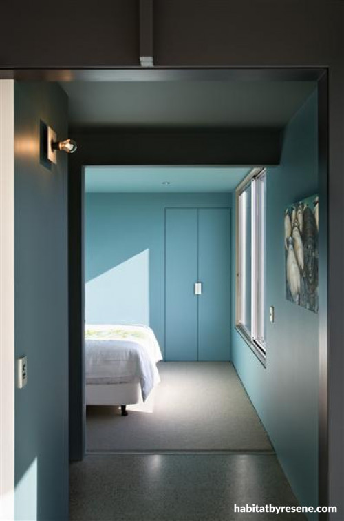
The two main bedrooms open off the living space through oversized doors that allow views and light to be shared but can be enclosed away when the sliders are shut. The vibrant blue shade of paint (based on Resene Juniper) was initially a mis-tint, but the owners loved it so much, they kept it. The hallway lights were created by Gerald Parsonsen, and feature special mirror bulbs to reflect light back onto the wall.

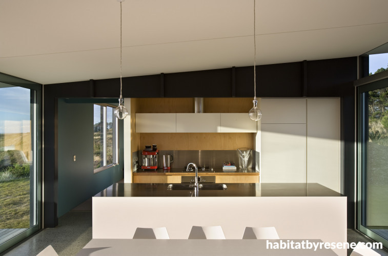
Great thought went into the lights over the dining table – the owners wanted something simple, which didn’t distract from the view but still looked elegant. “We couldn’t find anything we liked, so in the end we came up with our ‘Tribute to a naked bulb’,” says one. The copper fixture was covered with brass, and fitted with clear dolly bulbs. Originally the kitchen was meant to be more ‘camping style’, but after adding the island bench, the owners find they enjoy cooking more often.

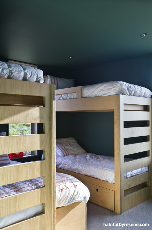
The remainder of the house is accessed through a darkened hallway. As you turn the corner, the rest of the house is revealed creating a sense of surprise that the house extends further. The painted ceilings create an immersive feeling, almost like being undersea, and the bunks were designed by Tim Lovell of Parsonson Architects.

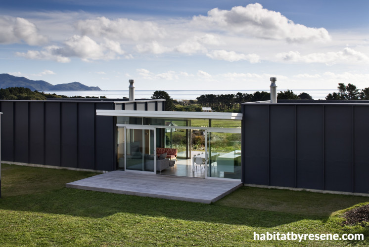
The exterior colour was inspired when the builder put up the building paper around the house. Seeing the dramatic effect, the owners opted for a much darker shade (Resene Cod Grey) than they had originally envisaged. “The paint is weathering really well – it has a special reflective quality that stops it from heating up too much and as a result it is not fading either,” says one owner.

A picture in the hallway leading to the main bedroom is a good fit for the house, says one owner. Her daughter looked at the black sheep standing in a crowd of white ones and noted: “It’s just like the house!” (meaning that the black, modern house stands out from its neighbours).

A Sanctuary of Sea, Sand and Stone
Published: 17 Sep 2010
Do you have a home full of wonderful Resene paint and colour? Send us some snaps by emailing [email protected].
Coastal inspiration at Kapiti
With views of the rolling Kapiti Coast, natural scrubland and wide skies, the owners of this beach house at Peka Peka didn’t have to look far for colour inspiration. But it was a much-loved carved glass art sculpture by Ron Reichs that was the muse for the striking blue they chose for their bedroom colour – at least, it was the starting point. “When the painter had completed the first coat, we were stunned at how vibrant the colour was compared with our memory of the colour,” remembers one of the owners. “All was revealed when he went back to get more paint and found out that it had been mixed incorrectly the first time. We said, ‘Don’t change it, we love it,’ – so a new colour was born.”
The couple bought the land the house is built on five years ago, because they loved the rural nature of the area and the elevated site with fabulous coastal views and proximity to the beach. They commissioned Gerald Parsonson of Parsonson Architects to design the house. “Our architects had great suggestions and were so aligned with our thinking that it made the design process very easy for us,” the couple says. “The layout, look and feel are almost exactly what Gerald presented as his initial concept.”
The central living area is the heart of the home, and their favourite space, with furniture mostly sourced from Kartell through Backhouse Interiors nd a coffee table from Portfolio. On sunny days, the couple open up the doors and move between sun and shade, warm and cool – states that are reflected in the warm and cool tones of the colour scheme – stone greys, sand-coloured plywood, and blues that echo the sea and sky.
How would you describe your ‘design style’?We wanted the house to have clean lines, be practical, offering shelter from the wind, and mindful of eco-considerations, but still modern and uplifting. We didn’t want it to feel too big, as it is usually just the two of us here.
What did you want to achieve with your house interiors?The “story”, as the architects would say, is that the living area is light and open – the conduit in and out of the house, the centre of all the activity. The bedrooms are more closed in – spaces to go to, rather than through, to feel cosy, secure, warm, thus no outdoor access, carpet, lower ceilings and more use of colour.
Where did your inspiration come from?This was very much a collaborative effort with our architects. We trusted them and their ideas and were delighted with the result. We wanted to take the environment into account, especially as we had to start with collection of our own water and treatment of our sewerage, and this thinking influenced the design, such as the size of the house, spacing of the external panels, thermal mass of the concrete floor, double glazing, use of Greenpeace-approved decking and the colours and materials both inside with the pine feature walls and joinery, but also outside with the aluminium panels.
What is your advice for someone trying to achieve a similar look?Think about how you will live in the space, not just how it will look. Copy ideas you like, but be prepared to do your own thing too.
pictures
Architectural Specifier: Parsonson Architects www.parsonsonarchitects.co.nz Painting Contractor: Rob Aston from Aston Decorators. Photography: Simon Devitt www.simondevitt.com
Blue morning, blue day
The two main bedrooms open off the living space through oversized doors that allow views and light to be shared but can be enclosed away when the sliders are shut. The vibrant blue shade of paint (based on Resene Juniper) was initially a mis-tint, but the owners loved it so much, they kept it. The hallway lights were created by Gerald Parsonsen, and feature special mirror bulbs to reflect light back onto the wall.
pictures
Architectural Specifier: Parsonson Architects www.parsonsonarchitects.co.nz Painting Contractor: Rob Aston from Aston Decorators. Photography: Simon Devitt www.simondevitt.com
Simple pleasures
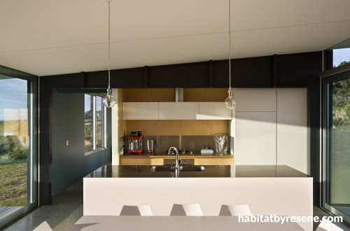
Great thought went into the lights over the dining table – the owners wanted something simple, which didn’t distract from the view but still looked elegant. “We couldn’t find anything we liked, so in the end we came up with our ‘Tribute to a naked bulb’,” says one. The copper fixture was covered with brass, and fitted with clear dolly bulbs. Originally the kitchen was meant to be more ‘camping style’, but after adding the island bench, the owners find they enjoy cooking more often.
pictures
Architectural Specifier: Parsonson Architects www.parsonsonarchitects.co.nz Painting Contractor: Rob Aston from Aston Decorators. Photography: Simon Devitt www.simondevitt.com
A sea-cret hideaway
The remainder of the house is accessed through a darkened hallway. As you turn the corner, the rest of the house is revealed creating a sense of surprise that the house extends further. The painted ceilings create an immersive feeling, almost like being undersea, and the bunks were designed by Tim Lovell of Parsonson Architects.
pictures
Architectural Specifier: Parsonson Architects www.parsonsonarchitects.co.nz Painting Contractor: Rob Aston from Aston Decorators. Photography: Simon Devitt www.simondevitt.com
Outside the box
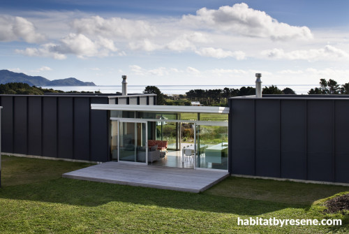
The exterior colour was inspired when the builder put up the building paper around the house. Seeing the dramatic effect, the owners opted for a much darker shade (Resene Cod Grey) than they had originally envisaged. “The paint is weathering really well – it has a special reflective quality that stops it from heating up too much and as a result it is not fading either,” says one owner.
pictures
Architectural Specifier: Parsonson Architects www.parsonsonarchitects.co.nz Painting Contractor: Rob Aston from Aston Decorators. Photography: Simon Devitt www.simondevitt.com
An outstanding effect
A picture in the hallway leading to the main bedroom is a good fit for the house, says one owner. Her daughter looked at the black sheep standing in a crowd of white ones and noted: “It’s just like the house!” (meaning that the black, modern house stands out from its neighbours).
pictures
Architectural Specifier: Parsonson Architects www.parsonsonarchitects.co.nz Painting Contractor: Rob Aston from Aston Decorators. Photography: Simon Devitt www.simondevitt.com

Resene Green Meets Blue

Resene Quarter Spanish White
the look
If you're stuck on what
colour to use or need colour
advice, try out the Resene
Ask a Colour Expert service.
Resene Green Meets Blue
Resene Quarter Spanish White
the look
If you're stuck on what
colour to use or need colour
advice, try out the Resene
Ask a Colour Expert service.

