
latest
habitat tv

Say goodbye to the morning scramble for keys, coats and sunglasses and hello to this… see this and more videos
blog

Re-living the 1980s through art
Clint C is an artist whose work instantly sparks recognition and joy. Based in Hamilton,… more

A trio of bold, rich Resene colours inspired by a garden outlook and the gold of the setting sun has transformed a bland interior into a warm cocoon that’s the perfect sanctuary for a busy working couple. When James Peters of James Peters Design Concepts was given an open brief for the project, he took full advantage of the freedom to achieve a superb result.
What Resene colours were used, and what inspired those choices?
The major inspiration for the colours came from the view into the back garden, which the clients had planned and planted superbly.
Resene Himalaya colour was inspired by the various shades of green in the foliage of the garden while Resene Buttered Rum was inspired by a view of the setting sun from the front deck during a site visit. Resene Caffeine is a very seductive colour and complemented the other colours perfectly.
These strong colours are complemented by Resene Half Tea on skirtings, architraves and bookshelves and Resene Alabaster on the ceilings. Resene Zylone Sheen low sheen waterborne paint was chosen for all interior walls for its practicality, durability and density.
What was your overall design philosophy?
While this house had gone through a major structural renovation ago, the owners – Alan Barber and Alan Moss - hadn’t had the chance to give the interior a new look. The house had strong bones but lacked atmosphere and warmth. I originally created a more muted colour palette but after a few visits, I discarded that approach for more vital colour.
The living rooms on the top floor are long and narrow with limited natural light. The final colour palette took this into account and used references from existing rooms of the house, including the timber in the kitchen, the wooden fire surround and the strong wooden floors. The colours needed to have sufficient strength to complement these timbers.
The essentially open-plan kitchen/dining area and the formal lounge meant that there needed to be continuity of colour. The aim was to be able to view a selection of the three bolder colours from each end of the living area.
As the colour was applied, I visited the house in the evenings as well as different times during the day to assess that the colour palette was fitting the overall concept.
What part of the design are you most happy with?
I am very satisfied with the end result. The environment comes across as imaginative, cohesive and warm. A place to call home. In this part of the globe we seem to be afraid of colour, with many of us choosing safe, predictable colour palettes. Colour is uplifting, exciting and can enhance our lives if we are brave enough to embrace the notion. My clients were amongst the brave and are pleased with the result.
The brief was open, and the clients were a joy to work with. Once I had met with them and considered their aspirations, I presented a colour mood board along with other design features and they accepted my suggestions.
From a practical stand-point, the painter Peter Witten also made the project easy with his meticulous attention to the preparation and detail.


Looking through the open-plan living area, you can see the rich colours layered together – the dusky green Resene Himalaya and the golden Resene Buttered Rum. Resene Half Tea is used on the skirtings, architraves and bookshelves, with Resene Alabaster on the ceilings.

The choice of Resene Himalaya was inspired by this view out into the garden. The wall on the right is Resene Buttered Rum.

Rather than using a colour that contrasts with the honeyed tones of the timber on the kitchen cabinets, James has cleverly blended them into walls painted in the delicious sounding Resene Buttered Rum.

The rich colour palette extends into the bedroom with Resene Mocha on the walls.

In contrast to the rest of the house, the light bathroom also takes advantage of the garden outlook through French doors onto the deck. Get this clawfoot bath look by painting it in Resene Enamacryl tinted to Resene Optimist.


Resene Caffeine is a deep violet-based brown, used here to highlight the fireplace and contrast against the bronzed green of Resene Himalaya.

James goes for gold...
Published: 06 Mar 2014
Do you have a home full of wonderful Resene paint and colour? Send us some snaps by emailing [email protected].
Inspired by sunsets and greenery
A trio of bold, rich Resene colours inspired by a garden outlook and the gold of the setting sun has transformed a bland interior into a warm cocoon that’s the perfect sanctuary for a busy working couple. When James Peters of James Peters Design Concepts was given an open brief for the project, he took full advantage of the freedom to achieve a superb result.
What Resene colours were used, and what inspired those choices?
The major inspiration for the colours came from the view into the back garden, which the clients had planned and planted superbly.
Resene Himalaya colour was inspired by the various shades of green in the foliage of the garden while Resene Buttered Rum was inspired by a view of the setting sun from the front deck during a site visit. Resene Caffeine is a very seductive colour and complemented the other colours perfectly.
These strong colours are complemented by Resene Half Tea on skirtings, architraves and bookshelves and Resene Alabaster on the ceilings. Resene Zylone Sheen low sheen waterborne paint was chosen for all interior walls for its practicality, durability and density.
What was your overall design philosophy?
While this house had gone through a major structural renovation ago, the owners – Alan Barber and Alan Moss - hadn’t had the chance to give the interior a new look. The house had strong bones but lacked atmosphere and warmth. I originally created a more muted colour palette but after a few visits, I discarded that approach for more vital colour.
The living rooms on the top floor are long and narrow with limited natural light. The final colour palette took this into account and used references from existing rooms of the house, including the timber in the kitchen, the wooden fire surround and the strong wooden floors. The colours needed to have sufficient strength to complement these timbers.
The essentially open-plan kitchen/dining area and the formal lounge meant that there needed to be continuity of colour. The aim was to be able to view a selection of the three bolder colours from each end of the living area.
As the colour was applied, I visited the house in the evenings as well as different times during the day to assess that the colour palette was fitting the overall concept.
What part of the design are you most happy with?
I am very satisfied with the end result. The environment comes across as imaginative, cohesive and warm. A place to call home. In this part of the globe we seem to be afraid of colour, with many of us choosing safe, predictable colour palettes. Colour is uplifting, exciting and can enhance our lives if we are brave enough to embrace the notion. My clients were amongst the brave and are pleased with the result.
The brief was open, and the clients were a joy to work with. Once I had met with them and considered their aspirations, I presented a colour mood board along with other design features and they accepted my suggestions.
From a practical stand-point, the painter Peter Witten also made the project easy with his meticulous attention to the preparation and detail.
pictures
Colour Selection: James Nicholas Peters, James Peters Design Concepts Photography by Stella Brandon
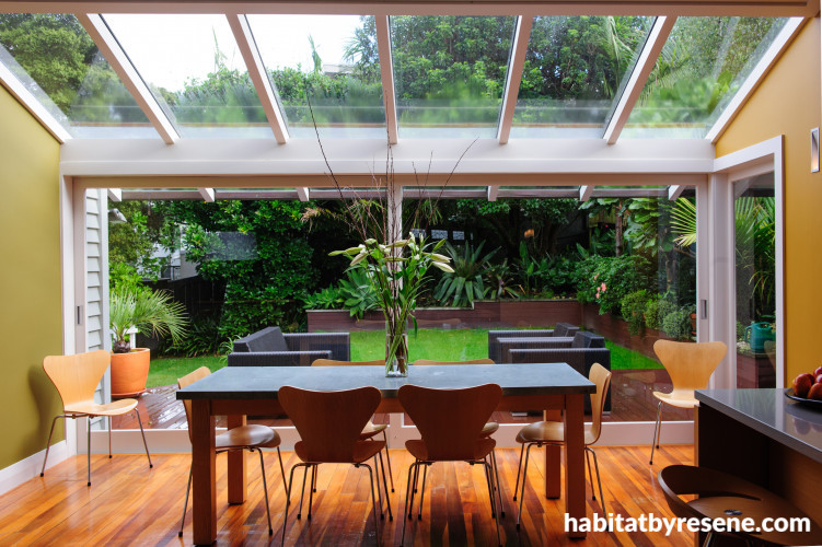
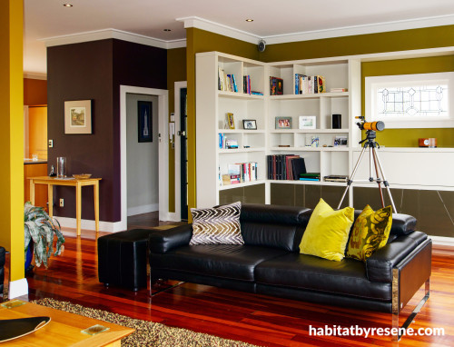
Layered colour
Looking through the open-plan living area, you can see the rich colours layered together – the dusky green Resene Himalaya and the golden Resene Buttered Rum. Resene Half Tea is used on the skirtings, architraves and bookshelves, with Resene Alabaster on the ceilings.
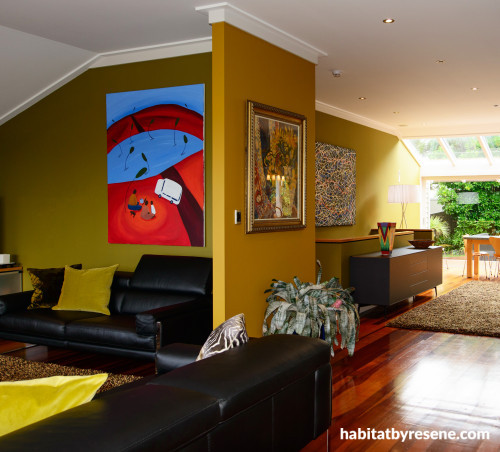
Bringing garden colours inside

The choice of Resene Himalaya was inspired by this view out into the garden. The wall on the right is Resene Buttered Rum.
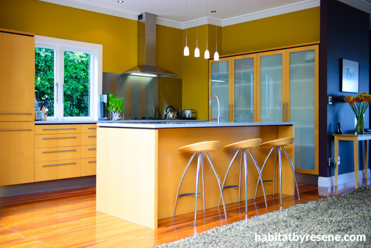
Honey and butter - yum

Rather than using a colour that contrasts with the honeyed tones of the timber on the kitchen cabinets, James has cleverly blended them into walls painted in the delicious sounding Resene Buttered Rum.
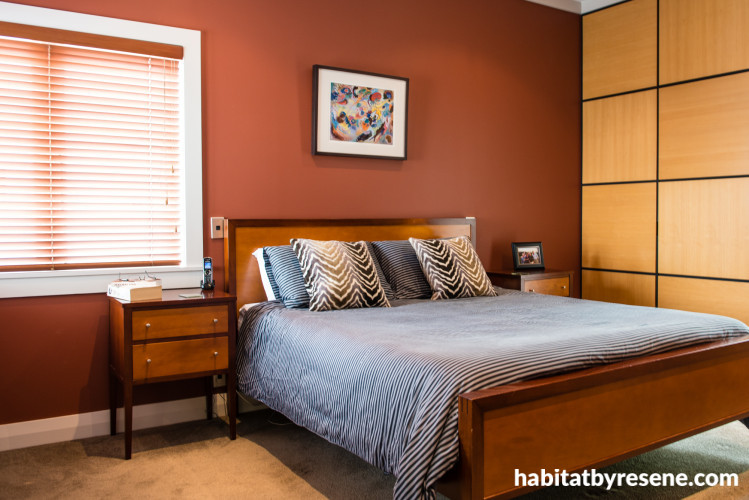
Continuing the mood
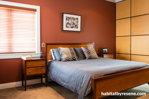
The rich colour palette extends into the bedroom with Resene Mocha on the walls.
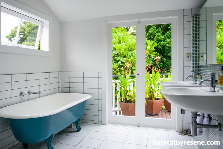
Light and bright

In contrast to the rest of the house, the light bathroom also takes advantage of the garden outlook through French doors onto the deck. Get this clawfoot bath look by painting it in Resene Enamacryl tinted to Resene Optimist.
Making a feature of the fireplace
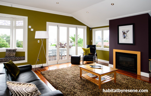
Resene Caffeine is a deep violet-based brown, used here to highlight the fireplace and contrast against the bronzed green of Resene Himalaya.


the look
If you're stuck on what
colour to use or need colour
advice, try out the Resene
Ask a Colour Expert service.
the look
If you're stuck on what
colour to use or need colour
advice, try out the Resene
Ask a Colour Expert service.

