
latest
habitat tv

Say goodbye to the morning scramble for keys, coats and sunglasses and hello to this… see this and more videos
blog

Reader roundup: See what our readers have been up to!
Refurbished vintage furniture, charming exteriors and magnet walls for kids. These projects are sure to… more
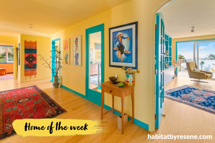
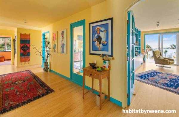
Like stepping straight into a sunny day at the beach, this hallway glows with joy in the energetic yellow of Resene Sweet Corn. Trims are painted in Resene Java and the ceiling is in Resene Moonbeam.


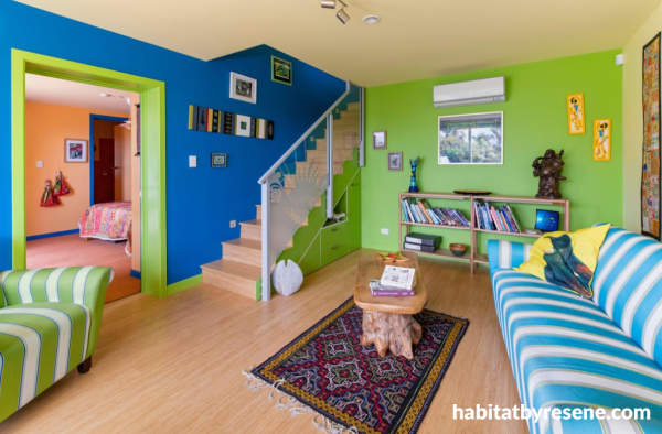
In the downstairs living room, walls and trims come to life painted in a zesty green, Resene Limerick, with a contrasting vibrant blue wall in Resene Guru that leads the way upstairs. The ceiling is painted in Resene Moonbeam.

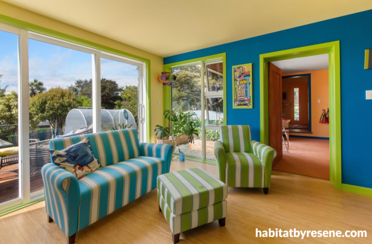
Natural light flows through the windows in the downstairs living room, highlighting the vivid hues of Resene Guru, Limerick, Sweet Corn and Moonbeam.

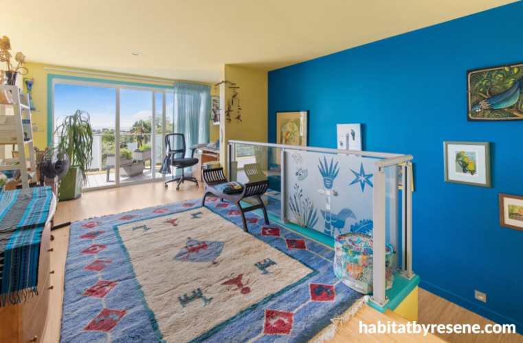
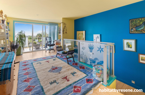
Resene Guru guides the way upstairs into a sunny yellow room of Resene Sweet Corn and Moonbeam. Trims are painted in Resene Java, a bright turquoise green.

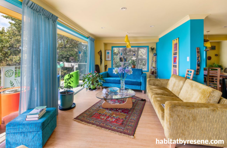
The décor and furniture in the upstairs living room reflect the colours on the walls. Resene Java is painted on the right wall and window trims, Resene Sweet Corn on the walls and Resene Moonbeam on the ceiling.


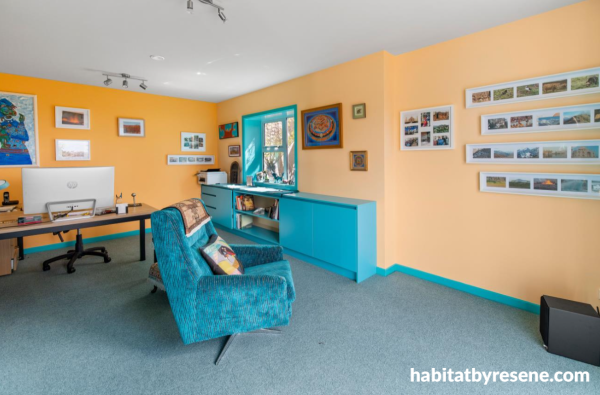
The home office is bold yet welcoming, painted in a mix of Resene Touche and Chardonnay, with Resene Java on trims and cabinetry.


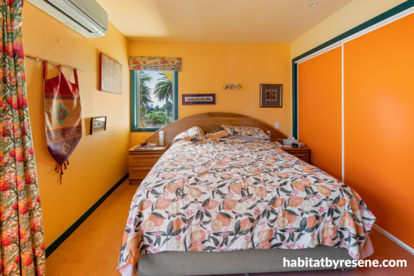
This brilliantly bold bedroom is painted in Resene Koromiko, a bright orange which complements the ceiling in Resene Splash and contrasting trims in Resene Guru.


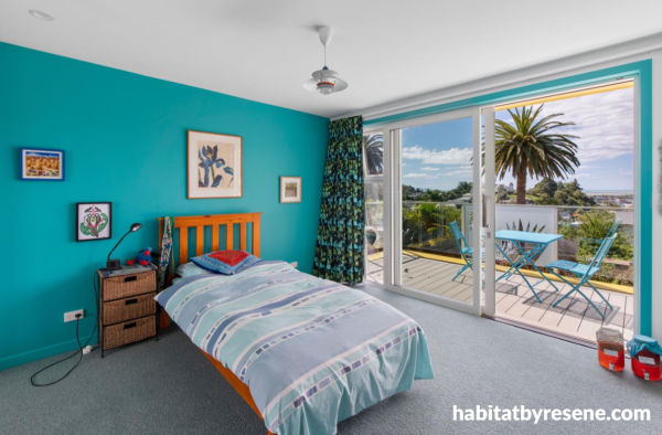
On the cooler side of the colour wheel, this bedroom is painted in Resene Java, a fresh turquoise green.


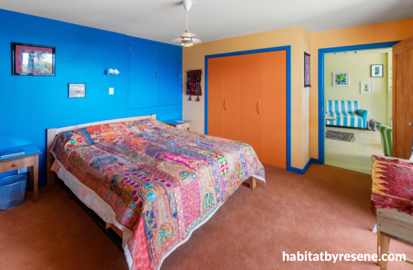
Like the sea and sand, this bedroom is a mix of warm and cool tones in Resene Koromiko and Guru.

Could this be New Zealand’s brightest and boldest home?
There’s certainly nothing shy about this Nelson home. It’s a celebration of colour in its bravest form thanks to the daring Resene palette that graces every surface. Joyful sunshine tones, deep blues, leafy greens and fiery oranges. Each room tells its own story and reflects the wonderful life its owners have lived.
A project like this needed the right team for the job. The home was painted by the team at ProColour Painting Nelson, and renovated by ET Builders who oversaw the gutting of the original interior before the colourful vision could come to life.
In the downstairs living room, walls and trims come to life painted in a zesty green, Resene Limerick, with a contrasting vibrant blue wall in Resene Guru that leads the way upstairs. The ceiling is painted in Resene Moonbeam.

Natural light flows through the windows in the downstairs living room, highlighting the vivid hues of Resene Guru, Limerick, Sweet Corn and Moonbeam.
Steve from ProColour says when he first met with the owners, Jill and David, they unveiled a colour plan like nothing he’d ever seen before. “They wanted multiple bold colours in each room, sometimes up to five different shades, and no two rooms the same,” he says.
That colour choices were deeply personal. Having travelled across the globe, Jill and David wanted their home to reflect the places they’d explored as well as the vibrant artworks they’d picked up along the way. The Resene scheme had to be punchy while still giving their art the chance to shine.
Resene Guru guides the way upstairs into a sunny yellow room of Resene Sweet Corn and Moonbeam. Trims are painted in Resene Java, a bright turquoise green.

The décor and furniture in the upstairs living room reflect the colours on the walls. Resene Java is painted on the right wall and window trims, Resene Sweet Corn on the walls and Resene Moonbeam on the ceiling.
The interior walls were lined with Saveboard, an eco-friendly material made from recycled products. And to get that crisp, consistent finish needed for such striking colours, the painting team had to first seal it using Resene Sureseal before skim coating and applying multiple topcoats, while keeping razor sharp cutting lines between contrasting hues. It’s the kind of skills that only pro-level painters can achieve!
“It was the most challenging project we’ve ever tackled,” Steve says. “But also the most rewarding.”
Like stepping straight into a sunny day at the beach, this hallway glows with joy in the energetic yellow of Resene Sweet Corn. Trims are painted in Resene Java and the ceiling is in Resene Moonbeam.
The home office is bold yet welcoming, painted in a mix of Resene Touche and Chardonnay, with Resene Java on trims and cabinetry.
From the sweet yellow glow of Resene Sweet Corn, Koromiko and Moonbeam in hallways and rooms, to the punch of Resene Limerick, Java and Guru on trims and walls, the house feels alive with energy. Each space pulls you into a different mood, but always one of joy. Playful, exotic, uplifting. Like moving through a gallery of memories.
This project also became a stepping stone for the next generation. ProColour’s apprentice Kahu managed much of the day-to-day painting on site, mentored by Production Manager Pete. His work here was used as part of his entry into the Master Painters Apprentice of the Year Awards in which he was a finalist for.
This brilliantly bold bedroom is painted in Resene Koromiko, a bright orange which complements the ceiling in Resene Splash and contrasting trims in Resene Guru.
On the cooler side of the colour wheel, this bedroom is painted in Resene Java, a fresh turquoise green.
Like the sea and sand, this bedroom is a mix of warm and cool tones in Resene Koromiko and Guru.
This is one home that truly feels alive in the summer season, and certainly one that brightens a grey winter’s day! It embodies travel, art and fearless creativity. It’s also a reminder that you can really make your home a reflection of you.
Step inside this one, and you’re wrapped in a kaleidoscope of colour that refuses to be anything less than pure joy itself.
paint ProColour Painting Nelson
build ET Building
images James Winch
Top tips: When you have interiors bursting with bold, bright colours, finish choice is as important as colour. Using low sheen or matte finishes, like Resene SpaceCote Low Sheen or Resene SpaceCote Flat, for broad walls helps cut down glare and stops the walls looking too shiny or highlighting imperfections.
When it comes to selecting gloss levels for interior walls and ceilings there are a few things to consider.
The higher the gloss level the more vibrant a colour will appear. So a high gloss front door can appear almost mirror-like if done well, while a dead flat wall or ceiling paint will be much more subdued and look very different. Some colours look great in a flat finish, taking on a muted almost chalky or suede-like look, yet are very contemporary.
Strong, vibrant colours like those used by Jill and David look best in a semi-gloss, or better still, high gloss, but just remember that when used on interior walls and ceilings they will highlight imperfections, especially under critical light conditions.
A degree of compromise is needed, which is where Resene SpaceCote Low Sheen hits the mark. It has low sheen finish but with controlled side sheen which helps disguise surface imperfections while still showcasing strong, vibrant colours.
Published: 17 Dec 2025
Do you have a home full of wonderful Resene paint and colour? Send us some snaps by emailing [email protected].


the look
If you're stuck on what
colour to use or need colour
advice, try out the Resene
Ask a Colour Expert service.
the look
If you're stuck on what
colour to use or need colour
advice, try out the Resene
Ask a Colour Expert service.

