
latest
habitat tv

Say goodbye to the morning scramble for keys, coats and sunglasses and hello to this… see this and more videos
blog

Re-living the 1980s through art
Clint C is an artist whose work instantly sparks recognition and joy. Based in Hamilton,… more
Robert’s art legacy
08 Feb 2018
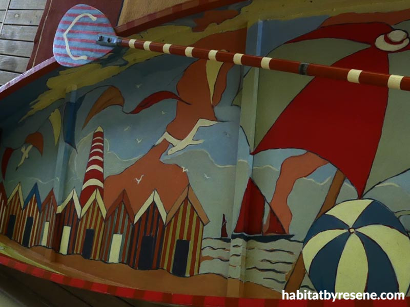
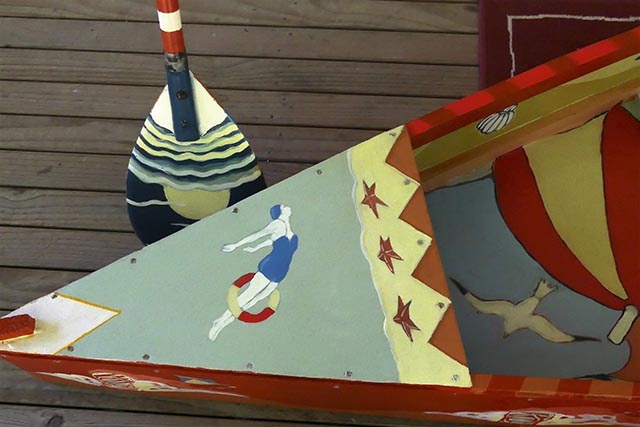
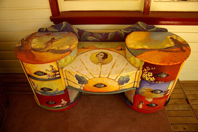
For 30 odd years, artist Robert Wallace has been wielding a paintbrush, bringing his imagination and talent to the world.
His latest works look to the past, using Resene paint and colour schemes inspired by the 30s, 40s and 50s eras.
Robert tells us more about his work.
Tell us a bit about yourself and your work.
I’ve been a painter since 1985 when a friend who owned a gallery said he could sell my canvas work. Since then I’ve been a teacher of visual art, a scenic artist, muralist, fine art painter and occasionally, an illustrator.
My current work has an illustrative bent, whereby I research images from the past and adapt them to suit my needs. I enjoy experimenting with colour schemes that found favour between the 1930s and 1950s.
Most of my commissions come from people who prefer a retro pictorial or decorative style. However, some of my more serious work can be painterly – in the sense that I overlay and blend my paint rigorously.
I enjoy working on both a small and large scale.
How has the style of your pieces evolved?
I used to adapt billboard and book illustrators work from the 30s, 40s and 50s. It seemed to me somewhere in the mix was an avenue worth following.
Since then, my work has assumed a fairly consistent palette and my technique is still developing.
I try to work from photographs, taken by me or from obscure sources. I work from black and white images since this emphasises form. I impose my own colour schemes.
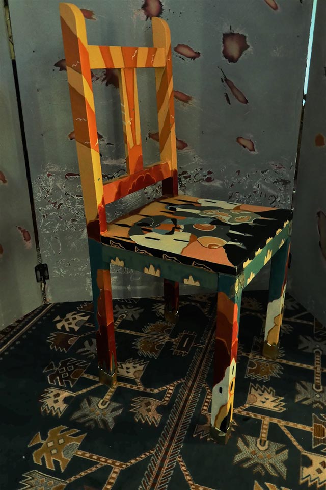
The style depends on what I’m painting; with furniture, for example, I pay homage to the period in which it was constructed. With murals, the fall of light, form and pictorial space are ongoing challenges. With my more personal and introspective work, I tend to use a darker and more sombre mix of colours with increasingly sparse subject matter.
What has influenced your work?
Leading luminaries such as Canadian painter A J Casson and American, Edward Hopper. There’s a purity and quiet dignity to their work.
Australian artists such as John Brack and Neil Moore. Their definition of form and bold colour has always appealed to me.
I’m a stickler for browsing National Geographic magazines for their artful photography. I get influenced by the arrangement of subject matter, whether it’s in a magazine ad or from naturally-occurring phenomena.
How do you incorporate Resene products and paint into your work?
I generally use Resene paint for my murals and painted furniture. I particularly like the way Resene paint feels under the brush. It can be used equally well for large areas and small; since a lot of my work is detailed in an illustrative way, this is important.
It applies easily and has good covering power. I paint with subtlety in mind and I appreciate the subtle shift of hues. Since I try to replicate colour palettes from the past, I appreciate the range of choices. I also use Resene FX Paint Effects regularly.
Do you have a favourite piece?
My favourite so far would be my 1920s-inspired dresser. The subtle shift in earthy hues and the overall design appeals to me. I would like to paint similarly on a large scale.
And a favourite colour?
Somewhere between Resene Hawaiian Tan, Resene Rich Gold and Resene Melon Orange (I sometimes mix my colours and the result can be amazing). I use warm earthy colours in the main, but it depends on the look or feel I’m trying to generate.
See more of Robert’s work at www.robeart.net.
Published: 08 Feb 2018

