
latest
habitat tv

Say goodbye to the morning scramble for keys, coats and sunglasses and hello to this… see this and more videos
blog

Reader roundup: See what our readers have been up to!
Refurbished vintage furniture, charming exteriors and magnet walls for kids. These projects are sure to… more
More colour picks from our designers
22 Nov 2018
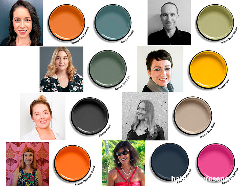
We asked a number of design professionals about their favourite colours from the new Resene The Range fashion colours 20 collection. While a variety of greens proved to be popular, there were also some surprises – hot pink, burnt orange and bright yellow!
Here’s what they said:

Therese Högstedt, Candela Design
www.candeladesign.co.nz
My favourite is Resene Grey Olive. It’s a great colour that transforms a space. It’s interesting and deep and matches perfectly with burnt oranges and deep greens.

Deanna Hills, The Designery Room
www.thedesigneryroom.co.nz
I'm always drawn to dusky and muted tones. This colour palette flows through the Resene The Range fashion colours 20 fandeck and shows off trends and colourways from around the world beautifully. Colours I am particularly loving are the dusky deep tones of Resene Swiss Caramel and Resene Artemis. These both have a gorgeous undertone to them that I can see working and lasting within a space over the years. As I love a great neutral, the monochromatic hue of Resene Porter as a soft black is just stunning. Using this or Resene Poured Milk would make the perfect back drop to any colour scheme. Or top it off with a pop of Resene Code Red, which would also look fabulous on a front door.

Emma Morris, Architect
www.emmamorris.studio
Resene Double Alabaster is my go-to white. It lights up a room and lets your artwork glow.
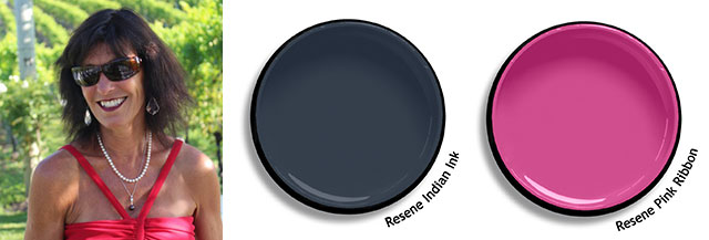
Debbie Abercrombie, Interior designer
www.debbieabercrombie.co.nz
My favourite is Resene Indian Ink. Fabrics are my inspiration and many of the new collections are saturated with shades of blue. I Iove how Resene Indian Ink can create a mood, nurture and ground a room. It can be lightened and lifted with fresh white Resene Poured Milk or paired with the exuberant and attention-seeking Resene Pink Ribbon.

Leanne Harley, SWP Interiors
www.swpinteriors.co.nz
My favourite colour in the new Resene The Range fashion colour 20 fandeck is Resene Hive. This playful shade will serve as the punchy pop of colour to enhance any aesthetic.

Julie Rees, Sojo Design
www.sojodesign.co.nz
My favourite straight away is Resene Artemis which is a fabulous “green meets blue” for today’s interiors. It’s a colour that is easy on the eye, yet can make a bold but not loud statement.

Debra DeLorenzo, Debra DeLorenzo Interiors
www.debradelorenzo.com
My favourite colour is Resene Clockwork Orange, because it is such a lovely burnt, but still bright orange. My signature colour has always been orange and I love incorporating a little into my clients' interiors.

Sophia Cole, Yellowfox?
www.yellowfox.co.nz
My favourite colour from the new fandeck is Resene Porter. I love the depth it has without being too dark, and it’s that true charcoal that will work well in both warm and cool schemes. It’s the colour I never knew I needed until I saw it! I am currently using it paired with black joinery and Resene Triple Sea Fog in an exterior colour scheme for a client in Hobsonville.

Laura Lochhead, Pocketspace Interiors
https://www.pocketspace.co.nz/
Resene Rivergum is my go-to favourite! It is easy to pair with blushes, oranges, and blues; both bright for a contemporary pop or muted for a softer palette. It is uncommon for me to find a colour that looks stunning with both warm and cool colour pairing which is why it is a winner for Pocketspace.

Rochelle Jackson, Kitchen Elements
www.kitchenelements.co.nz/
It is hard to choose one colour there are some beautiful colours to have fun with in the new Resene The Range fashion colours 20 fandeck. My pick is Resene Green Meets Blue. It has a dreamy relaxed feel but enough colour to contrast beautifully with timber. This colour would be great as a bathroom unit or feature colour teamed with copper/brass or marble. It's a perfect accent colour in a kitchen too.

John Mills, John Mills Architects
www.johnmillsarchitects.co.nz
Resene Green Smoke is a sultry splash of mid-century suburban domestic life, that complements rimu and similar timbers.
Published: 22 Nov 2018

