
latest
habitat tv

Say goodbye to the morning scramble for keys, coats and sunglasses and hello to this… see this and more videos
blog

Re-living the 1980s through art
Clint C is an artist whose work instantly sparks recognition and joy. Based in Hamilton,… more
Megan's room recipes
11 May 2017
Colour expert and stylist Megan Harrison Turner uses certain rules when creating rooms for Resene. She shares her secrets.
Baking a cake successfully is about getting the proportions of ingredients right, in the right order. It’s the same for a room scheme.
Choosing the elements of an interior in the right order can save a small fortune. It’ll be some natural law that the best match for the Resene paint colour you've committed to is the most expensive benchtop granite ever imported. Choose your paint colours last – with so many to choose from, paint is the most flexible part of a room scheme. It’s easy to literally paint yourself into a corner when choosing paint colours first.
Start with the most limited or most expensive material first. So in a kitchen, choose that granite benchtop first, then the tiles/splashback, then the flooring, then the cabinetry. Finally, choose the paint colour for the walls that best ties together all these elements.
The right proportions
When putting a number of colours together be sure to vary the proportions. Using them in equal proportions, will give the room an unsettled feel and make the colours feel far too intense. Use the 60:30:10 principle - 60 is the walls, 30 the flooring and 10 is an accent colour. You don’t need to take the ceiling into account using this proportional scheme unless you plan to paint it in a colour other than white.
These proportions are a tried and true industry standard for high-end product packaging. For example, a perfume box in deep red, black and gold. For an even more luxe feel, a 70:30 proportion uses just two colours, such as white and gold. These principles can be easily converted into colour schemes for your home to convey the same message.
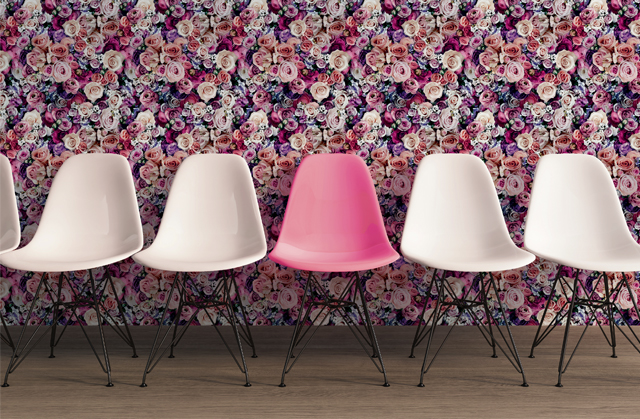
If you’re keen on using a range of colours or have elements that are colourful (like a wallpaper), one way of tying these together, is to add a good dose of an ‘achromatic’. That’s black or white, or colours close to them, such as charcoal, pale grey, cream.
Using white, grey or black can work brilliantly as neutral foils to make even pale colours sing, and are great choices if you want to break away from just using neutrals. They can add drama to a scheme without having to add a bold colour.
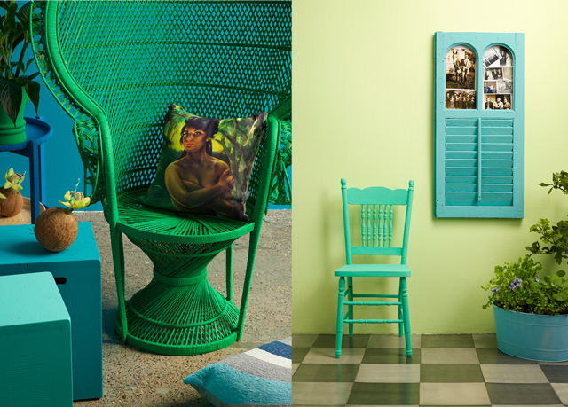
If you’re set on using bold colour, but still want a cohesive look try a tonal recipe made up of ‘related’ colours – those that sit next to each other on the colour wheel. So green, turquoise and blue is a tonal related scheme. Or, varying shades of green from turquoise to leafy yellow-greens.
A more classic approach to a tonal scheme is to use a colour in varying strengths or shades, such as icy blue through to inky blue. Stick to the 60:30:10 rule and use one colour in a higher proportion. Or, of course, you can use colours from the Resene Whites & Neutrals collection where colour families and variants are already chosen for you.
Accessories
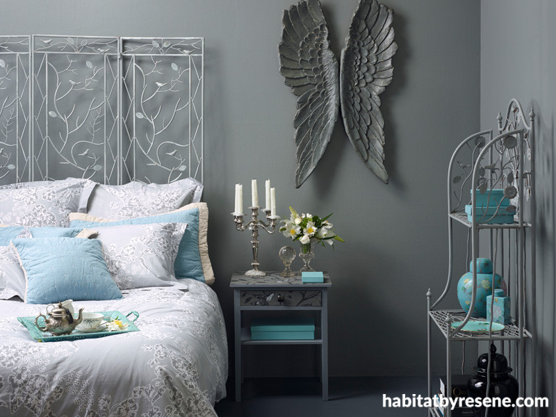
Another room recipe is more to do with accessories than colour, and sounds similar to the old wedding rhyme “something old, something new, then add shiny, reflective and a hue”. The old and new are easy enough, the ‘shiny’ is something high gloss, and reflective is a mirror or metallic item. And hue is about adding a colour. Doing this creates layers of interest and textures. Although it’s not in the rhyme, adding fur, suede or velvet has the same effect, just like the room at the start of this article.
Fabrics and wallpapers are great ways to build a colour scheme because all the hard work of “does this green match with that purple/orange/blue” has already been done by an expert.
Tip: if you are using a wallpaper to inspire a colour scheme (this is Urban Flowers 32722-1, available from Resene ColorShops), beware of picking an exact match of just one of the colours. Stand back, squint a little and choose a paint colour that goes with the overall tone of the wallpaper. Just like Monet paintings, the colours in a pattern can blur together and look quite different when viewed from across the room rather than close up. You want a colour that echoes the far-away view. One easy way to do this is to take a photo and load it into the Resene Palette Generator and it will turn it into a colour palette for you.
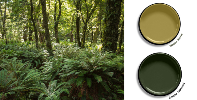
Our bush greens are greyer than you might think.
If you’re keen on echoing the colours and textures from outside the room, don't let the left side of your brain, which knows that ‘leaves are green’, do the choosing for you. Really look. A lot of New Zealand bush greens are surprisingly grey-green or black-green and not nearly as sharp as the colours we often point to first on a paint chart. Look at the colour against black not white and look at the largest sized sample you can.
Megan’s top tip: With all the decorating styles and choices available it’s easy to be overwhelmed or to lose focus on your style direction. A simple but effective way to stay on course is to choose a couple of words that describe how you want your home to be and feel. Emotive words, like welcoming or decadent, or casual. Use five words maximum. Then with every decision and purchase, ask yourself if it fits the description. Use it when you’re buying carpet, or when you’re tempted by a teapot. That way, you won’t end up with ‘orphans’ in your scheme.
Published: 11 May 2017

