
latest
habitat tv

Say goodbye to the morning scramble for keys, coats and sunglasses and hello to this… see this and more videos
blog

Re-living the 1980s through art
Clint C is an artist whose work instantly sparks recognition and joy. Based in Hamilton,… more
Colour tips from an expert
19 Nov 2014
Resene Christchurch colour consultant Becca Long talks colour schemes:
The four fundamental considerations when picking a colour scheme are: the age of your home; natural light; limitations (eg existing fixtures); and your favourite colours.
It’s essential to respect the age and style of your home. While it is definitely fun to push the boundaries, always respect your home. A super sleek white scheme may look gorgeous in a brand new modern home but an older home would benefit from warmer tones to prevent it from looking too bare and stark.
Natural light can alter your colours quite drastically. Note how some colours can stand bright light while others can appear too washed out under direct sunlight.
Where do you start?
Seek inspiration! Whether you flick through magazines while waiting in line at the supermarket, notice a striking home as you wait at the traffic lights or check out websites packed with ideas such as www.habitatbyresene.co.nz you’ll soon starting noticing what appeals to you. Jot down your ideas and bring them into Resene to chat to one of our colour specialists, such as myself! I’m available for on-site consultations too [link http://www.resene.co.nz/colorite/colour-consult.htm].
Once you get the juices flowing, start thinking about how the ideas would work in your home. If you are working with an existing home, consider the elements that aren’t changing such as your kitchen and flooring.
If you are building a new home, pick out your flooring and kitchen to start you off. These will be your most expensive purchases that need to last 10 or more years so it’s important to start with these and build up a scheme from here. Some kitchen finishes are limited while paint colours are not.
Things to avoid – are there colours that don’t go together?
I’m always amazed by new colour schemes and I love all the different colour ideas that my clients bring to the table, so don’t be afraid to mix it up. Everyone has different views and ideas about colour. It depends on where you are putting the colours and what you are trying to achieve. A bright orange feature wall matched with yellow polka dots on a white background would not be appropriate for a formal dining area but it would be a lot of fun in a child’s room!
When it comes to the living room or bedroom, there is no set rules for colour so have as much fun as possible! Having said that, ask yourself what mood you want to create. A soft grey could look gorgeous in a modern master bedroom matched with crisp white linen, a textured white duvet and a thick and fluffy rug whereas a soft grey in a tiny, south-facing child’s room matched with a bold and colourful bedspread could leave the soft grey looking cold and weak in contrast.
Impact of colours on moods
Colour has a huge impact on moods. Red for example raises our blood pressure, stimulates appetite and tends to make us lose track of time. Yellow on the other hand is the colour of optimism, confidence, extraversion, emotional strength, friendliness and creativity. Check out the Habitat Plus booklet called Colour Connection online http://www.resene.co.nz/homeown/Habitat-plus/Habitat-plus-01.htm
Colours, carpets and curtains – matching them up
Picking your carpet first, followed by your drapes and then your colours. Resene has thousands of colour choices to choose from and gorgeous curtains to match them. Our Resene Curtain Collection [link http://www.resene.co.nz/curtains.htm] offers your home a whole new dimension of pattern and texture.
What about lighting – can it change how colour looks?
Most definitely! I always recommend taking a Resene testpot home and trying it out on a large, A2 piece of card that you can get at your Resene ColorShop. Move the painted piece of card around the room and view in the middle of the room as well as in any dark dingy corners. Check out the colour during the day in natural light, as well as in the evening with any artificial light. A good wee trick too is to note the colour of your light bulbs. Changing your standard yellow bulbs to white can give a whole new look to your colours.
Current colour scheme trends
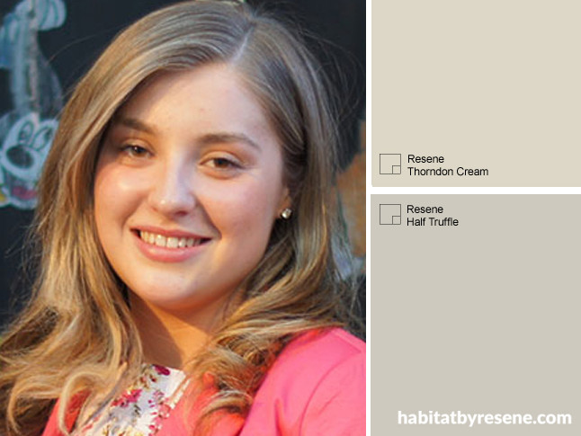
I’m personally seeing a rise in grey and green-toned neutrals here in Christchurch homes. Colours such as Resene Thorndon Cream, Resene Rice Cake and Resene Half Truffle are proving to be very popular. New Zealand as a whole is certainly pushing the boundaries and having fun with bolder and brighter colours, which is great to see. There is still a huge off-white (Resene Alabaster, Resene Black White) fan base out there too!
Published: 19 Nov 2014

