
latest
habitat tv

Say goodbye to the morning scramble for keys, coats and sunglasses and hello to this… see this and more videos
blog

Re-living the 1980s through art
Clint C is an artist whose work instantly sparks recognition and joy. Based in Hamilton,… more
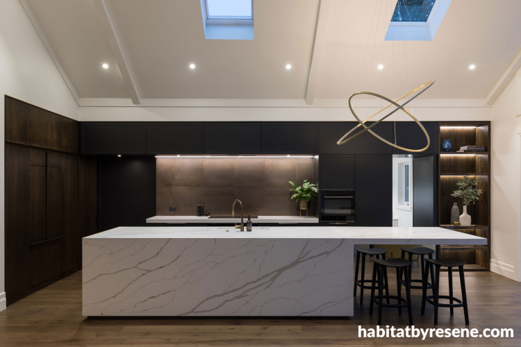
Jordan was looking for a deep neutral kitchen colour palette and painted the cabinetry in Resene Noir. Resene Noir was everything Jordan hoped, a lovely moody black with blue and grey undertones.

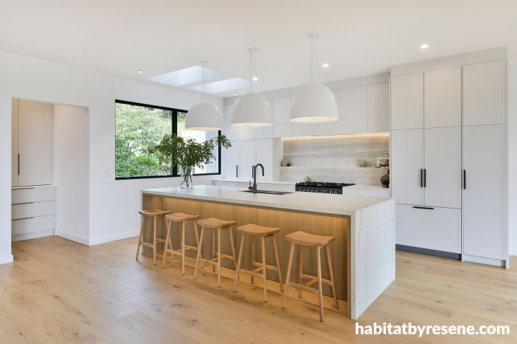
Jade’s design focusses on creating a bright and spacious kitchen with Resene Alabaster on the walls and ceiling. With 2.8-metre-tall cabinetry, Jade needed a cabinet colour that wouldn’t be too imposing or clinical. Resene Triple Sea Fog gave a hint of misty grey colour while keeping the space feeling light and fresh. La Bella Kitchens manufactured the kitchen.

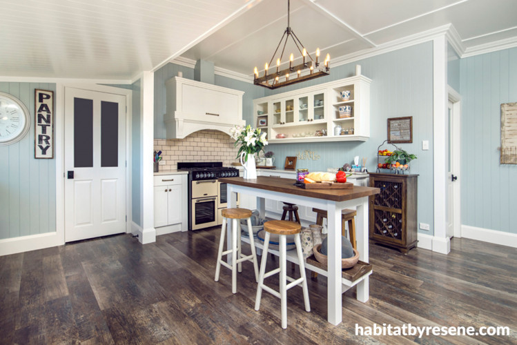
Kirsty chose soothing Resene Emerge in this cottage kitchen and finished the look with cabinetry, trim and ceiling in Resene Quarter Rice Cake.

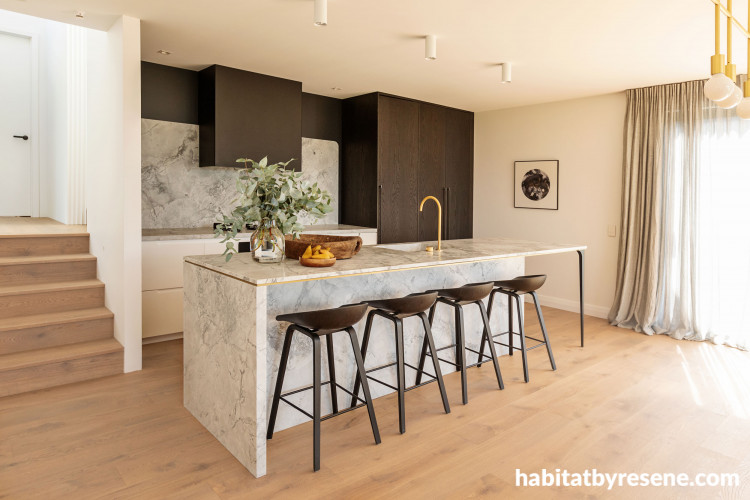
Kate used Resene Fuscous Grey on the feature wall behind the splashback to create drama and anchor the tall dark cabinetry. Use Resene Alabaster for a crisp white wall and ceiling finish. Image by Emma MacDonald from Fotographicsnz.

Designer Hannah Hebson says she chose Resene Bismark and Resene Rainee for this Tasman kitchen to bring a freshness to the open-plan space while also complementing the home’s countryside surroundings. The walls are Resene Bianca and the ceiling is Resene Alabaster.

Amanda finished the joinery in Resene Lip Service, Resene Scotty Silver and Resene Time Warp. The owner, a prominent New Zealand artist, mixed the Resene colours himself for the walls. For a similar cheerful yellow hue, try Resene Buttercup.

Dane chose cabinetry painted in Resene Dark Knight to add elegance to their Queenslander. Pair Resene Dark Knight with green-based whites such as Resene Half Thorndon Cream or Resene Rice Cake.

7 kitchen designers share their top kitchen design tips and Resene colour choices
We’ve rounded up some of the most drool-worthy kitchens and their talented designers to bring you a smorgasbord of advice to spice up your kitchen with colour. With a sprinkle of clever design hacks and a dash of Resene paint, you’ll be serving up a feast for the eyes in no time.
The kitchen is the perfect place to go bold with colour. A kitchen is so much more than a space to prepare food; it’s a place to get creative, baking, brewing and creating delectable dishes, it’s a place where we spend quality time with family and friends, it’s the space we turn to when we want a celebratory drink or a comforting snack after a long day. Ultimately, the kitchen is one of the most important areas of the home, so why not concoct something wonderful for the space itself.
Our perception of certain colours alter our perception of food and can make certain foods more appealing, think sunny citrus yellows and creamy blues. A kitchen renovation can be daunting, but these eight kitchen designers are sharing their wisdom and tips for nearly every style of home, making it easier for you to dig in and get painting.
Jordan Kroon from Gold Kitchens

Jordan was looking for a deep neutral kitchen colour palette and painted the cabinetry in Resene Noir. Resene Noir was everything Jordan hoped, a lovely moody black with blue and grey undertones.
Jordan is a kitchen designer for Gold Kitchens and has a distinctive style when it comes to her colour palette. She embraces neutrals to create sleek, stylish kitchen designs for every style of home. This kitchen design was centred on the high-pitched ceilings and abundance of natural light, with dark Resene Noir chosen to ground the room. Designed for a busy modern family, Jordan incorporated traditional elements that tie into the age of the home and included antique brass handles, tapware and shaker doors. When it comes to choosing colours for your kitchen, Jordan recommends four main aspects to consider:
- Consider the amount of natural light, as well as what type of reflections you will get from your chosen colour and finish. For example, if you’re going for a dark kitchen colour palette, make sure the space is bright enough.
- Room size is an important factor. For example, darker colours will make a room feel smaller or unbalanced placement of feature colours can make an area of the kitchen too visually heavy.
- It is very important to choose colours that fit well with your own décor as well as being sensitive to the home’s era. Your choice needs to complement the interior features and existing or new paint colours.
- Consider how timeless your colour combination is. Think of the longevity of the colour in terms of fashion and resale value. Choosing your colour palette to suit the style of the house is essential as it provides an ambience that is in sync with your architectural features and design.
Jordan’s top tip: Be brave and mix up textures, materials and colours to gain a more bespoke feel to your kitchen. Have a point of interest or luxury feature, whether that be through pendant lighting and bar stools or brass tapware and handles, feature splashbacks or bold colour cabinetry. Clean lines and balance in every style of kitchen will be pleasing to the eye. Kitchens should be beautiful and inspiring in our day to day lives!
Check out Gold Kitchen’s website here or Jordan’s Instagram here
Read more: Kitchens - is it blue for you?
Read more: Smart and colourful solutions for supersizing your kitchen
Read more: The perfect kitchen island
Jade York Design

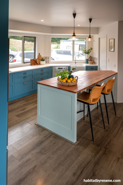
Jade’s design focusses on creating a bright and spacious kitchen with Resene Alabaster on the walls and ceiling. With 2.8-metre-tall cabinetry, Jade needed a cabinet colour that wouldn’t be too imposing or clinical. Resene Triple Sea Fog gave a hint of misty grey colour while keeping the space feeling light and fresh. La Bella Kitchens manufactured the kitchen.
Jade York creates bright, sophisticated kitchen spaces often inspred by the nature of the home she is working with. “This kitchen design was inspired by the open plan home and the homeowner’s appreciation for Californian kitchens and design,” says Jade. Californian homes are generally spacious and light-filled with large light fittings and an emphasis on symmetry. “I took inspiration from the classic Californian kitchen’s profiled door and created a more contemporary version for this kitchen.
“My clients’ love for a lighter colour palette inspired the muted colour scheme for the kitchen and I used texture to create visual interest.”
The kitchen is not a standalone space and Jade recommends taking the colour palette of the house into account when choosing kitchen colours.
“I always think about the way I want the space to feel. Do I want to create a kitchen that feels spacious and bright or a kitchen that exudes warmth and cosiness, drawing people in,” says Jade.
“As well as influencing the way we feel, colour can set the tone for what happens in a space; is it a kitchen for entertaining, for seated family meals or for the serious home chef.
“Colour can also be used to draw attention towards or away from certain aspects of the kitchen so think of anything you want to emphasise or disguise.”
Jade’s top tip: A designer’s best friend is samples! Get samples of all the paints, materials and finishes you are considering using for your kitchen and lay them out together on a white board. This way you can quickly assess whether your colours and textures work well together. Remember to take the samples or swatches with you when looking at other products.
See more of Jade’s work on her Instagram account Jade York Design
Kirsty Wraight from David Wraight Cottages

Kirsty chose soothing Resene Emerge in this cottage kitchen and finished the look with cabinetry, trim and ceiling in Resene Quarter Rice Cake.
Kirsty Wraight of David Wraight Cottages designed this kitchen with a country style in mind to complement the home’s rural setting. The home includes lots of detail throughout the interior and Kirsty felt it was important to bring this into the kitchen as well.
“All the detail adds flow to the home,” says Kirsty.
“I love colour in a kitchen as it adds warmth. I spend a lot of time there, so I feel that the Resene Emerge walls add depth and warmth. It’s an inspiring room to work in.
“Colour goes hand in hand with older style character homes. You can pare them back with neutrals, but colour adds something special.”
Kirsty recommends matching colours to the style of house to ensure the whole space flows seamlessly and the colours work with the architecture of the home. She uses an array of Resene colours in her kitchen designs. “Everyone knows Resene colours – as well as the old favourites it is always fun to discover a colour I haven’t used before and work out where I think it will look great.”
Kirsty’s top tip: Be yourself and work out what is important to you ahead of copying trends, which may not work in the space you have available.
Learn more about David Wraight Cottages here
Kate Gardham from Sticks + Stones

Kate used Resene Fuscous Grey on the feature wall behind the splashback to create drama and anchor the tall dark cabinetry. Use Resene Alabaster for a crisp white wall and ceiling finish. Image by Emma MacDonald from Fotographicsnz.
Kate Gardham co-owns Sticks + Stones; a boutique design and construction business that creates elegant kitchen designs. Her latest kitchen renovation is characterised by a moody Resene Fuscous Grey feature wall. “The dark painted wall accentuates the subtle curved splashback and allows the veined granite to be the hero of the kitchen,” says Kate. “Simplicity, luxury materials, and texture are very important to us as we love depth and tactility with colours and finishes.”
Kate always looks at the light levels in the kitchen before creating a colour palette. Style is also very important, especially how the homeowner’s style, furniture and artwork will relate to the new design. When Kate looks for design inspiration, she likes to keep her mind open, sometimes even a colour from the homeowner’s favourite cushion can be a starting point for an amazing colour palette.
Kate’s top tip: Always take into consideration the size of the kitchen, as it will indicate how light or dark your colour palette should go. Looking at the size and layout of the kitchen also suggests spaces that could be ideal to add in accent colours or arrange the kitchen into two-tone colour blocks.
Check out more work from Sticks + Stones on their website, Instagram or Facebook
Hannah Hebson from Cooper Webley Joinery

Designer Hannah Hebson says she chose Resene Bismark and Resene Rainee for this Tasman kitchen to bring a freshness to the open-plan space while also complementing the home’s countryside surroundings. The walls are Resene Bianca and the ceiling is Resene Alabaster.
Hannah Hebson of Cooper Webley joinery created a kitchen design for this home in Nelson’s Redwood Valley which is awash with calm blue hues, inspired by a client’s wish to go bold and beautiful. “The clients – a couple with boys in their early teens – wanted a country kitchen that was fun and colourful. It needed to make a statement among the white walls that were used throughout the house. But from the start, they were torn between having a blue and green kitchen.” Hannah says she was initially stumped by the idea. “We rarely get clients who want to be that bold with their cabinetry.
“It’s usually the same white-on-white or woodgrain accent. But I was excited by the challenge. I played around at first with darker tones, but they still wanted the kitchen to be light and bright.”
Hannah says she knew she was onto a winner when she found the colours Resene Bismark and Resene Rainee. “The teal blue of Resene Bismark and the mint green of Resene Rainee tied together perfectly and, when teamed with the timber benchtop and patterned tile, created the exact look they were after.”
She says the selection of a white stone benchtop and a wooden countertop to ‘break’ the cool blue hues make the room welcoming. “These materials and the two colour choices, paired with Resene Bianca walls makes the space successful. The large window, which bathes the kitchen in natural light, works well with the colours.”
Top tip: Ensure you allow enough space around the work zones in the kitchen to ‘spread out’ when prepping, cooking, and cleaning. When creating a kitchen design, always consider who lives in the home and how they will use the space.
See more of Cooper Webley’s design here
Amanda Smith from AS Design

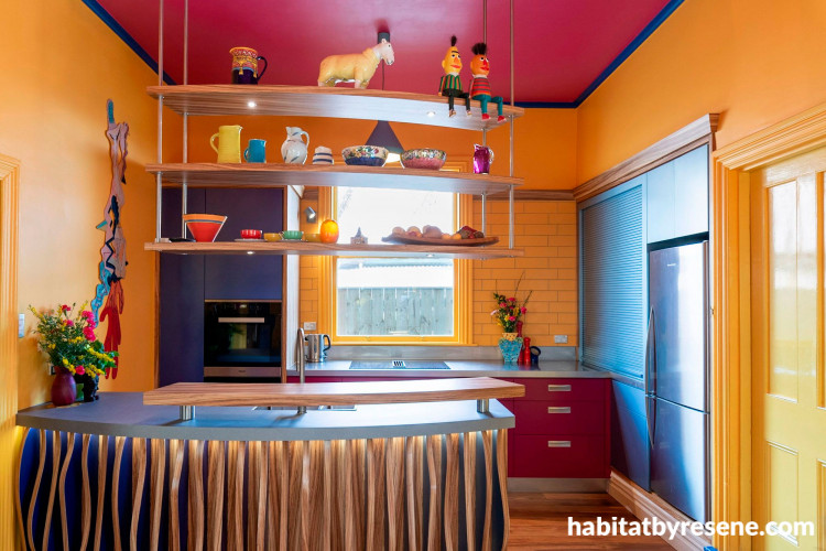
Amanda finished the joinery in Resene Lip Service, Resene Scotty Silver and Resene Time Warp. The owner, a prominent New Zealand artist, mixed the Resene colours himself for the walls. For a similar cheerful yellow hue, try Resene Buttercup.
Amanda Smith of AS Design in Wellington renovated and restored this much-loved colourful family kitchen, maximising function in a tight space while creating interest with shapes, colours, textures, and finishes. She expertly balanced timber tones with deep Resene Lip Service and metallics Resene Scotty Silver and Resene Time Warp. “The metallics were a risk that paid off – by attempting to replace a previously loved hammered textured metallic finish which had seen its day. I presented the idea of using a more refined Resene metallic for certain elements of the joinery,” says Amanda. “I ensured that each colour was represented in a balanced way, avoiding colour chaos and instead allowing the eye to move through the space harmoniously.
“I believe the ultimate success of this kitchen is the way that not one of the colours or textures overtakes or dominates the space, each holds its own and plays its part in enhancing the form and flow of the kitchen space.”
Inspiration can come from anywhere, and for this kitchen aesthetic Amanda was inspired by another client’s piece of artwork featuring patterns that changed with the light. To further increase the drama, she lit the underside of the kitchen bench to create a day/night
dynamic, giving the kitchen an opportunity to re-invent itself throughout the day.
“The result is a lively, energising space than can be revved up or calmed down throughout the day. This kitchen space is a true collaboration of where form and function can both exist in unity!”
Amanda’s top tip: Begin your kitchen design with the shape of the space. Manipulate the functional elements and establish their relationship to one another to ensure the space works harmoniously. Next, approach each functional element individually and begin to build up layers of texture, form, and interest. It’s especially important to establish a clear connection between the existing features of the home and the new design.
See more work from AS Design here
Peter Barrass and the Kitchen Evolution team

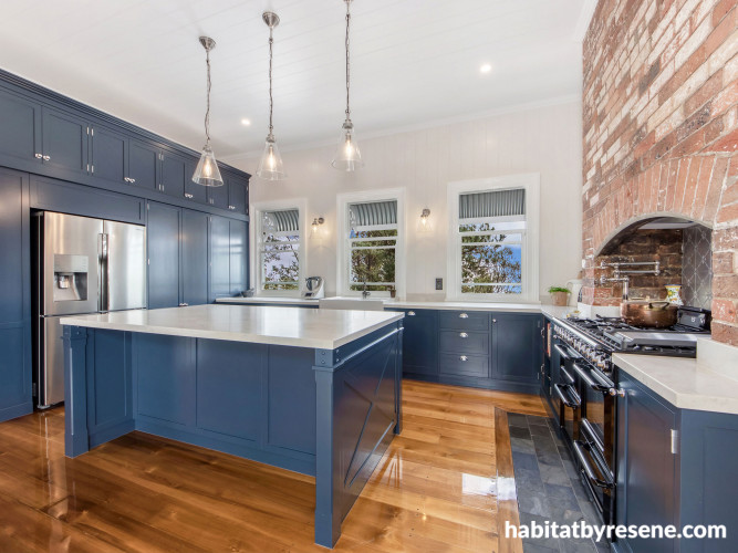
Dane chose cabinetry painted in Resene Dark Knight to add elegance to their Queenslander. Pair Resene Dark Knight with green-based whites such as Resene Half Thorndon Cream or Resene Rice Cake.
Designer Peter Barrass enlisted the help of Dane Hancock and Brisbane’s Kitchen Evolution team to create a serene oasis in this early-1900s Queenslander. The brief from the homeowners was clear: “They wanted a timeless aesthetic suited to the remainder of the house as well as room for the family and space for entertaining,” says Dane, who painted the kitchen’s shaker style cabinetry in Resene Dark Knight, a slate blue. “They liked the look of the dark blue against the rich honey colour of the pine floor and the original brick fireplace.
“They didn’t select blue for anywhere else in the home, which makes the kitchen a standout feature.
“The darker blue colour complements the timber beautifully, giving the kitchen a nice warm feel. The benchtops are a beautiful contrast to Resene Dark Knight. The colour brings out the character of the white stone.”
Top tip: To create a striking space, feature a mix of classic and contemporary elements. Creating a functional hub is also important, so combine aspects such as generous bench space and storage with practical cooking appliances.
See more of Kitchen Evolution’s work here
Top tip: Remember to make sure your designer specifies Resene AquaLAQ for your painted cabinetry to ensure that your cabinets are the authentic Resene colour you have chosen. Resene tinters are only available in Resene paints. There are many horror stories from clients who have chosen their colour only to find the supplier has used a cheaper product and the colour is wrong and doesn’t look like the one they chose.
Published: 29 Jul 2021
Do you have a home full of wonderful Resene paint and colour? Send us some snaps by emailing [email protected].


Resene Triple Sea Fog
Resene Quarter Rice Cake
Resene Double Alabaster
Resene Scotty Silver
Resene Half Thorndon Cream
the look
If you're stuck on what
colour to use or need colour
advice, try out the Resene
Ask a Colour Expert service.
Resene Triple Sea Fog
Resene Quarter Rice Cake
Resene Double Alabaster
Resene Scotty Silver
Resene Half Thorndon Cream
the look
If you're stuck on what
colour to use or need colour
advice, try out the Resene
Ask a Colour Expert service.

