
latest
habitat tv

Say goodbye to the morning scramble for keys, coats and sunglasses and hello to this… see this and more videos
blog

Reader roundup: Happy dogs, custom colours and a small Resene fan
We love to share what you have been up to with Resene paints and products!… more
 look book
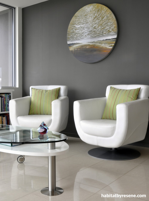
So many of us think of neutral paint colours as white or cream but neutrals don’t just stop there. When it comes to paint, the definition of a neutral colour means those on the spectrum between brightest white to deepest black, many of which have just a touch of other colours to lend character.
Many of the popular dark neutrals in recent years have had a toasting of brown, like Resene Masala shown above, whereas current trends are heading towards truer charcoals or even those with a bluish tinge. Lighter neutrals, however, are heading towards those with green undertones. Here are some examples, mostly off the Resene Whites & Neutrals chart, of the different types of dark neutrals and the effect they can have:
- Toasty neutrals, like Resene Napa, Resene Oilskin and Resene Mondo. The big advantage of these colours is that you can use them quite dark yet keep that lovely soothing warm quality that a tinge of aromatic, coffee bean or chocolate brown will bring.
- Going greenish, with Resene Tapa or Resene Masala. These colours give a more complex earthy twist to darker neutrals and have the ability to look quite different from room to room depending on the light and orientation.
- Truer charcoals like Resene Gravel, Resene Double Stack and Resene Quarter Fuscous Grey. Flinty and sophisticated, these colours lend a cool urban edginess.
- Midnight madness: Switch from the Resene Whites & Neutrals chart to the Resene Multi-finish palette collection to find inky charcoals with a velvety blue tinge like Resene True Blue or Resene Rhino. Add a drop of red to get rich purpley aubergine tones like Resene Valhalla.
Darker neutrals look amazing in interiors, and can be used in so many ways. Ideal on their own or to anchor a scheme, they provide a soulful backdrop for brighter, more intense feature colours.
As a whole-room solution, team dark neutrals with cream or crisp white trims. This works especially well with older homes where the skirtings, architraves and cornices are likely to be more ornate and will be beautifully highlighted by the contrast with smoky dark walls.
Darker colours immediately make a room feel more intimate and cosy - great for bedrooms, media rooms or large living spaces. Alternatively, use one dark wall to visually change the dimensions of the room. A far wall painted in a dark colour can make it appear closer, and therefore ‘correct’ the dimensions of a long, narrow room.
Use a dark wall colour to offset a particularly beautiful sideboard, mantelpiece, free-standing bath or upholstered chair.
Tip: Make sure you use Resene paint as the base for your Resene colour, especially dark shades. I visited a house recently where the owner complained that her painter had to apply about six coats of paint to her headboard wall before he achieved the right depth and coverage. Turns out he hadn’t used a Resene paint at all but had another cheaper brand of paint tinted to a colour match of the Resene colour. An expensive mistake! Not only did it cost a lot more in labour than it would have cost to buy the right paint the first time but the colour wasn’t right either because it wasn’t made using the Resene tinters or formulation. Resene paints are renowned for their quality and coverage.
You can add drama to a dark room by introducing a sharp colour, like chartreuse green, yellow or teal, or a bright one like red or orange.
Contrary to popular belief, dark walls are a superb backdrop to artworks. The accepted norm is to use white walls but dark walls can have the same effect, especially for artworks set within simple white picture frames.
If a full colour scheme of dark neutrals is too much for you, go tonal by using varying shades of the same neutral in different rooms. The Resene The Range Whites & Neutrals fandeck (see pdf) is particularly useful for this with its varying strengths of the same colour displayed on the same card.
Tip: Make sure your lighting is up to the task. Dark walls will absorb light so you may need to beef up your lighting to compensate. Spreading the light around the room, rather than just having a central ceiling fixture, helps distribute more light but also gives you flexibility – you can just use side lamps for intimate evenings or use more light sources for general light.


An old French school table is converted for use as a vanity in this rich bathroom, part of a renovation designed by architect Lloyd Macomber of Salmond Reed Architects. The walls are Resene Triple Mondo.


If you want dark walls to have a bit of texture or interest to break the effect either paint over one of the anaglypta wallpapers available through Resene or use a wallpaper like this one from Schoner Wohnen 2011 (no 2269-45), also available at Resene.

If very dark neutrals are too much, go a notch lighter with something like Resene Shady Lady, used in this master bedroom in a renovation by Yellowfox.

Resene Masala is used as a backdrop to dramatic white furniture in an apartment designed by Brisbane-based Phorm Architecture + Design. The trims and ceiling are Resene Alabaster.


Another shot of the Brisbane apartment. Resene Masala was chosen for the walls by the designers Phorm Architecture + Design because it echoes the industrial and urban tones of the city beyond the windows.

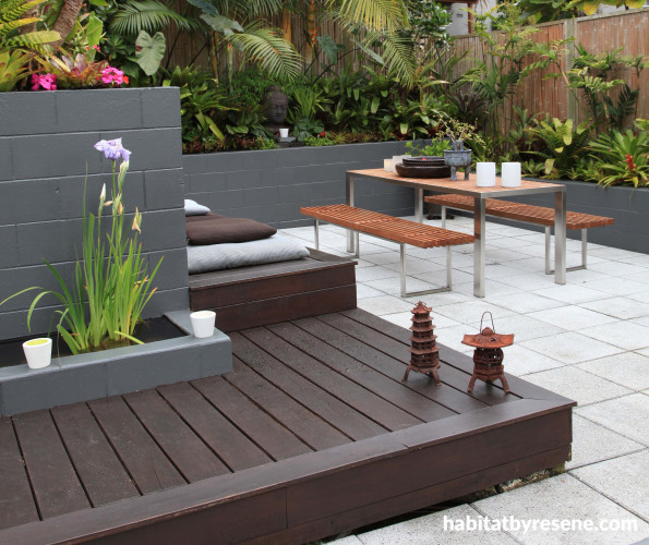
Super neutrals are also extremely useful outside, not only as background fences to blend in behind plants but as feature walls such as Resene Gravel used in this garden designed by Jules Moore and featured in the latest Habitat magazine.

Meet the super neutrals: smoky and delicious
Published: 11 Apr 2013
Do you have a home full of wonderful Resene paint and colour? Send us some snaps by emailing [email protected].
Bitter browns, industrial charcoals, swampy greys
So many of us think of neutral paint colours as white or cream but neutrals don’t just stop there. When it comes to paint, the definition of a neutral colour means those on the spectrum between brightest white to deepest black, many of which have just a touch of other colours to lend character.
Many of the popular dark neutrals in recent years have had a toasting of brown, like Resene Masala shown above, whereas current trends are heading towards truer charcoals or even those with a bluish tinge. Lighter neutrals, however, are heading towards those with green undertones. Here are some examples, mostly off the Resene Whites & Neutrals chart, of the different types of dark neutrals and the effect they can have:
- Toasty neutrals, like Resene Napa, Resene Oilskin and Resene Mondo. The big advantage of these colours is that you can use them quite dark yet keep that lovely soothing warm quality that a tinge of aromatic, coffee bean or chocolate brown will bring.
- Going greenish, with Resene Tapa or Resene Masala. These colours give a more complex earthy twist to darker neutrals and have the ability to look quite different from room to room depending on the light and orientation.
- Truer charcoals like Resene Gravel, Resene Double Stack and Resene Quarter Fuscous Grey. Flinty and sophisticated, these colours lend a cool urban edginess.
- Midnight madness: Switch from the Resene Whites & Neutrals chart to the Resene Multi-finish palette collection to find inky charcoals with a velvety blue tinge like Resene True Blue or Resene Rhino. Add a drop of red to get rich purpley aubergine tones like Resene Valhalla.
Darker neutrals look amazing in interiors, and can be used in so many ways. Ideal on their own or to anchor a scheme, they provide a soulful backdrop for brighter, more intense feature colours.
As a whole-room solution, team dark neutrals with cream or crisp white trims. This works especially well with older homes where the skirtings, architraves and cornices are likely to be more ornate and will be beautifully highlighted by the contrast with smoky dark walls.
Darker colours immediately make a room feel more intimate and cosy - great for bedrooms, media rooms or large living spaces. Alternatively, use one dark wall to visually change the dimensions of the room. A far wall painted in a dark colour can make it appear closer, and therefore ‘correct’ the dimensions of a long, narrow room.
Use a dark wall colour to offset a particularly beautiful sideboard, mantelpiece, free-standing bath or upholstered chair.
Tip: Make sure you use Resene paint as the base for your Resene colour, especially dark shades. I visited a house recently where the owner complained that her painter had to apply about six coats of paint to her headboard wall before he achieved the right depth and coverage. Turns out he hadn’t used a Resene paint at all but had another cheaper brand of paint tinted to a colour match of the Resene colour. An expensive mistake! Not only did it cost a lot more in labour than it would have cost to buy the right paint the first time but the colour wasn’t right either because it wasn’t made using the Resene tinters or formulation. Resene paints are renowned for their quality and coverage.
You can add drama to a dark room by introducing a sharp colour, like chartreuse green, yellow or teal, or a bright one like red or orange.
Contrary to popular belief, dark walls are a superb backdrop to artworks. The accepted norm is to use white walls but dark walls can have the same effect, especially for artworks set within simple white picture frames.
If a full colour scheme of dark neutrals is too much for you, go tonal by using varying shades of the same neutral in different rooms. The Resene The Range Whites & Neutrals fandeck (see pdf) is particularly useful for this with its varying strengths of the same colour displayed on the same card.
Tip: Make sure your lighting is up to the task. Dark walls will absorb light so you may need to beef up your lighting to compensate. Spreading the light around the room, rather than just having a central ceiling fixture, helps distribute more light but also gives you flexibility – you can just use side lamps for intimate evenings or use more light sources for general light.
pictures
Photograph by Juliet Nicholas. Interiors by Wendy Campbell.
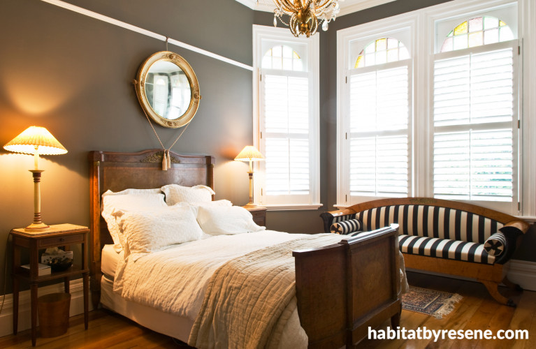
Dramatic yet restful

Resene Mondo walls create a moody and dramatic contrast to trims and internal shutters in Resene Alabaster for this master bedroom.
pictures
Photograph by Mark Heaslip
A bold treatment for a bathroom
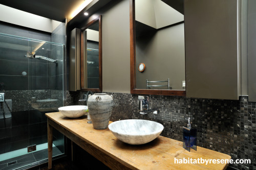
An old French school table is converted for use as a vanity in this rich bathroom, part of a renovation designed by architect Lloyd Macomber of Salmond Reed Architects. The walls are Resene Triple Mondo.
pictures
Photograph by Mark Heaslip
Go funky industrial
If you want dark walls to have a bit of texture or interest to break the effect either paint over one of the anaglypta wallpapers available through Resene or use a wallpaper like this one from Schoner Wohnen 2011 (no 2269-45), also available at Resene.
pictures
Photograph from Vision Wallcoverings
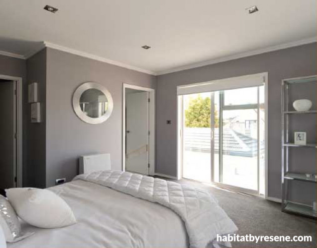
Go a few steps lighter

If very dark neutrals are too much, go a notch lighter with something like Resene Shady Lady, used in this master bedroom in a renovation by Yellowfox.
Offsetting designer pieces
Resene Masala is used as a backdrop to dramatic white furniture in an apartment designed by Brisbane-based Phorm Architecture + Design. The trims and ceiling are Resene Alabaster.
Echoing industrial and urban tones
Another shot of the Brisbane apartment. Resene Masala was chosen for the walls by the designers Phorm Architecture + Design because it echoes the industrial and urban tones of the city beyond the windows.
Take it outside

Super neutrals are also extremely useful outside, not only as background fences to blend in behind plants but as feature walls such as Resene Gravel used in this garden designed by Jules Moore and featured in the latest Habitat magazine.
pictures
Photograph by Sally Tagg

the look
If you're stuck on what
colour to use or need colour
advice, try out the Resene
Ask a Colour Expert service.
more inspiration

Liam’s Cambridge bungalow has been transformed by a light and earthy palette
Having completed a number of renovations in Auckland with his… more

A pragmatist’s guide to future proofing your home
If you’ve found a home you plan to stay in… more

Black and white and fab all over
There's a phrase in interior decorating that claims that "every… more

Kathy and Greg’s character villa gets a cosy update
15 years ago, when Kathy and Greg Chiles purchased their… more

This stunning showhome proves that neutral need not be bland
Designed as a showhome for Masonry Design Solutions (MDS) to… more
the look
If you're stuck on what
colour to use or need colour
advice, try out the Resene
Ask a Colour Expert service.

