A city warehouse where home living, work and play are defined by colour
Working at home is the trending topic of 2021 - and nothing suits business consultant Cath Vincent and music producer Aron Neale better than working in their own 1950s converted warehouse designed by Lisa Day of DonnellDay Architects, surrounded by hot colours from the Resene palette.
“We both live, work and play from home in the creative environment we’ve developed. On our most exciting and fulfilling workdays, we haven’t even left the house,” Cath says and she has chosen a deliberately minimalist palette to define work/life in this urban space.
“I find it blissful to work from home! I have a dedicated home office upstairs so I am clear when I am “at work” and when I’m not. We probably work more hours, but when you really love your work it stops being about work-life balance, it’s all just life,” she says, attributing the quote to Richard Branson.
Cath and husband Aron (who also uses the artist name Jesse Wilde) have chosen just a couple of strong colours that define each space - using a pure red in their working areas for an energy burst with dark grey as a counterpoint and sticking to a pure white in the living areas.
Cath went to the experts for help on the colours, inviting the Resene Colour Expert over and together they went through the colour books. “We lined up various shades until we figured out the best combination.”
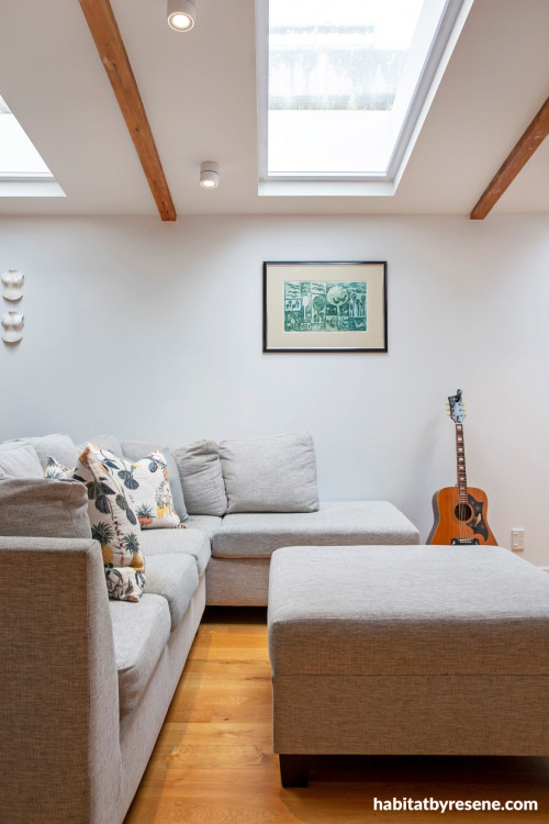
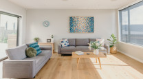
Resene Alabaster was chosen for the wall for the living areas – it’s defined as a near-white with a light blackened edge in the Resene colour charts, but to most people it’s a pure white, and a very popular one.
“The basic ‘blank canvas’ colour for both upstairs and downstairs is a pure white [Resene Alabaster] I like the simplicity of the walls, the ceiling, the skirting boards and the doors all being the same,” Cath says.
“We chose a pure white which might look cold in some houses but works great in ours because our space is flooded with natural light from the skylights which always feels warm.”
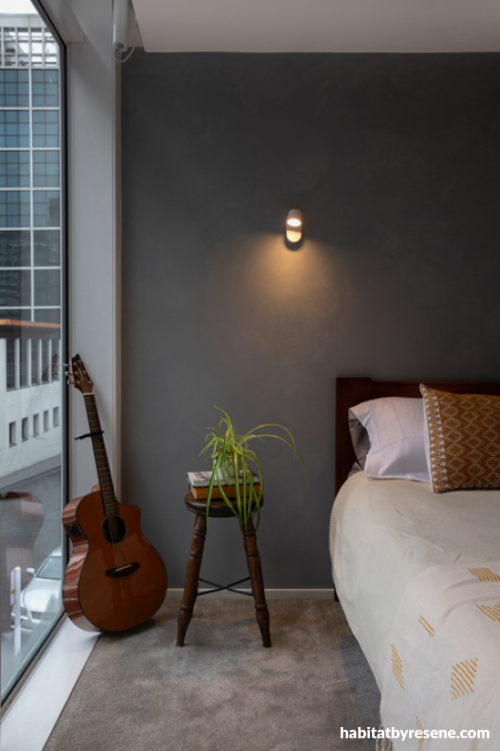
For the bedroom Cath and Aron chose the aptly named Resene Nocturnal a deep charcoal grey, perfect for a room that echoes the deep night sky. Cath says she was surprised how much she loved the colour.
“I think colours are for specific occasions depending on the mood – they’re for a reason, a season or a lifetime! I love orange, Aron loves red. I suppose the surprise for me is how much I am drawn to the beautiful dark grey Resene Nocturnal.”
Knowing that Resene has the ability to colour match any colour and with advice from the Resene Colour Consultant, Cath chose a colour she’d previously came across in Aron’s work (a Pantone colour, PMS 200C) as the exact red she wanted in the workspaces. This and other colours were also used in their branding, on their signage and on the street door, as they wanted a consistent theme. The red was custom mixed by Resene and Cath calls it Wilde Red in honour of Jesse’s studio. The Pantone colour system or the PMS is a universal standard to allow designers to "colour match" specific colours and is used by graphic designers through to paint manufacturers. The woodwork is painted in Resene Nocturnal which gives a solid frame to the explosive red.
Cath is a consultant helping businesses improve their profitability and get more work-life balance, a motivational conference speaker and a speaking coach. She wanted a space to run training events, and Aron needed a music studio, for his business Studio 38. Finding a warehouse they could convert to a home and studio had been a dream for many years.
“My husband and I had long had a vision to own a warehouse style building in which we could create a creative, motivational hub, a place where people could fulfil on their dreams.
“I happened to meet architect Lisa Day at a networking event and we really connected. I told her ‘One day we’re going to find this warehouse building and create something amazing, and when we do I want you to be the architect’. Seven years later, I phoned her up and told her ‘We found the building, let’s get started’.”
The warehouse has a bit of history. In 1957 it started as a textile factory then went on to house a manufacturer who made designer French style fashion, it was an acting/film studio and later it was a night shelter for homeless people.
When they bought this warehouse, it was derelict space, with few redeeming features. “When we bought it, it had been a methamphetamine lab, “says Cath, “It took seven months for us to decontaminate it before we could even start work, so there were a lot of financial pressures and impatience to get on with the project. Once we had Auckland Council approval of the completion certificate of the cleansing work, there were a lot of walls to demolish, and it was very physical work.”
Finally, they moved into the concrete shell which was just one big open space with no walls, no ceilings, hardly any electrics, a tiny bathroom and no kitchen! “All our friends were a bit shocked that we were seriously going to live here while the work was underway,” she recalls.
The renovation took three years, working with architect Lisa Day of DonnellDay, and Cath says while the workspaces were created first, the upstairs living areas took longer. “It was gritty and disgusting [at first], and because of living through that chaos I really appreciate the serenity of the calm colours.”
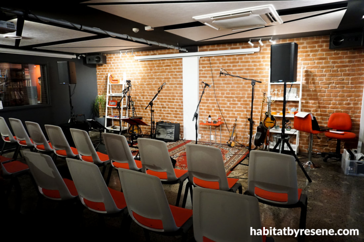
Studio 38 encompasses Wilde Records music studio, an event space that can seat 50 theatre-style and a TV studio for Cath. It called for a combination of tastes.
“Now that I reflect on it, I am a structured person who is a little creative. My husband is a creative person with a little structure. I think we’ve have put together a minimalist backdrop in which creativity can shine.
“For me it’s about both workability and beauty,” Cath says.
Cath says the final result is a dream come true. “I still feel I can’t quite believe it. I love how it’s turned out and I feel gratitude every day for it.”
See more of Studio 38, including the Airbnb at www.s38.co.nz/contact.html.
For more work from Lisa Day and DonnellDay architects visit www.donnellday.co.nz.
Top tip:
Need advice on what paint colours will match other colours, will evoke a mood or look great in your particular project? Get free advice through the online Resene Colour Expert service, www.resene.com/colourexpert. Send your decorating or colour question to the Resene colour experts. Or book a Resene colour consultation – virtually, in store or at your home, www.resene.com/colourconsult.
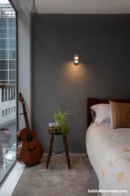
Resene Nocturnal is the perfect shade for a moody wall, in a room dedicated to sleeping. In the daytime the space is flooded with natural light and looks on to an inner city street. Close the blinds, and the room is dark and yes, nocturnal. The ceiling and trims are Resene Alabaster.

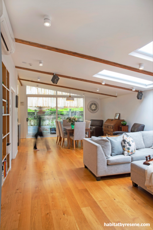
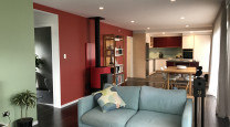
“My favourite room is the open plan kitchen/dining room/lounge. Okay, that’s really three rooms,” says Cath. “From the moment I wake up and sip my morning coffee looking out at the garden, looking out at the garden, to chilling out on the sofa at night, I just love how it functions in so many different ways.” Cath chose Resene Alabaster for the walls and ceiling.
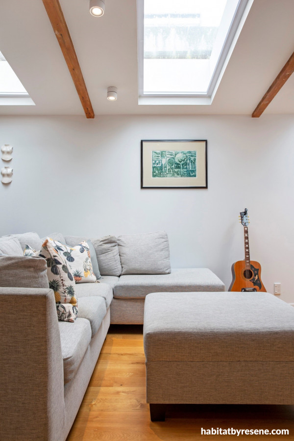
Resene Alabaster used on walls and ceiling compliments the exposed woodwork and timber flooring in the open plan lounge in the converted warehouse.
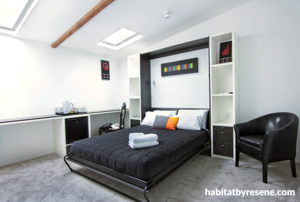
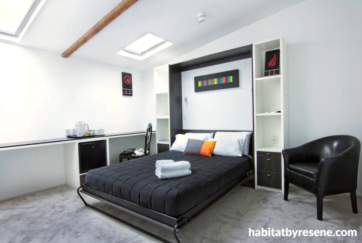
This room is rented on Airbnb as a self-contained room with street access. “We wanted to create quite different moods for the upstairs where we live and rest, and downstairs where we work and create,” Cath says, choosing Resene Alabaster as a pure and restful white for the bedrooms and living spaces. Resene Nocturnal is an accent in the bookcase frame.
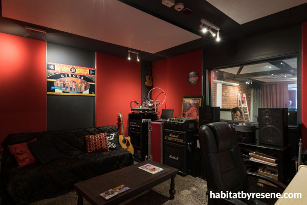
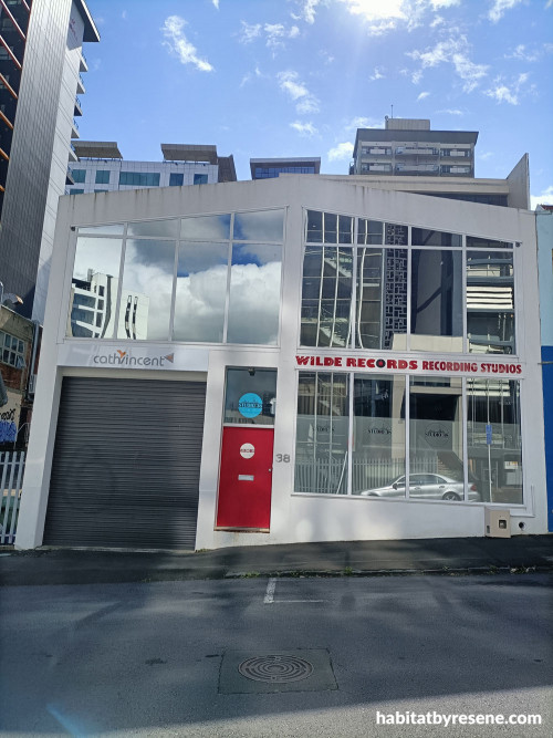
Wilde Records Recording Studio where sound engineer and performer Aron Neale (his artist name is Jesse Wilde) records his own work and that of many others. James Reid from the Feelers, Jason Kerrison from Op Shop and Midge Marson have all collaborated here. Resene custom mixed this colour - try Resene Smashing for similar, with Resene Nocturnal on the beams and woodwork.

In the TV and music recording studio the dark grey on the walls is Resene Nocturnal. “The key feature of our downstairs space is a beautiful dark grey. It really grounds the space and looks beautiful against our brick wall, and the pure white of the woodwork,” Cath says. Red on the seating is also matched to the paint colour.

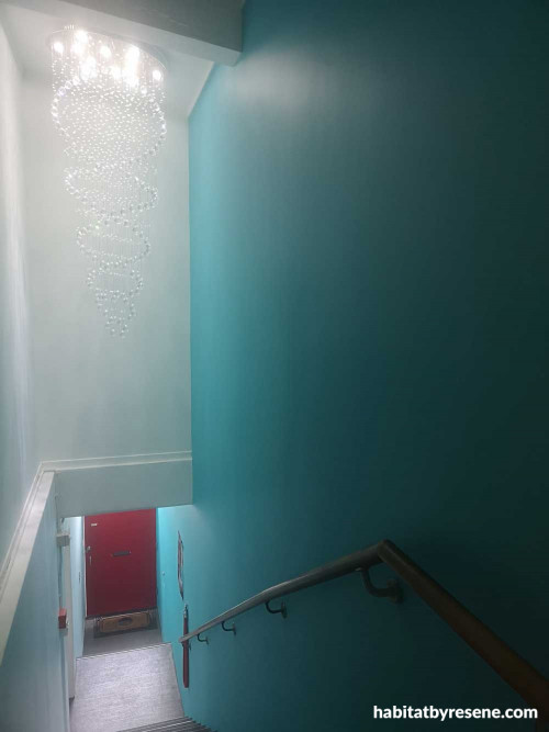
In the stairwell Cath selected Pantone 3115C (3502) as the contrast to the vibrant red of the door. Resene colour matched it to create a custom paint colour. Try Resene Seeker for similar. The chandelier was bought locally, and Aron and an electrician spent a day assembling and hanging each individual glass ball.

Cath and Aron’s home is a 1950s warehouse in the heart of Auckland central. Cath says they both always had a vision to own a warehouse style building that would be a creative, motivational hub, ‘A place where people could fulfil on their dreams,” Cath says. The red door is a statement in Resene custom mixed colour, matching their branding and signage. For a similar colour, try Resene Smashing.
Published: 09 Dec 2021
Do you have a home full of wonderful Resene paint and colour? Send us some snaps by emailing [email protected].
the look
If you're stuck on what
colour to use or need colour
advice, try out the Resene
Ask a Colour Expert service.
the look
If you're stuck on what
colour to use or need colour
advice, try out the Resene
Ask a Colour Expert service.


 look book