
latest
habitat tv

Say goodbye to the morning scramble for keys, coats and sunglasses and hello to this… see this and more videos
blog

Re-living the 1980s through art
Clint C is an artist whose work instantly sparks recognition and joy. Based in Hamilton,… more
Designers’ top colours for summer
16 Nov 2017
We asked three designers their favourite colours for summer.
Jackie Jones of Jackie Jones Interior Design
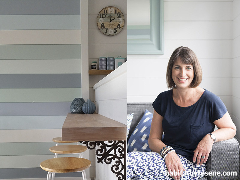
This striped feature wall at our bach is a real focal point and the seven Resene colours work so well together (see above). They remind us of the Coromandel coastline, which is truly beautiful – up the Thames coast and over the hills, with waves breaking on the beaches, the ever-changing colours of the sky and the islands in the distance in the deeper shades.
We are never bored of this stunning view and find ourselves thinking every time we drive up or down the coast, what a truly beautiful country New Zealand is.
I have three favourite colours from the wall. Together, and combined with the other colours, they create a soft and muted coastal palette; restful and calm. The perfect backdrop to a relaxed holiday.
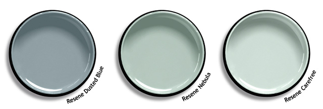
Resene Dusted Blue is timeless and restful yet with enough depth to look really interesting. It is the darkest shade on the wall.
Resene Nebula and Resene Carefree are fresh and light with a summery feel and are tones of my all-time favourite type of colour - basically anything in a duck egg (greeny blue) tone.
Click here to see all of Jackie’s gorgeous bach.

Debbie Omond of Compose Interiors
I have a thing right now with calm pastel shades paired with brights, which I generally like to use in the form of accessories such as cushions, art, throws, rugs, vases, bowls and fresh flowers.
By using a pastel base, you can swing with the seasons. For summer, you can pair them with bright accessories to go with the upbeat feeling the sun gives you, then for winter you can change to dark moody colours, making you want to stay indoors and snuggle up on the couch.
I’ve chosen three of my favourite ‘dusky’ pastel shades at the moment and paired them up with complementary brights so you can hit the ground running with a colour palette that works.

Just for fun I’ve added some fab Scion fabrics so you can see what I mean by accessorising with bold colour. Enjoy!
Jill Marsh, Resene colour consultant
As a Resene colour expert my days are filled with colour choices. Colour makes such an impact on our lives so it’s important that we choose colour that makes us feel good. My favourite Resene colours at the moment are:

Resene Alabaster is a near white with a light blackened edge. It’s such a versatile colour that can be used on walls, ceilings, trims and doors. Using white doesn’t always mean a stark, bland interior. It’s the use of texture, furnishings and accessories which turns these rooms into beautiful living spaces.
Resene Half Cut Glass is a soft shade with a tint of green/blue. It looks stunning in a bathroom with Resene Alabaster on the ceiling, skirting, window frames and doors.
Resene Coast is a stunning blue that’s perfect to use in many ways. It’s great as a colour feature in a neutral scheme or perfect for media rooms or master bedrooms where the colour creates a more intimate and cosy feel. Try using Resene SpaceCote Flat for the paint finish as this gives a rich velvety look.
See here to take advantage of the free instore Resene colour consultancy service.
Published: 16 Nov 2017

