
latest
habitat tv

Say goodbye to the morning scramble for keys, coats and sunglasses and hello to this… see this and more videos
blog

Restoring memories: A bath with a colourful new life
Within a heritage-listed homestead, amidst the serene beauty of nature, lay a unique piece of… more
Colour trends from Milan Design Week
26 May 2016
Each year, the global interiors phenomenon of Milan Design Week is a mecca for creatives from around the world. Local interior designer Nicola Manning reveals the colour trends she spotted at this year’s event.
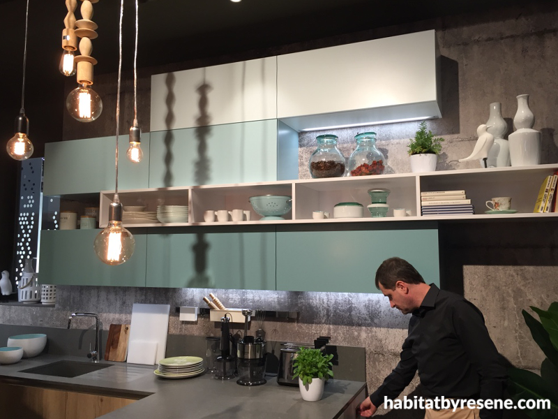
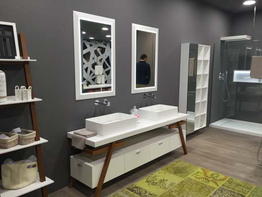
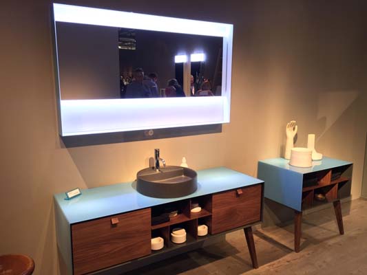
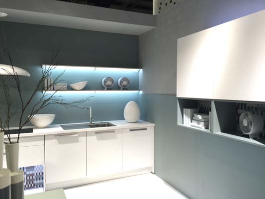
The predominant colour story at Milan Design Week 2016 was the depth of colour on display with lots of moody charcoals, blacks and greys. Some had added texture in the form of faux concrete wallpaper and, in many cases, grey was teamed with brown, often timber.
Note the metal detailing and matte finishes in the bathroom and kitchen setting below.
Get the look: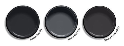
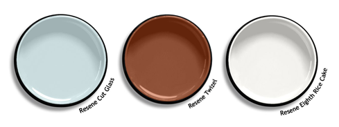
Blue was the clear winner in terms of being the most popular accent colour. There were deep moody blues as well as crisper cleaner blues, seen with browns and crisp whites.
Get the look:
Another popular accent colour was yellow, ranging from a bright citrus yellow to a deeper, richer yellow; gold and mustard tones.
Blue and yellow were seen together, and yellow was often set against textured greys.
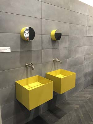
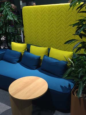
Get the look:
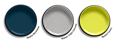
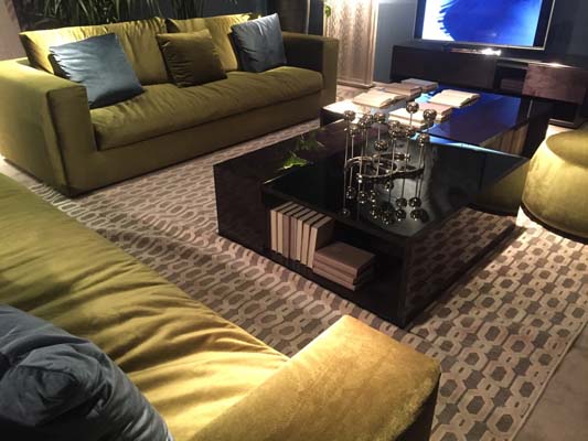
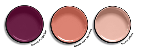
Pink was another favourite, seen on many stands at the show, ranging from soft dusky pinks to deeper pink.
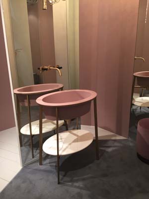
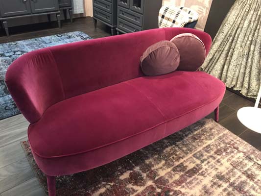
Get the look:
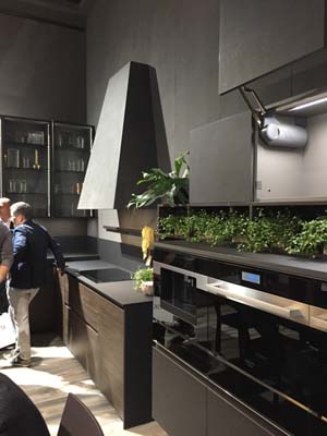
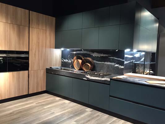
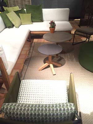
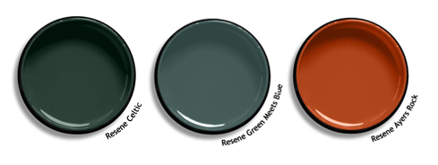
Another striking colour being used in kitchens especially is moody green. Combined with timbers and concrete or brick finishes, this creates an earthy slightly industrial look.
Take note of the mix of different timbers on the cabinets and floor of this kitchen, and the mix of different greens in the outdoor setting.
Get the look:

Nicola Manning is an interior designer, based in Auckland.
For more of Nicola’s blogs and industry commentary see www.nicolamanning.design.
Published: 26 May 2016
more inspiration

Restoring memories: A bath with a colourful new life
Within a heritage-listed homestead, amidst the serene beauty of nature,… more

Making an entrance with Resene Dark Knight
Resene paints have the transformative power to turn an ordinary… more

Award-winning mural aims to bring nature to the city
Auckland artists Kim Littlejohn and Carol Green recently unveiled their… more

Shades of citrus: Creating unique spaces for growing minds
This Auckland bungalow not only embodies modern design but also… more

Celebrating creativity and innovation with Vjekoslav Nemesh
From winning the Auckland Art Battle to his latest exhibition,… more


 look book