
latest
habitat tv

Say goodbye to the morning scramble for keys, coats and sunglasses and hello to this… see this and more videos
blog

Jacqui’s pretty petals will brighten the deck
Patios and decks come in all shapes and forms, and Resene’s wide range of exterior… more

The clock wallpaper (Exposed PE-12-02-9 from Resene) is one of Anita’s favourite features and gives the house a quirky on-trend feel. The other walls are Resene Half Truffle and the ceiling is Resene Alabaster.

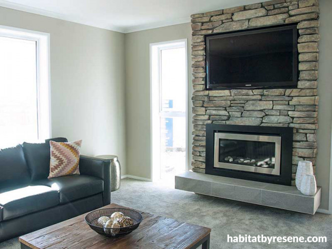
Anita feels that Resene Half Truffle for the walls works well with the home’s natural features, like this stone fireplace.

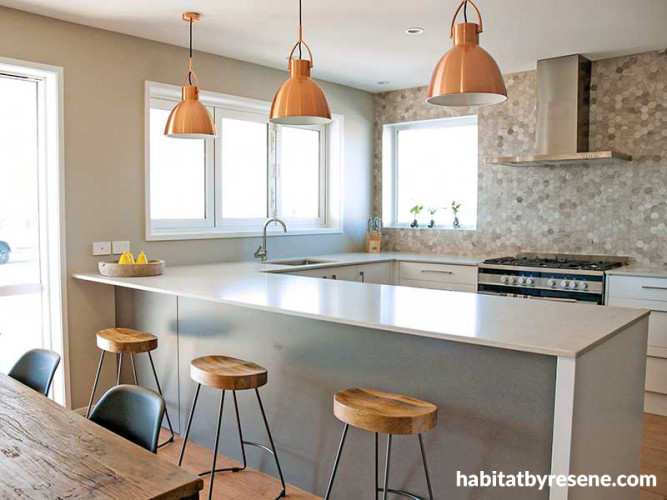
Anita loves the way light plays in a room so chose reflective surfaces such as the mosaic tiles in the kitchen, the copper-coloured lights and the glossy benchtop. The walls are in Resene Half Truffle while the ceilings are Resene Alabaster.

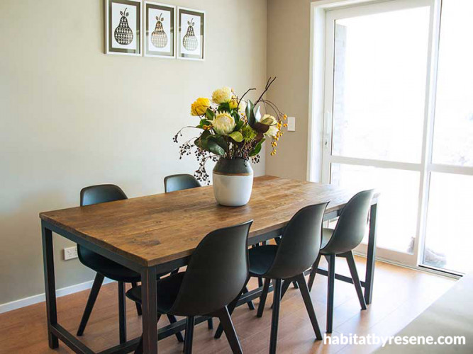
Anita carefully chose contemporary furniture with a hint of rustic charm such as the timber and steel dining table and bar stools.

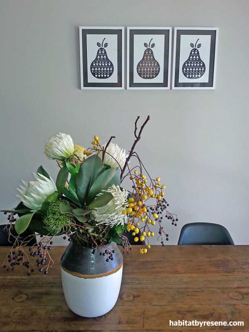
Quirky artworks, a ceramic vase, rough timber table and freeform floral arrangement set against a Resene Half Truffle wall – it all adds up to an inviting rustic look.

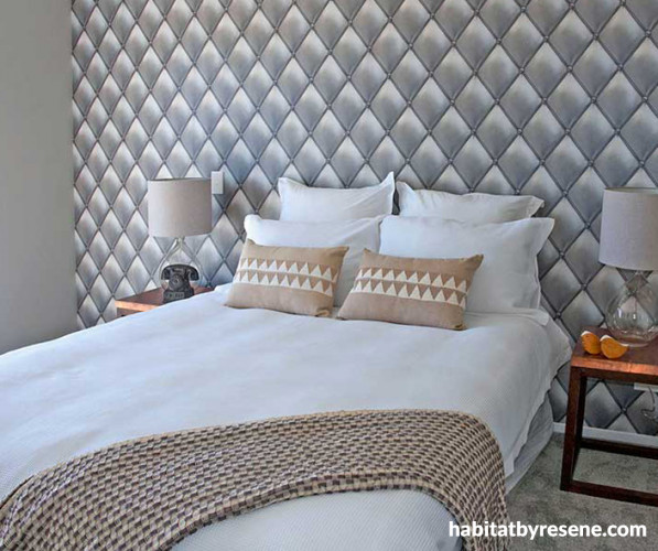
The faux padded wallpaper (Exposed PE-01-03-2 from Resene) looks stunning from any angle and gives the master bedroom a richly elegant look. The other walls are Resene Half Truffle.

Anita turns on some rustic homely charm
It’s always a dilemma for an interior designer when their ‘client’ could be… well, anyone. When Anita Thomas was asked by Navigation Homes of Wellington to design the interiors for a new showhome, she knew it had to appeal to a variety of people but also to have enough personality to be memorable. So armed with a palette of warm and welcoming Resene colours and a couple of quirky Resene wallpapers, she gave the house some rustic homely charm. It’s a modern twist, for a traditional family home.
What was the client’s brief and how do your design and colour choices respond to that?
The client’s brief was to create an interior that reflects contemporary interior trends suitable for a family home. They wanted a sense of consistency throughout the house.
As this house was designed for practicality and easy living, I wanted to create a spacious feel with a rustic homely charm. I did this through the use of colour, pattern, unique furniture and bronze accents.
The understated neutral colour scheme based on variations of Resene Truffle was chosen to tie in beautifully with the stone features and natural elements through the house. The warm neutral colours help create a sense of space and tranquility and are used in every room to give the house a cohesive feel.
The clients also wanted a home that was fashionable but would still appeal to a broad range of people and which could adapt to their own specific tastes. It’s important that Navigation’s potential clients can visualise their own furniture in the house without being limited to a restrictive colour palette or a very on-trend design element.
What was the overall design philosophy?
I wanted to create a unique interior that had quality and style. This meant using carefully considered contemporary paint colours and feature wallpapers to create impact and interest. I love the play of light in a space so I tried to use some products that would reflect light (like the copper pendants, glossy tiles and mosaics) and that would work well with the neutral paint colours to create a crisp clean feel.
What Resene colours were used, and what inspired those choices?
Resene Quarter Truffle and Resene Half Truffle on the walls, Resene Double Truffle on the doors and Resene Alabaster on the ceiling and trims. Some people might perceive Resene Truffle as a cool-feeling colour; it does have a hint of grey along with the taupe so creates a richly warm colour ideal for a homely interior.
Did you know… that Resene Truffle is becoming the new Resene Tea? Resene Tea has been in the Top 20 list of paints for the past few years because of its unique warmth and adaptability. Now, with colour trends tending more greige than beige, Resene Truffle is the new wonder colour and a great choice for those looking for a Resene Tea alternative.
What part of the design are you most happy with?
I love the bold wallpapers! The clock wallpaper (Exposed PE-12-02-9) in the living room provides an immediate wow factor. Likewise, the faux padded wallpaper (Exposed PE-01-03-2) in the master bedroom creates a striking feature when viewed at any distance. I customise every job so it was important selecting wallpaper that was unique to this house.
What was the biggest design challenge for this project?
The biggest design challenge was sourcing suitable furniture that reflected the desired brief. As it was a specific look I was after I had to be more selective. It was worth the extra effort as I am very happy with the final result.
See more about Anita at www.athomeinteriors.nz/ and www.navigationhomes.co.nz.
Published: 21 Jan 2016
Do you have a home full of wonderful Resene paint and colour? Send us some snaps by emailing [email protected].
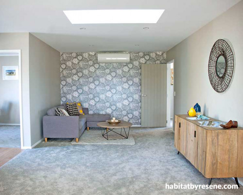
The clock wallpaper (Exposed PE-12-02-9 from Resene) is one of Anita’s favourite features and gives the house a quirky on-trend feel. The other walls are Resene Half Truffle and the ceiling is Resene Alabaster.

Anita feels that Resene Half Truffle for the walls works well with the home’s natural features, like this stone fireplace.
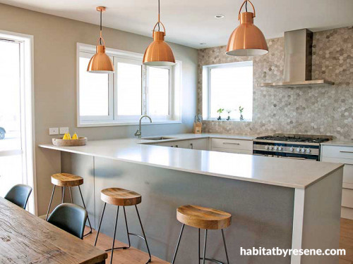
Anita loves the way light plays in a room so chose reflective surfaces such as the mosaic tiles in the kitchen, the copper-coloured lights and the glossy benchtop. The walls are in Resene Half Truffle while the ceilings are Resene Alabaster.

Anita carefully chose contemporary furniture with a hint of rustic charm such as the timber and steel dining table and bar stools.
Quirky artworks, a ceramic vase, rough timber table and freeform floral arrangement set against a Resene Half Truffle wall – it all adds up to an inviting rustic look.
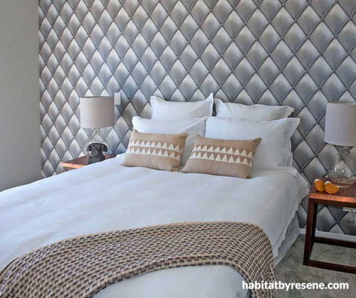
The faux padded wallpaper (Exposed PE-01-03-2 from Resene) looks stunning from any angle and gives the master bedroom a richly elegant look. The other walls are Resene Half Truffle.


Resene Quarter Truffle
Resene Double Truffle
the look
If you're stuck on what
colour to use or need colour
advice, try out the Resene
Ask a Colour Expert service.
Resene Quarter Truffle
Resene Double Truffle
the look
If you're stuck on what
colour to use or need colour
advice, try out the Resene
Ask a Colour Expert service.

